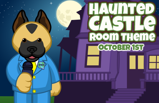
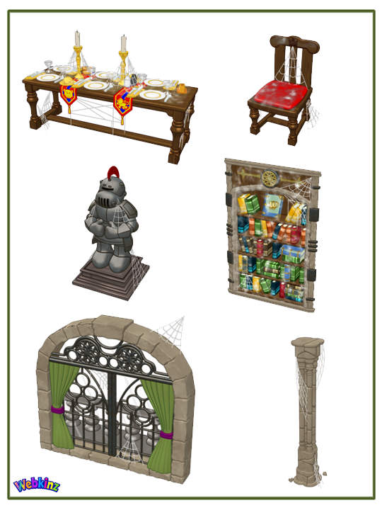
Hey guys… Michael Webkinz here, reporting for Webkinz Newz. I am back with your first look at some of the final items that will be included in this year’s brand new Halloween room theme: The Haunted Castle! This theme will be available in the W-Shop on October 1st.
One interesting aspect about this theme is that it can be mixed and matched with the rare Medieval theme that can be found at the Curio Shop. Imagine a Medieval Dining Table featuring mostly regular Medieval Chairs with one or two Haunted Castle dining chairs mixed in with the rest? Or the same idea with the columns? At first glance it would appear that the room was simply a medieval themed room however, on closer inspection, the castle would appear to be haunted!
I can’t wait to see the Haunted Castle screenshots players will send me when this theme is released on October 1st…
If you missed my last post, You can see it HERE. If you have any feedback or name suggestions for any of these items, please feel free to leave your ideas in the comment section below.
This has been Michael Webkinz reporting for Webkinz Newz…





I like the bookcase, the concept drawing colors were too bright but this looks awesome
Looks awesome Ganz…thanks!
Seriously, Michael, I like the mix and match scheme. I’ve incorporated other Halloween themes before and it’s amazing how well they mix, but to have it mix with a regular theme gives you endless options. Now with the hints of purple in there you have more to do with the free PAN items. It broadens the scope of the theme and ties in so many others. Medieval, purple, signature, a lot of previous Halloweens, lime green counters, maybe even the blooming theme to some degree.
These look great! I’m looking forward to getting several of those pillars–I never seem to have enough pillars, lol.
Well…..agree with Michael—this can definitely be mixed and matched with the Medieval Theme in the Curio Shop. I’ve been collecting that theme for almost 10 years, so you guys can imagine how many pieces I have of it, and how many rooms are filled with it. (Love that theme; it’s my favorite…) So, I’m thinking: Yes, I can use these Halloween pieces with my Medieval theme pieces…..,,,,and the cobweb covered pieces will just make it will look like my Kinz just never got around to dusting!!!!!! Thanks for the preview! Previews are so much fun!!
Great!! We can mix this up with Medieval item already in our collection! Love that!
Hmm, names for the items…bookcase: Haunted Archives, balcony window: Dare to Leave Terrace… :)
or “Dare to Escape Terrace” ?
Really love the name Haunted Archives for the bookcase. Great idea, EmeraldCity!
Thanks animalmomkls !!! :D
I think the windows are the best part. It’s going to be fun to haunt my castle! I hope the columns change as they turn. I like the bookcase but now it looks flat like wall decor instead of the freestanding piece that the concept art seemed to show. I had hoped to do an entire haunted library with bookcases in the room and secret passages “behind ze bookcase, put ze candle back!” I’m surprised that the table, chair, suit of armor & column look just like the Medieval theme pieces but with spiderwebs. The concept drawings looked more original while still coordinating with the old theme. This will be interesting…
I liked it purple better than the red because at least it looked different. Most of this room is going to look the exact same as the regular Medieval room, just with cobwebs. I wish one of the other rooms had won :(
hannah5banana and 1Emerald1: I totally agree with the purple color and originality in the concept drawings. I was soooo excited about this year’s Halloween theme! When I saw the concept drawings I told my friend about the theme right away and she loved it too. We had both been saving up to get all the new Halloween pieces and then create our Halloween rooms to show each other. That was until for some reason the color purple was abruptly changed to red; and the custom-look-for-Halloween concept designs were unexpectedly changed to the regular old Medieval pieces. Why? Was it more time efficient to just draw cobwebs on Medieval pieces instead of finalizing the original, really cool concept drawings of this year’s Halloweeen theme? Or, maybe the changes were intentionally made to coordinate with the Medieval theme. I have read a lot of people are looking forward to that idea. I really like to decorate specifically for holidays, separate from other themes. But that’s just me. The purple color and original concept drawings were, in my opinion, what made this a Halloween theme. I do still really like the window and bookcase though. I think if the Medieval theme colors and room pieces were to be used for a holiday, they could have been decorated and made into a really great Christmas theme. Well, that said, I am glad for the others who like this year’s Halloween theme. It’s fun to read happy comments and hear people’s excitement and enthusiasm. As for my opinion of this year’s Halloween theme, as completed, I just don’t get it. And, actually, I probably really won’t get it. I’m looking forward to an awesome Christmas theme! Hey! How about a haunted Dickens’ Christmas Carol theme?? Seriously! I know it may be early to plan for Christmas, but I’m sure the artists could have a lot of fun with that theme! (It’s my favorite Christmas story.) Happy Halloween everyone!
I’m sorry my earlier reply was sooo lengthy. It was my first attempt to submit a reply. I’ll keep it shorter next time. LOL
Hi puppies4me, I like Christmas Carol story too, we watch it every year on Christmas. One thing, the red, yellow and blue from the old Medieval Theme doesn’t go well with the green/purple here for the new Halloween theme merge…maybe they’ll change the seat and table runner colors??? Hmmm and I really didn’t notice that at first.
I’m really excited about making a room with this new theme! It’s fabulous!
Awesome! I like that it matches the original theme. That bookcase looks great too! And thanks for not giving it a purpley glow like the Freaky Forest theme, that makes it hard (for me at least) to match it with other items.