Wow! So the last room that we are making over for Fluffington’s Christmas party was a pretty tall order. He has this light and airy rec room with a real summery feel. We want to inject some Christmas spirit into it without losing its sense of spaciousness and lightness.
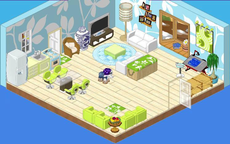
We tried to maintain the cool colors that Fluffington had in his original room. So we accented it with lots of white and blues. We also added some green, Christmassy accessories. The Blue Frost Evergreen seemed like the perfect choice for this cool room.
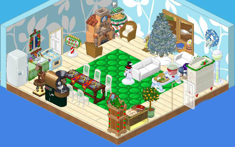
We started out by adding a base of Green and Groovy Tiles on the floor. Then we brought in the King’s Feast Dining Table. We felt the weight of it was a bit more in the spirit of the season than the glass topped table that was already there. We surrounded it with Elegant White Dining Chairs to maintain that light, airy feel and replace the counters with ones from the Bloomin’ Room theme. We also added a Hot Chocolate Machine and Chocolate Fountain to the eating area.
We used Fluffington’s White Silk Sofas and added some cool touches like the Cool Ice Coffee Table and the Frosted Ice Floor Lamp. The Christmas Cabinet Fridge seemed like a good fit with its icy tones.
We also added a Christmassy corner with the Santakinz Desk and Hickory Clock. In the opposite corner, the Chef Gazpacho Stove made a cozy focal point. We surrounded it with a pair of Wicker Chairs which were in keeping with the casual feel of the room.
Finally, we added festive touches like the Festive Cheer Cookie Jar, the Happy Holidays sign and we thought Fluffington would really appreciate Snowy the Snow Bernard.




It looks kind of cramped. It’s defintly not their best
Personally i dont like the second one….it seems more cluttered and not so inviting…
It would be really great if they would tell us how to get all of the items used in these lovely rooms; wreath on the wall, Christmas cabinet fridge??
Awesome!!!!
I agree, Random456.
But I think that the first room looks awesome, but when they turned it into a Christmas themed room, it looked a bit too crammed.
In a big room, things shouldn’t look crammed..
Is it just me, or does anyone else think it looks crammed?
They are both sorta odd but I prefer the first. Merry Christmas To All The Kinz!
It is lovely! Thanks for sharing it!! And we are having a white Christmas – it is snowing and suppose to be cold for the next few days!! Safe travels to all who have to go through this stuff!! No more school until 2012!!!
Before: Mostly W-Shop, the way I like it!
After: Crowded with eStore! (Can’t Hailey and Elwin use W-Shop for once?)
~PrincessLunaIsDaBomb
I am sorry but I really think the redo looks horrible. The way it was before was way better!
The second room is too crowded and the christmas stuff makes it look tacky. It looked so much more comfortable in the first room. Maybe if they just took the Chef Oven and put it in the first kitchen, and got maybe a wreath and put it by the door, that would’ve been a much better room. I really don’t like the second at all, but the items are cute and I could use them in other rooms. They don’t go much with the theme and seem really mix matched.
Fizzle Fizzle Yall!
Sprite