Ms. Cowoline called Elwin up and asked him to re-do the Kinzville Academy’s kindergarten classroom. Since Elwin has never really grown up, this was the perfect project for him (just kidding, Elwin…sort of!).
Anyway, Elwin worked his magic and turned the bleak into the beautiful! Check out the transformation!
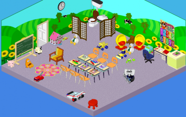
This is the before – things were worn out, the colors were mismatched – and there was no storage for all those toys!

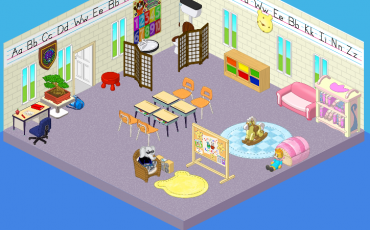
And this is the after! Wow! Look at this new room – it’s beautiful. The kindergarten class responded with an enthusiastic “YAY!” and their teacher responded with a VERY enthusiastic “WOO HOO!”

I think this makeover is an official success!
Ciao for now!
-Hailey


Kindergarten is absolutely great! Furniture is very well chosen and positioned, so you did a great job, and Elwin Hailey! : * :*
i don’t think i like any of the rooms between both the classrooms.
(sorry… its probaly cause i’m used to things with value in it
not w shop items.)
i will try it with my room$
I loved the first one so much but i cant aford it :( :( :( :(
Elwin looks a lot happier in the first one. The first one is more fun for the kids. It’s colorful, and it has a lot of items that the children like. The second one is too organized. It doesn’t look as fun. It looks more like Elwin was designing it for adults. Not kids. I would rather go to the first one. I don’t mean to be rude, but that’s just my opinion.
why is there a car in the 1st one why would you put a car in a classroom?
( ° – ° )
i like the first one wa-a-a-a-a-a-a-a-ay better!!!!!!!!!!!!!!!!!!!!!! sorry Elwin, but that looks awful… look on the bright side— could be worse!!!!!!!!!!!!!!!!!!!!!!1
omg… the second one is so plain. The first one looks more like a kindergarden class room than the second one. They should have kept it the way it was!!!!!!!! :(:(:(:(:(:(
THE SECOND ONE IS CLEANER AND I LIKE THAT, BUT IT NEEDS MORE COLORS.
I think the first one looks more fun but the second is more neat. It’s okay I guess.