By Wiggles Pig
Sometimes designing a space you dig without digging too deeply into your pockets means making some trade offs. I was able to splurge on a few pieces for this boy’s bedroom while keeping within my budget of 2,500 KC by making smart choices elsewhere.
For example, I really wanted him to enjoy a beautiful meadow view, but the window I had in mind cost 485 KC. That’s a lot, but I knew I could compromise and still get a great look if I went with a 60 KC coat of red paint on the walls and On Deck Pirate flooring for just 150 KC.
With their cheerful primary colors, the Prairie Wood Bed and Circle Sensation Carpet gave me the playful look I was going for, but together they came to $850! Yikes! It’s a good thing I spotted these Tree Stump Side Tables for just $75 each. Tree stumps? In a boy’s room? What could be more perfect?
When I spotted the Joyful Jigsaw Coffee table with its bright primary shades, the final pieces of the puzzle started coming together. It fit perfectly with the Chunky Red Chair. And I could afford them both with one last trade off – an affordable Rattan Toy Box that works nicely in almost any setting.
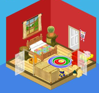
So you see, my friends, when you’re designing a room on a budget, you don’t have to limit yourselves. You CAN include a few higher end pieces as long as you’re willing to trade off for some cheaper items too.







dont like it coz
1 : its 2 cramped
2:I could make a better boys room on 15oo kinzcash :)
add me im gingerhorse9
megansezpeaceout :)
yaaa i do not like this what guy is foresty and country and colorful with 1500 kins cash way better where does pigs and soccer come together and what is going on it is CRAMMED
I thought the tree stumps side tables only went in outdoor rooms
I think it is a little too cramped.
Nicely done! Thanks for sharing!
I would like it if it was bigger and the banner was taken out and their was a different window. I also like things that are more expensive (on webkinz not in real life) cuz I have lots of kinzcash and stylish rooms are more my thing. otherwise good job
cool designs
I don’t like it at all.:(
I like it! :) but iam not a boy :) If it was a bigger room it whould be ALOT better! And the rug dosnt go!! :)
you don’t ? i do it is cheap
Cheap doesn’t mean good. Cheap things can be even harmful in some situations.
I agree! This room is terrible! Nothing matches! I think Wiggles needs to go back to Design school, because he isn’t half the interior designer that Hailey and Elwin are!
I’m a big time perfectionest. That room has everything everywhere! My real room if it is not spick and span I will freak out.
I THINK IT IS CRAMPED TOO,
I little too cramped
I think so to.
Oh my. This room isn’t very boyish to me. It looks more like…..well I don’t know what it really looks like. All I can tell about this, is that Wiggles the Pig could use a little bit of help from Hailey and Elwin. I think a boy’s room would look better if Wiggles had gone with the sports theme and add a few sparks of color here and there. And he said that tree stumps in the room were perfect for a boy, but no one I know has tree stumps in their rooms! :D The funny thing I think about this room is the fact that usually Hailey or Elwin pose inside their redesigned room, but instead of a Webkinz pig inside the room, there is a golden retriever! Haha! Wait….I guess Wiggles is sort of in the picture, if you count the piggy bank on the table. ;)
welll it looks a little too country…. i prefer more modern looks :)
One thing is wrong, though ————– Wiggles said that she used the On Deck Pirate Flooring (150 KC) when the picture of the room shows the Ichiban theme floor (250 KC, i think). That might put her a little over budget!
It’s definitely the pirate flooring. You probably don’t recognize it as well with such a small room.
it is definitely not the pirate floor wrong color
It’s too light, and it has the dull dark green stripe on the edge! Ichiban Color Alert!
It is definetly ichiban QueenVet is right
it’s 300KC!!!!! come on wiggles!!!! don’t lie!!!! also, they should get rid of the banner as it has nothing to do with the theme!
A bit too cramped if you ask me:)
i agree
I agree it would work better if it was a medium or large room
yeah
i like this design :)
Me too, it’s cute! :)
Oh, wow, that is SUPER CUTE! Love it! :D
i have one word for that room;UGLY
Agree!
YEAH IT’S SOOO UGLY!!!!!
I don’t think I’m a big fan of this room……… I think it is too random, I think it looks nicer if you use a theme……… I mean that’s why the theme’s are there right?!
I agree that room needs a theme !!!!And it has way to many colors that don’t match together!!!
Like ummm… in April? Maybe. I made an apartment for my Strawberry Cow. I hate to use random themes and colors running wild. I like to keep them under control. LOL!!!!!!!! But my apartment is light blue and a nice green. (Not ugly green though…YUCK!!!!) Her room made be more like a home(with paper towels and shoes,postcards and magazines,yeah the works.), but seriously, why make a room so neat and tidy you just want to throw a pile of toys in the middle of it? Add me! My username is: psalm11911
I like the randomnis of the room Its not like a theme
Well, the themes are there to suggest room looks, you can just go with the flow and copy the exact themes, or, you can think outside the box and combine themes and a few matching random items. What I like to do, is create rooms based on a few matching theme things, and then go from there.
I agree, I just adopted a lamb named Meagan, and I used the suggestions. My room came out great. It is a nice blue. I used the lamb bed, some blue and white striped things, some things from the cloud theme, and some things I had. I started off with * 4500K and I ended with * 1500K
pumpkie10 :)
****ESTIMATED
There are too many colors!
Hey guys, I wanted to remetion my idea! Ok, this room is horrid! The bamboo toy boz doesn’t match anything! The red wall paper maked the room look even smaller than it actually is. The tree stumps don’t go with the country. What boy has country stuff!? ( A window and a bed?! ) That rug looks so ugly in the dark browns and blacks and beiges. Jigsaw Coffe Table? 1. That looks just as bad as the rug!
The zangoz toy is right next to a treee stump table and is on the ground! Would it kill Wilggles to put it on the table? It is way to random and crowded! I could make a better room with 2,500! -Moonstar*
I like the way you think Moonstar! Jig Saw Coffe Table? I am gonna go with what you siad: It’s as bad as the rug!
There is to much stuff cramped in one room.
Totally agree with you, Moonstar!! I’m not that good at decorating, but when I decorate my rooms, I make them match as best as I can. And some of the other rooms Wiggles has made I didn’t like them either. That horrible flooring with the yucky red wallpaper, they so totally clash!!! -Horselover99
THATS SOOO MEAN WHAT IF YOU MADE THIS ROOM AND PEOPLE SAID THAT – HOW WOULD YOU LIKE IT!!!
I absolutely agree this room is obviously cheap! I would rather spend all my kinzcash on a good room than save money and have this kind of room!! Its not an appealing room.
I so agree with that. THIS ROOM IS SUPER UGLY :( :( :( :( :( :( :( :( :( :( :( :( :( :( :) :( :( :(
Yeah, squiggles!!! This room STINKS! I never like Wiggles’ designs!!! Yuck!!!!
Whoever says this room is ugly is being MEAN!!! If you dont have something nice to say, dont say anything. I personally love it.
You’re soooo right! I love this design too:)
that was a nice thing to say about that room hi
dude! everyone is entitled to their own opinion, and they are NOT being mean if they say the room is ugly because that’s their opinion.
taterbugtay is right. if you have something mean to say, don’t say it. it will just offend poor wiggles pig. he’s just trying to help!
P.S. some people DOlike that room
that is mean! just because you think it is bad, doesn’t mean it is bad! ganz made that, and they made it to show you could make rooms with hardly any kinzcash!
This isn’t my favorite design but you don’t have to yell. Someone probably spent their weekend trying to make this for your enjoyment not so you could insult it. I feel like your comment is rude.
I agree. No need to be rude just because you don’t like it!
I agree… Other people could enjoy this room. it is not my favorite either.. but you are right… no need to yell.
There is no need to say anything mean about this room. If you don’t have anything nice to say then don’t say anything.
It is cooooooooooooool
I have only one word to say, realistic. I have cool rooms, but this is w-shop and its cool.
I agree though, boy’s rooms are messy
I agree
I agree, it may look ugly but its a BOYS bedroom! Its not girls bedroom, if it was a girls bedroom it would be all girly and pink!!!
:(
I KNOW!!!!!!
you cant even put tree stump tables in your indoor-room!!!! plus that room is REALLY UGLY!!!!
These aren’t the tree stump side tables you’re thinking of. The ones you’re thinking of are part of the treetop theme. These are really old ones from when webkinz first opened up before they even had themes. They have no theme and nothing that matches them
All you guys who say that it’s uply, I agree. However, you can learn something from this: When you don’t have a lot of money for a room, you CAN get some more expensive items, like the fancy blue canopy bed (forget what it’s called) as long as you find some cheap items that YOU THINK look good together. That’s the real lesson.
what the heck!????
Agreed.
thats mean I like it!!!
Thank you!You can earn kinzcash from the arcade or jobs and mostly everything. If you wanna make a room on a cheap budget look for better items not items that are from totally different themes that don’t even have a precentage of 50.Look for cheap but stylish.And even if your on a budget you could buy expensive items just don’t waste even more kinzcash on junk you don’t need or stop buying stuff to trade when the items are useless.I could make a much better room with 1500$.-Ceci
TOTALLY AGREED!
I think this room is ugly too!! You can tell its cheap!
I agree!!!!!!!!!!!!!!!!!!!!
You are right that room is HORRIFYING. My rooms are way better!!!!!!!!!!!
This room is dull – this looks like the room before it’s makeover blahh i don’t like it at all
yuck! thats so not a makeover!!!!!!!!!
So ugly!
I don’t get it. Why are people saying it’s cut when its for boys.
I love this room so much!
IT’S surely not the design i would have for my room.
NO WAY
I love it! The country bed adds a nice splash of western and country to it, especially mixed with that open country window and the two tree stump cabinets! The cacti looks pretty, with its vibrant greenness, and the orange pot! And the soccer banner: The boy must be a fan of soccer, so the banner goes perfectly! The 2 side doors kinda make it look bad, but without the doors: EXCELLENT! That wooden flooring looks absolutely GOOD in there, and so does the splash of color from the rug! I’d give this room a 5 STAR RATING!
I am sick of being copied! I am going to use another name-but I won’t tell what name. Figure this out, you’ll know who I am where I am waiting. The blue den is where I wait. . . . . . -Silverstar??
The last Silver camp. My old den is more clear. A star like a moon is ready for you. Feather longer than a tail will help and a star duller than a willow may be needed. -1000Silverstar
That is horrid! I would like to see 1 boy’s room that has country things! The red makes the place look compressed and small. That rug is so ugly with that room. The bamboo desk or whatever it is looks horrible with the other stuff! The soccer banner doesn’t really fit in this style of room. The truck is just out, and the zangoz is next to a table top and is on the floor! That cactus doesn’t look good on that tree thingy. I can imagine something high tech and modern. Maybe a Foosball table and that rug. Like a football bed and some kind of field looking flooring and wall paper. A soccer ball, bowling ball and ???? in the corner or on a stand. Something that looks modern and high tech, sports stuff too. That is what I think! It is also waaay to cramped! -Moonstar*
I like it!!!! I was thinking about mabey doing that design
I would like it a lot better if the room was bigger. They made that design in a small room. And does anyone now how to make smileys?
My username is aoryona if anyone would like to become friends. I have alot of parties and i invite everyone i can!!!!
I really HATE Ganz designs (not trying to be mean) it just looks crowded, and just not right, sorry Ganz, just be BETTER at your designs :(
I <3 IT !!!! ;) ITS SO SIMPLE!!! U GOTTA B KRAZY 2 HATE IT!! I THINK THEY DID A GOOD JOB!!!
Sorry but i was looking for the “after” picture and realized that the only picture was the ‘after” picture. I don’t like it sorry!
Yuck!