Tabby Von Meow gave us a call earlier this week and invited us over to see her “horrible bathroom.” Hailey and I thought “horrible” was a bit of a strong word – but that was before we had seen the room. When we actually WENT to her house and SAW it in person, we had to agree – “horrible” is actually quite befitting. Take a look for yourself:
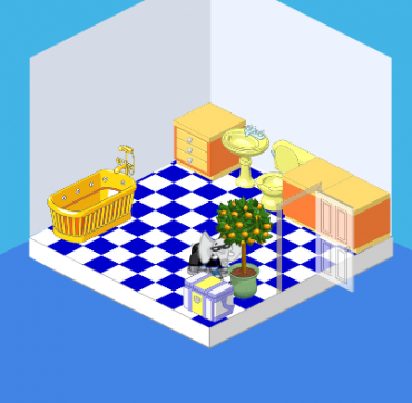
That’s me, peeking out from behind the orange tree.
The problems with this room are threefold:
1. The floor – while blue tiles work in SOME rooms, they overwhelm this little room. The blue is just TOO intense – it overpowers everything else.
2. The layout isn’t great – ideally, having the bathtub oriented in a different direction or having some kind of divider between the tub and the toilet would be ideal.
3. The walls are SO bare – there are no pictures, there’s no mirror – there’s nothing but a very blah wall color.
This room needs some serious help!
Tabby begged us to work our magic, but she had two requests:
1. Keep the walls pretty basic. Tabby wanted a very peaceful bathroom, and I guess she was worried that I’d go a little crazy with colors and patterns. Or a mural (it would’ve been a good idea, trust me!).
2. Infuse some pink! I love pink (as does Hailey) so this was an easy one. Pink is an extremely restful, easy color to live with (except, you know, neon pink).
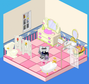
And voila! This is the end result. We’ve got a well-laid-out, pretty bathroom. We’ve got a simple but elegant (and pink!) room. The walls are still pretty basic, but we added nice wainscoting and swan border. The pink tiles work nicely with the dresser and the white fixtures. Tabby was very pleased with the result – and so were we!








I love the second one- the first one is horrible. It’s way too cluttered and ugly.
I love you, Hailey and Elwin! Come to Kinzville and open your own store!
Wow that is really cute!
WOW THAT OLD ONE LOOKED VERY UGLY NOW IT LOOKS VERY COOL AND WANT TO BE MY WEBKINZ FIREND MY USERNAME IS descrypau agin descrypau
That is amazing, Hailey and Elwin! Nice work! I agree the first one was horrible, but the after . . . WOW!!! Excellent work!
The pink bathroom looks great
I like the first one better. waaaayyy to cluttered on the second one. and why is there a dresser?
its not supposed to be a dresser (even though it is) it is supposed to serve as a vanity. :)
Interesting, Firefox still doesn’t recognize this page.
Nice, but shouldn’t the tub be by the divider?
That room looks sooo much better now!
i like the second one better, but whats with the dresser, its a bathroom right? (rhetorical don’t answer.) Also i like it when the before and after rooms use ONLY w shop items. Because then if we what them to redesign our room, but they don’t, we can buy all the items, put them in the exact same spots as the picture, and there you go! Your own little bathroom that looks like it was redesigned by them.
No offence tabby meow but… you are famous in webkinz world and you have a horrible bathroom!!! And i would not like a elephant coming in my webkinz room and telling everybody on webkinz newz it was horrible looking….i mean whose with me!!!???
~Kaci PS: i think that is kind of rude Elwin and Haily!!!!
PPS:BTW i would not let any elephant come in my house unless it is a friend!!
You need to CHILL!
YOU need to CHILL! People say that because they get steamed over what other people say! Plus, it’s a free country, so she can be as un-chill as she wants!
i think you read the article wrong, she invited them over.
because she wanted them to do a make over.
P.s this is cookie, or cookie(.), it just says i’m posting to quickly.
Yeah the bathroom isn’t great. Second of all, if Tabby says it’s horrible herself, it would be okay to agree! Woah I have really written a lot yikes! Well anyway, Yikes!
agreed
Same thing!
i love the room afterwards!
think pink!
Like last one better but i wouldn’t like a random guy coming in my house and taking a picture of my bathroom LOL
DOES ANY-1 NO HOW 2 TRADE ANY-MOR? GOSH!
I have tried trading several times in the last three weeks and seems everyone who is there just wants specific things. So I gave up.
Same here! I was trading with someone and they asked if I had shuts. I said no, and they said thanks for my time and goodbye. Really, people?
I stopped going to the trading room months ago as most times I went people only wanted super beds or only had W Shop items to swap. Also peps tried to cheat me out of my items by swapping there’s at last second and clicking on trade , well you have to smarter than that to trick me , I just closed the trade ,simple !!!
NOT Me I just want cool suff AND ADD Me
Don’t give up. Try and try you don’t have specific things, find other people that you don’t think wants those things.
I liked the first one. No offense!!!
that must be so embarrassing for Tabby!!!!!!!! I mean like who wants to have their “horrible” bathroom all over the internet??
I LIKE BOTH ROOMS BUT THE 2ND ROOM IS BETTER LOOKING THAN THE FIRST ROOM…MAYBE IF THE FIRST ROOM HAD DIFFERENT COLOR WALLS AND FLOORS AND SOME ITEMS ON THE WALLS IT MIGHT LOOK WAY BETTER…I THINK THE CHOOSE OF COLORS IN 2ND ROOM IS MORE PUT TOGETHER THAN THE FIRST….TRY ENTERING AND PLAYING VIDEO CHALLENGES…THEY SOMETIMES GIVE YOU ITEMS THAT YOU CAN USE TO DECORATE YOUR ROOMS FOR FREE….KEEP ON COMING OUT WITH GREAT DECORATING IDEAS…THANKS
Why does Tabby have a box-refregerigheter in her bathroom?! At the first picture, does she gets hungry when shes in the bathroom?!!!!????
LOL!!!! Nice catch! Maybe she has to harvest all of the oranges that fall off the orange tree.
Everyone gets hungry in the bathroom, right :oops: :?:
nice new bathroom
That was Ha Ha Hilarious!!!!
It is 100% cute and 0% ugly
Switch it sist’a! 0% cute and 100% ugly!
No, it’s 100% cute and 0% ugly! lol :)
NEON PINK IS BETTER!!!
Blue and orange so don’t go together!
Actually, they do, just not in this situation. Blue and orange are opposite on the color wheel, so they’re called complimenting colors. With the right shades they are awesome together. Just look at orange soda packaging. Even my laundry soap is blue and orange!
Me too!!!! I love that they put the vanity in there. Brilliant!