Tabby Von Meow gave us a call earlier this week and invited us over to see her “horrible bathroom.” Hailey and I thought “horrible” was a bit of a strong word – but that was before we had seen the room. When we actually WENT to her house and SAW it in person, we had to agree – “horrible” is actually quite befitting. Take a look for yourself:
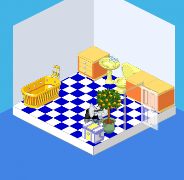
That’s me, peeking out from behind the orange tree.
The problems with this room are threefold:
1. The floor – while blue tiles work in SOME rooms, they overwhelm this little room. The blue is just TOO intense – it overpowers everything else.
2. The layout isn’t great – ideally, having the bathtub oriented in a different direction or having some kind of divider between the tub and the toilet would be ideal.
3. The walls are SO bare – there are no pictures, there’s no mirror – there’s nothing but a very blah wall color.
This room needs some serious help!
Tabby begged us to work our magic, but she had two requests:
1. Keep the walls pretty basic. Tabby wanted a very peaceful bathroom, and I guess she was worried that I’d go a little crazy with colors and patterns. Or a mural (it would’ve been a good idea, trust me!).
2. Infuse some pink! I love pink (as does Hailey) so this was an easy one. Pink is an extremely restful, easy color to live with (except, you know, neon pink).
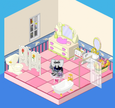
And voila! This is the end result. We’ve got a well-laid-out, pretty bathroom. We’ve got a simple but elegant (and pink!) room. The walls are still pretty basic, but we added nice wainscoting and swan border. The pink tiles work nicely with the dresser and the white fixtures. Tabby was very pleased with the result – and so were we!








Is 100% and 100° perfectly.
Well I personally don’t like pink AT ALL! so this bathroom may be good for Tabby but I would not like it. Oh By the way who loves Nancy Drew computer games!!!!! I looooooove them, we own eight and are still getting more!!!
i don’t really like the end result not to be rude but its still to BLAH not in a boring blah but nothing goes together again i am not saying this to be rude
I think the big city window was a nice touch. It looks a lot better. ;)
I would like to make a room of it, but I don’t an extra room!!
Sob! Sob!
I wouldn’t have any limitations/requests if she would come redo my beagal’s room… it’s horrible!!! Yes, I entered it in the May Makeovers Contest. I really hope I win!
pink?
That’s realy nice ; )
wayyyyyyyyyyyyyyyyy better than the first one but PLEASE NOT PINK! but i like the singer p!nk. :) =]
I love the “after” bathroom! In the first one, the blue really clashed with the orange…. Ugh!
Has anyone noticed that they said the word Ideal in number two: “ideally, having the bathtub oriented in a different direction or having some kind of divider between the tub and the toilet would be ideal,” at the beginning and the end? It sounds kinda weird….