Tabby Von Meow gave us a call earlier this week and invited us over to see her “horrible bathroom.” Hailey and I thought “horrible” was a bit of a strong word – but that was before we had seen the room. When we actually WENT to her house and SAW it in person, we had to agree – “horrible” is actually quite befitting. Take a look for yourself:
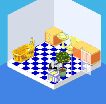
That’s me, peeking out from behind the orange tree.
The problems with this room are threefold:
1. The floor – while blue tiles work in SOME rooms, they overwhelm this little room. The blue is just TOO intense – it overpowers everything else.
2. The layout isn’t great – ideally, having the bathtub oriented in a different direction or having some kind of divider between the tub and the toilet would be ideal.
3. The walls are SO bare – there are no pictures, there’s no mirror – there’s nothing but a very blah wall color.
This room needs some serious help!
Tabby begged us to work our magic, but she had two requests:
1. Keep the walls pretty basic. Tabby wanted a very peaceful bathroom, and I guess she was worried that I’d go a little crazy with colors and patterns. Or a mural (it would’ve been a good idea, trust me!).
2. Infuse some pink! I love pink (as does Hailey) so this was an easy one. Pink is an extremely restful, easy color to live with (except, you know, neon pink).
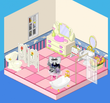
And voila! This is the end result. We’ve got a well-laid-out, pretty bathroom. We’ve got a simple but elegant (and pink!) room. The walls are still pretty basic, but we added nice wainscoting and swan border. The pink tiles work nicely with the dresser and the white fixtures. Tabby was very pleased with the result – and so were we!








Ummm….. Question, why was there a tree and cooler in the first one? Lol And why is there a dresser in the second one?
I liked it before
i LOVE pink!!!!!!!!!!!!!!!!!!!!!!!!!!!!!!!!!!!!!!!!!!!!!!!!!!!!!!!!!!!!!!!!!!!!!!!!!!!!!!!!!!!!!!!!!!!!!!
I love it i like the pink one soo cute makes me wanna blush lol 0//0
I love webkinz world!!!!!!!!!!!!!!:)
i personally like the first one better. for one, its not as cluttered as the second one. also,im not that big a fan of pink. then,theres the fact that there are tulips in there (and if they were to put in flowers, why not by the toilet, it makes sense, dosent it?). and isnt that a GARAGE window? why they put that in a bathroom is beyond me…
i don’t like how the bathtub is positioned. sorry
both are good . To much pink in 2 . no offence
i like the second room more,even though it is cluttered.I NEED TO GET HAILY OR ELWIN AT MY HOUSE! THEY HAVE THE BEST IDEAS EVER! HALIY AND ELWIN I INVITE YOU OVER AT MY HOUSE TO DO A MAKEOVER!
this room definetley looks so much better. the wallpaper is sort of awkward and looks like it should belong in a lil’ kinz bedroom. the drawer and mirror look a little weird in there too. otherwise, good job its pretty and affordable :)