Our next task in the Henrietta Hippo Theater was to redecorate some of the dressing rooms. There’s some serious rockin’ going on out on stage right now so we were asked to design one dressing room with a rock ‘n’ roll theme.
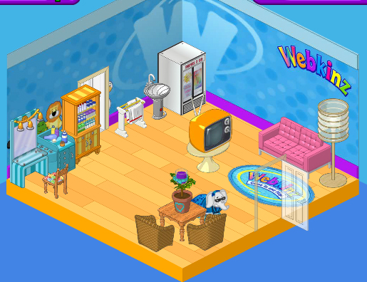
Here’s the dressing room as we found it. Cute, but a bit bland, you know? I really like the Superstar Styling Station in the corner, but when we replace that Webkinz Superfan Wallpaper I’m not sure it will fit with our new look. We’ll have to see. The wood flooring is nice but a little too vanilla for our rock star look and those wicker chairs and country table will have to go.

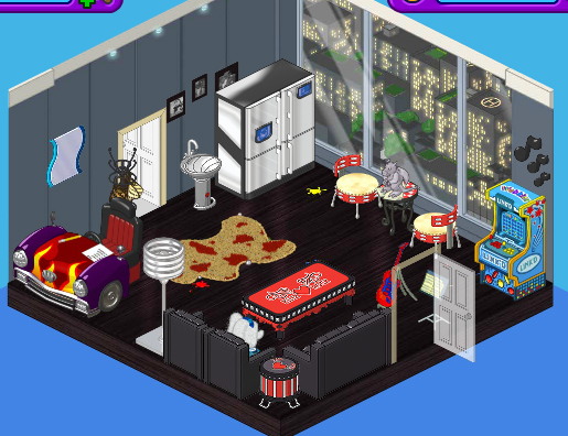
Here’s the new space. As soon as I checked out the new Mega Modern theme I knew it would be perfect for the look we were going for. We paired the Mega Modern Wallpaper with the Creative Studio flooring. A High End Fridge is a stylish place to store cold drinks and snacks, and we replaced the table and chair with a couple of Tamborine Chairs and the Radiant Red Mosaic table topped with a Gargoyle Paper Weight.
Boomin’ Black Couch and Lounge Chairs, a Studded Coffee Table, and Snare Sidetable were the ideal choice for the seating area in this room, and we decided to replace the dressing station with a Hot Rod Desk and mirror.
Finally we threw in a gaming station in the corner to keep those rockers busy. This is one cool room, don’t you think?


Awsome! I agree!
Hailey’s is SO much cooler… : )
I actually like it! I thought the elephants needed some design tips. It looks like they got them , and tried as hard as they could to follow them. It doesn’t look good , but if you think about it , there just doing the best they know how to. signed , AllAGirl
The room rox!!! I love everything, but i just do not think it looks a lot like a dressing room.
i don’t like them either. :(
I feel the same way. the room is a little small and it does not look like a dressing room.
I don’t like either, personally. Hailey and Elwin are getting worse and worse at designing, or is it just me…… ~~Rainbow*Rain~~
They always have been! Maybe a course at design school?
I think you did a really cool job!! You don’t spend much time in a dressing room and it is nice to have a game area and a different area to eat. I’d give you an AA. Nice job!
Neither of these Look Like Dressing Rooms……. Anyone else feel that way?…. or is it just me…….
I agree. The first one at least had a vanity with a mirror and makeup station. “Dressing room” – you’d think that would imply a place to change and get ready, so therefore, closets and clothing. The second one in particular seems more like a lounge. I really think Hailey and Elwin need to consider the purpose of the room first, as this is by no means the first time that they really seem to be missing the mark in regards to what it is for.
Yup! You would think they would Stay more into the actual room idea! instead of adding a fridge, Desk? Arcade Game? Who plays Games while getting dressed lol
I agree Hrsgrl10! Wanna be friends on Webkinz? my user name is 4hkitty! ~Azula Tiger *Just adopted a Bengel Cat named Whiskers, so you guys will also see me as Whisker Cat! Or something
lol OK, You can Add me @ HrsGrl10 I LOVE the Bengal Tiger! I have yet to get one, My little sis has one though ;D
I agree… I doubt anyone would dress in front of a window. -Bluepeso
I know right? and Why do you need a Fridge in a dress room? I mean OK Maybe in the Webkinz stadium in the room that you wait in before the contests (Not sure what the room is called) But I can see a fridge in there, to get snacks, I mean I don’t Eat while I am Getting Dressed! And I thought that was pretty normal lol Maybe not….
I like the new room! Your friend sarahandlacey! :lol: :mrgreen: ;-) :-) :roll:
I agree sarahandlacey! I don’t know what all the fuss is about. It’s a great room. It’s not exactly a dressing room though. But the design looks nice.
heres what went through my mind (i am SO SORRY hailey & elwin but you can do better) i looked at the article on the front page of the newz when i went to wkn and it said “hailey and elwin make over a rock star dressing room” with a picture of a room ( i did not know that the picture was actually the finished room , again SO SORRY!!) and i said “wow i can’t wait to see what they turn this weird looking room into” and i clicked on it and i saw the “before” room and i became confused (because i did not know that the room was the “before” room) and i read it and scrolled down to the rest of the article and i was like “oh my goodness! this doesn’t look like hailey or elwin’s work AT ALL”. and to be honest i liked the “before” room better (SUPER SORRY!!!) but i think the “before” room doesn’t resemble a rock star dressing room and neither does the “after” room. BUT good try and @sugercomet i liked your re-arangemeants to the room i think that the room would look much better with those design tips then the original.
Thanks for agreeing @honeycat20! ~SugarComet***
Yeah! and where is the place were you DRESS! hens the name DRESSingroom!
Good point! :)
I agree, it looks more like an apartment room like a penthouse than a dressing room. It’s still cool though :D
Your not the only 1 Hrsgrl10. It looks like a “resting after a show room” don’t you think? #Lemon^Starburst#
Cool but a little cramped. The floor is nice but it shouldn’t have those paint drops on it. It makes the ”rockers” look messy.That sink came out of nowhere. I don’t think it blends in very well. The rug is OK. And that mirror….I don’t really like it there. But these are all my opinions. Someone may like it better than I do!
Is it just me but does the “dressing room” look like a “getting ready” room? To me, it also looks a bit like a lounge. I would eliminate the rug, as for it does not fit in the theme, and switch up the mirror and the photos or whatever they are. I kind of dislike their choice of wallpaper, although it is okay. It really doesn’t fit with the theme “rock ‘n’ roll” The lamp I woud change too. It isn’t so bad though. I would change it to the zodiac e-store one. Also, the Arcade unit, or whatever it is, should be changed in my opinion. I disapprove of the blue poping out. The rest of the room is fine, but Hailey and Elwin should make a few tweaks like the things I mentioned or other ones. ~SugarComet***
That’s what a dressing room IS. It’s a place for people to get dressed and ready to, and relax if there’s time, before going on set/stage.
I actually think this room looks pretty good. One thing I don’t like about the room is the rug. And why put a sink in a dressing room? Looks too much of some “getting ready for the day” room. Hailey and Elwin, you guys did a good job, but you guys didn’t really make a dressing room. It looks nothing much like a dressing room. But hey, I think Hailey and eliwn are doing a little bit better on their designing work. Keep it up! ;) ~Chicago Made☠
i agree that rug does not fit at all ick
Yeah…the rug doesn’t really belong. This room is more of a modern type and everything, and the rug just doesn’t fit. Also, i would find another mirror, but overall, nice remodeling Hailey and Elwin!!!! ~stargirl
To bad! Elwin and the other one (forgot her name) were doing so much better before this! I mean the wall paper is nice in general but rockers (and everyone else) don’t want to change in front of a giant window where everyone can see them come on!
I agree. I don’t think the wall paper was a great choice. It looks more like a studio than a dressing room.
@LadyPancakes, SugarComet, purrgirl2, CM, xingmou, sparkledove, MH, CCNY, Hrsgrl10,honeycat20 and bubbleteapot, I agree w/ all of your comments! Like CM always said, I have a felling that is just….. ramdom? I’m sorry, but I just don’t like it. Ruby the Phoenix~♥
I like it
Great job! Your friend sarahandlacey! :lol: :mrgreen: ;-) :-) :roll:
Hailey and Elwin just threw pieces of furniture together and called it a room. The paint splatters definitely make the users of the room look careless and messy and where in the world did that rug come from? If you ask me it belongs in a western room. The designer elephants seriously need a spa day and more designs…
I agree with LadyPancakes. Hey, this is a dressing room right? Them why does it have that HUGE window to the big city down below? I liked the Superstar Styling Station. They should have kept it! I do like the arcade station, though.
The first looks better