Our next task in the Henrietta Hippo Theater was to redecorate some of the dressing rooms. There’s some serious rockin’ going on out on stage right now so we were asked to design one dressing room with a rock ‘n’ roll theme.
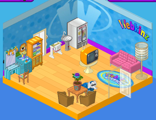
Here’s the dressing room as we found it. Cute, but a bit bland, you know? I really like the Superstar Styling Station in the corner, but when we replace that Webkinz Superfan Wallpaper I’m not sure it will fit with our new look. We’ll have to see. The wood flooring is nice but a little too vanilla for our rock star look and those wicker chairs and country table will have to go.
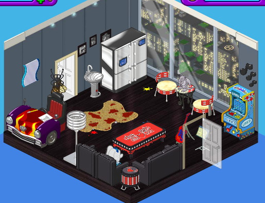
Here’s the new space. As soon as I checked out the new Mega Modern theme I knew it would be perfect for the look we were going for. We paired the Mega Modern Wallpaper with the Creative Studio flooring. A High End Fridge is a stylish place to store cold drinks and snacks, and we replaced the table and chair with a couple of Tamborine Chairs and the Radiant Red Mosaic table topped with a Gargoyle Paper Weight.
Boomin’ Black Couch and Lounge Chairs, a Studded Coffee Table, and Snare Sidetable were the ideal choice for the seating area in this room, and we decided to replace the dressing station with a Hot Rod Desk and mirror.
Finally we threw in a gaming station in the corner to keep those rockers busy. This is one cool room, don’t you think?







i personally dislike the mat because it doesn’t really match and neither does the mirror, and why would they need a gaming system? This room also looks more like a lounge than a dressing room.
WAY to tacky not cean, nothing! i would much rather design my own! like take MY advise design it like mine princess walls and floor princess bed in one corner super bed in another and queen of hearts at the side of the super bed princess sofa in a corner two girl room deviters and a white throphy stand at the side of the deviders white rug exclusive mirror throphy stand havean flower on it almost ALL from the wshop! try you will love it!!!!! p.s. it is desighed for three pets!
I think it defeats the purpose of a get-ready room for performers, there is no place for them to change hair or makeup…and who needs a car desk!
I like the wallpaper it gives it an edgy look but the hot rod desk? NO WAY! I liked the dressing area in the before room and if you have seen the webkinz rocker pets there not like this room is there bright and fun neon colors! They should have incorperated those colors in the room! That mirror came out of no where to! its small so it looks oddly placed in next tto the huge car desk. Its also a dressing room and from what I see theres no makeup tables, clothing racks or changing area of any sort!
This is NOT a dressing room. There isn’t anyplace to even get dressed. What were they thinking? ~()PL4Ever()~
i agree it is a cute room at first but then u add sizzle and pazass nice job:)
I agree with CityChicNewYorker. I actually like the old room better, its more calm and relaxing, and the colors actually go together.
It’s ok, but it doesn’t have anything that would get you dressed or pretty/handsome. It doesn’t match and it just doesn’t make sernse. You could do much better!
i liked the first one better. what’s with da windows its a ‘dressing’ room? if it’s a girl… lol
wow i could do way better (not trying to brag) ()()()()Roundupgirl2002