Hey, readers! It’s Hailey. My brother, Elwin and I have been tasked with another cool project, redecorating the Arcade Cafeteria. The Cafeteria is a great place to hang out when you’re visiting the arcade with friends, but it’s kind of a mish mash of furniture. They asked us to come in and try to give it a more fun and unified look. Elwin and I each did a design so let us know which one you prefer.
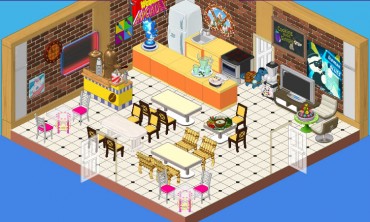
This is the original design. It’s okay, but I don’t really know whether it say ‘arcade’, you know? Also, there seem to be a lot of different styles of chairs and I’m not sure about those orange counters. They’re a bit glaring in this space. We want to create an area that is fun and welcoming where players can mingle while they enjoy their snacks.
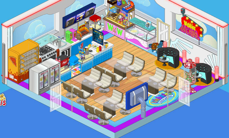
So this is Elwin’s design and I have to admit, it’s pretty awesome. He went with the Superhero wallpaper and the Superfan flooring. He added Concession Stand counters as well as a Professional Pizza Dispenser and Ice Cream Parlor Counter. Then he paired the Glass Topped Dining Tables with the Cream Crescent Dining Chairs, and put in a couple of After Party Booths in one corner for some extra seating with extra style.
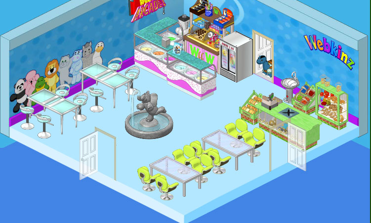
This is my design. I went with a cleaner, more spacious feel, you know? I wanted to have a focal point in my space so I chose the Elephant Fountain (I just love that fountain!) On the walls I used the Superfan Wallpaper and paired it with simple blue flooring. I included a couple of the Ice Cream Parlor counters and went with the Store Checkout Counter and displays. For seating I used High End Tables and Stools against one wall, and in another area I paired Brushed Metal Dining Tables with Lime Corinthian Chairs. I think it’s clean and simple and makes a great break from the excitement of the games in the Arcade, you know?





Wow, that’s a tough choice to pick who’s is better! At first I thought Elwin’s because there is more seating and this arcade gets really crowded but then I counted the seats and there are just as many in yours Hailey! I still haven’t decided, oh….do you have pizza in your breakroom?
I am sorry for this Hailey ,but I choose Elwin’s. I think it really matches me very well, and it is cool for kids to hang out and mingle. $Chocolate Chip Cookies Rock!$
Elwin’s room is AWESOME!!!!! It’s like, the best room anyone’s ever created.
Wow they are both nice. Hard to make a choice. Good work.
Elwin’s for SURE. I mean Hailey’s is nice and elegant but lunch needs pi-z-az to it.
I like Elwin best its clean & fun but they are both are nice :)
I Would Have To Say Elwin :)
I love both designs but my favorite is Elwin’s design. I just love the look of it, it’s cozy whereas Hailey’s is more elegant. ~SilverFluffy
I’d have to say Elwin’s design on this one, I love those blue and black sofas he used.
Hailey’s! Sorry Elwin, but your’s is a bit to cramped.
Elwin’s surpisingly!:D I love how you mixed everything up! Hailey, I think yours got a little TO spacious. I think it foucuses to much on relaxation and quietness, rather than hanging out with friends and having fun. *Peace, Love and Hope, Icewolf*
I’ve said Hailey’s in the past, but I have to say I like Elwin’s better. ~(*)sparklegirlLT(*)
I like Elwin`s better.
I agree, but Elwin’s kitchen does have a very cool feel to it. I’m gonna have to say its a tie. Hailey 2 Elwin 1. Last round was Hailey so she’s actually winning. I’m keeping score.
really I have to say elwins
Actually, the score is Hailey 3 Elwin 2
Elwin’s would’ve made it, but it’s so clausterphobic in his.
I like Elwin’s the best! I agree Northwestern! Your friend sarahandlacey! :lol: :mrgreen: ;-) :-) :roll:
I like Elwin’s. But just like what @Northwestern said, it is claustrophobic. But Hailey’s room doesn’t have that “style”. But I am sure Hailey will win the next one!
Haleys design is way better. Her design is less cramped and the colours go better, also lots of w-shop items. Elwins is really cluttered and the furniture is more mish-mash. And it uses way more estore items. ~*Sigs*~
I LOVE Elwin’s COOL room.P.s. I have never voted for Hailey and I don’t think I ever will.
Surprisingly, I chose Elwin it just has more of a arcade feel to it (and it has way more vendors!) even though it is a little catustrophic, but Hailey’s s a little too spacious and it has a deserted ice cream parlor feel to it. *~Artistic~*
@Northwestern Agreed.
Wow, I am having mixed feelings about both of these designs…. Elwin’s design is very cramped, but the items in his design are really just SCREAMING arcade! And Hailey’s design is very nice and roomy, but the items aren’t really that arcade themed. Maybe if they took the items from Elwin’s design and spaced them out a little, that would be a winner. I mean, Most of Hailey’s items are arcade themed, but the Elephant fountain just broke it. It would have worked if she chose something else to fill up that empty space instead of the fountain. If I had to choose one, it would be Elwin’s for sure. Bye! ♥~Silverfang~♥
Elwin’s. I love the way he paired the wallpaper with the flooring, and the Ice cream is a great addition. Also, they made a mistake. When Hailey is discribing her work she says: “I don’t know if it really SAY arcade, you know?” she left out the “s” in says.
Yeah, Hailey gets my vote! Elwin, you haven’t been doing so well so far…
Elwin’s design is better. I like the excitement in it. Hailey’s is TOO relaxing and has TOO much room. The arcade is exciting; it’s not a hotel, resteraunt, or spa! – * S h a d o w c l a w *
Same here I love Hailey’s much better than Elwin’s, his is just to crowded. Add me to your friend’s list, my username is wimseycat (all lower-case)
I like Hailey’s. That ice cream looks so good, and, as Hailey said, it gives you a break from the business of the Arcade. :) ~:: cfc~~crazyforcats~~ :: $
I AGREE HAILEY WINS THIS ONE IN MY BOOK….ELWIN’S ROOM HAS MORE BUT IT LOOKS CRAMPED….
Elwin wins! Hailey’s is abit too plain for an arcade.