Hey, readers! It’s Hailey. My brother, Elwin and I have been tasked with another cool project, redecorating the Arcade Cafeteria. The Cafeteria is a great place to hang out when you’re visiting the arcade with friends, but it’s kind of a mish mash of furniture. They asked us to come in and try to give it a more fun and unified look. Elwin and I each did a design so let us know which one you prefer.
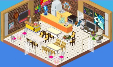
This is the original design. It’s okay, but I don’t really know whether it say ‘arcade’, you know? Also, there seem to be a lot of different styles of chairs and I’m not sure about those orange counters. They’re a bit glaring in this space. We want to create an area that is fun and welcoming where players can mingle while they enjoy their snacks.
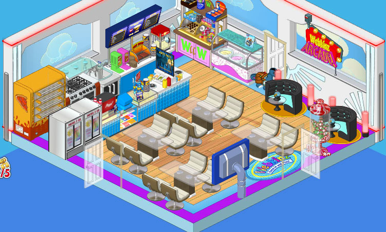
So this is Elwin’s design and I have to admit, it’s pretty awesome. He went with the Superhero wallpaper and the Superfan flooring. He added Concession Stand counters as well as a Professional Pizza Dispenser and Ice Cream Parlor Counter. Then he paired the Glass Topped Dining Tables with the Cream Crescent Dining Chairs, and put in a couple of After Party Booths in one corner for some extra seating with extra style.
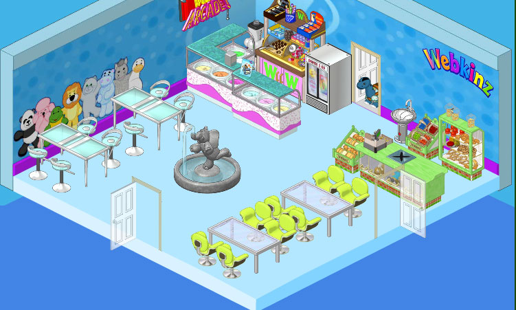
This is my design. I went with a cleaner, more spacious feel, you know? I wanted to have a focal point in my space so I chose the Elephant Fountain (I just love that fountain!) On the walls I used the Superfan Wallpaper and paired it with simple blue flooring. I included a couple of the Ice Cream Parlor counters and went with the Store Checkout Counter and displays. For seating I used High End Tables and Stools against one wall, and in another area I paired Brushed Metal Dining Tables with Lime Corinthian Chairs. I think it’s clean and simple and makes a great break from the excitement of the games in the Arcade, you know?





I really like them both. I think that Hailey is going a little out there with the store checkout stuff, but the rest of her room I enjoy. Elwin’s looks like a fun room. I think this one’s a tie. (*(*dragonfish*)*)
I like Elwin’s design better. It fits an arcade.
Hailey FOR SURE!!!!!!!!!!!!!!!!!!!
I like Hailey’s design better as it is cleaner and Elwin’s design has too much going on and looks a bit messy as there is so much furniture in there.
Hailey’s is a lot better, It looks a lot roomier
I am going with Hailey’s again. Elwin’s is too crammed, yet more Arcade-ish But, Hailey’s is more of a relaxing environment a nice place to get away from all the business, noise, and lights of the Arcade. So, way to go Hailey! ~500mandms~
Elwin’s
Hailey wins. She always does.
Hailey’s all the way. I mean, Elwin’s just too crowded. -Bluepeso
Hailey your design is the more open and friendly. i like it. jenniferobbi