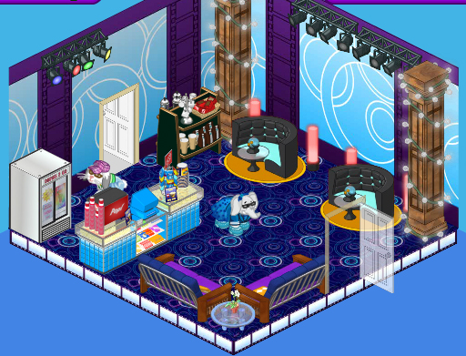
Hi readers! Well, Hailey’s and my redesign of the Henrietta Hippo Theatre is coming along really well. The producers of Kinzville Sings seem to be really impressed with the changes.
Our latest project involved redesigning the concession stand. The previous concession stand is okay, but a bit bland. The Bloomin’ Room wallpaper is cute, but the black and white tile floor and the Chrome-edged Square Tables were more fitting in a cafeteria than a high-end theatre. And there was too much pink going on if you ask me. I know they were just trying to pick up the accent color in the wallpaper but it wasn’t that really welcoming to all the theatre-goers.

Hailey and I thought that the Movie Magic theme fit perfectly with the existing concession stand (it IS a part of the same theme after all) and the deep rich colors were more elegant and in keeping with the rich atmosphere we were trying to evoke.
The concession stand isn’t really meant to be an eatery. It’s more of a lounge so we decided to do away with those tables and chairs and introduce some seating that would let some patrons take a seat during intermission and give others plenty of space to mill around while they enjoyed their drink or snack.
We added a couple of Studio Loft Loungers, and Studio Loft Columns to add a chic, funky feel and we also included a couple of After Party booths up against the far wall.

I think that the new look is much more fitting for the patrons of the performing arts looking for a fancy evening out, and that it really meets the high standards of the producers of Kinzville Sings.


It’s a really cool room but i wood take out the pillars with the lights…they were a bad idea ~S
I love the choices of the semi-circle couches, the columns and the lighting. Leaving the concession counter and soda machine so takes away from the look and feel of having a fancy evening out watching Kinzville Sings. I think there were many other options that could have been selected to provide a more elegant after theater feel and look. It’s a good start but needs some further tweeks…
I think the original room had a lot of problems, which H&E have addressed very nicely. Good job, guys. It does look like a concession area. I keep thinking about the screaming yellow lobby. Don’t care for it, but am not sure which wallpaper I would have used instead. Maybe the Ancient rare theme. Maybe not…..
The new room lookes WAY better that the before! Way to go! That is the typpe of concesion stand I would go to!
Could B better!!!!
WAYYY beeter then last on!
Well, I like the redo better then the original, but I still don’t like it. I think it should have blended more with the lobby they just did. I could have done without the columns that seem very outta place there. This is supposed to be an elegant theater, not a night club. Sorry H & E, try again. **Robyn
I have to admit that the “after” look looks much better. This is a decent room, I guess. Hailey and Elwin still aren’t the greatest designers I know, but I know that they can do even better. This room looks pretty good for Hailey and Elwin’s work, but I think they can do much better than this, but nice job on the room, Hailey and Elwin. ;) ~Chicago Made☠
Actually, I think Hailey and Elwin did thier very BEST on the after look. It looks like a good room, and this time, it doesn’t look like Hailey and Elwin put that “random” look in the room. Looks good to me! And when Hailey and Elwin didn’t do anything to the room 9The before look), it just looks kind of girly. So, I’m happy Hailey and Elwin did redo the room, and put a better look into the room. Good job! -SOAD Chick
those are awsome bedrooms. can you do one for me?
The new room has more of a concession area feel.
Lately, I had been thinking “Hailey and Eliwin have been getting worse and worse at designing.” Actually, now I don’t think that way. Why? This room is actually a decent room. I have to admit- the ‘after’ (The one that Hailey and Elwin designed) look looks better. If you would’ve asked me how did the before look, I would’ve said it looked okay, but it needed some work. Great job, Hailey and Elwin, keep working on your designing skills! ~SugarComet***
I agree. This room isn’t bad but it could be better. I just hope that their skills keep improving. ~(*)sparklegirlLT(*)
the room isn’t bad,considering how they have been doing. i like everything but the purple couches,the pillars and the thing with stuff on it next to the blach couch.
I have to admit, this looks great, Hailey and Elwin! You did a really nice job this time. I’d just take away the pillars and the sphere thing on the tables at the black couches. Well, good job!
I totally agree. Haily and Elwin are finally back on track in designing!
Agreed SugarComet. The 1st 1 looks SO girly. I HATE pink so I’m glad u redesigned the concession stand! #Lemon^Starburst#
I agree with you Sugar Comet. This room looks amazing! Very appropriate for a concession stand. Keep up the good work guys! (*(*dragonfish*)*)
Thanks for agreeing, to all the people who agreed with me! ~SugarComet***
Ditto! No change here! Agreed like a 100000000000000 times! I like the first one better. Ruby the Phoenix~♥
2 words. Ep-ic!
I agree. Chicago Made started off that Hailey and Elwin have been getting worse at designing. I still think they’re not the best designers, and like Chicago Made said, Hailey and Elwin can do better. Just keep trying on what you just did to this “after” look, Hailey and Elwin! If they design rooms without that “random” look to it, they might actually be doing better with their work! Not that this room they designed is bad, it looks really good. But Hailey and Elwin been designing rooms for a while, and been giving that “random” and “miss-matching” look to their designing work, so I think they can do much, much better, if they just try. ;)
I like it awesome job guys! Your friend sarahandlacey! :lol: :mrgreen: ;-) :-) :roll:
I guess I can agree on @Webkinz User. I think Hailey and Elwin can do better than they done to this room, if they can just try harder. Everything you said @Webkinz User, I agree. ~Chicago Made