Hi readers! I guess you’ve probably heard by now that there is a pretty important event coming to town. The popular talent show, Kinzville Sings, is holding auditions at the Henrietta Hippo Theater. This is a really big deal and so the owners of the theater want to showcase their venue in the best possible light. After taking a long hard look at every room in the theater, they decided that it would really need an overhaul before it was featured on TV.
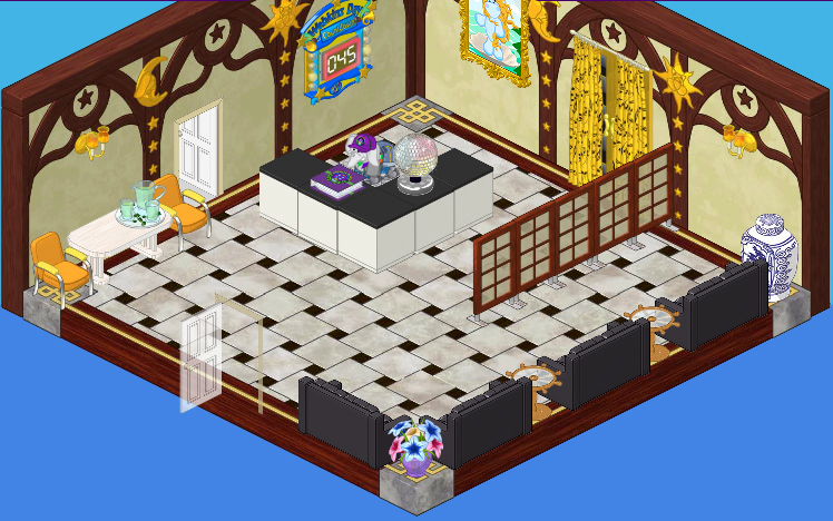
That’s where we come in. Elwin and I have been commissioned to redesign the theater. We started with the lobby. The existing lobby has beautiful marble Town Hall flooring, but the Wizard Wallpaper could stand to be updated. And those counters don’t really belong in the box office of a high end theatre. We liked the leather couches though and figured we could recycle those, but just one doorway for all those people going in and out of the auditorium? Isn’t that a fire hazard?

Here is the ‘after’. Elwin and I felt that the golden glow of the Galactic Wallpaper really captured the feeling of opulence we were going for. A fountain is always a nice touch in a public space and the King of Karats Golden Fountain fit the playbill perfectly. We thought that a Glistening Gold Kitchen Counter Top would make a better box office desk than those black and white counters, and we paired it with a Golden Trend Kitchen Stool so that the employee working the box office isn’t always on their feet. We rearranged the four black leather couches, placing them back to back so that some patrons can rest while they mill around, waiting for the doors to open. Oh, and we widened the entrance into the auditorium so that the lineups to get in will be more manageable. Posters of upcoming acts seemed like a good choice for artwork for the walls.

Overall we’re really happy with the results. I think it’s a much more elegant look and will really work well with the high profile production of Kinzville Sings.


Excellent, excellent, excellent! Once again, Hailey and Elwin, you have done a fabulous redesign of existing space. Thanks for sharing it! All the best! MDIChickadee
I don’t like the wallpaper but the rest is cool. Remorso11
I don’t really care for the wallpaper either. It looks the exact opposite of opulent to me. Not sure what I would have used, but the Galactic wallpaper would not be it.
Elwin, you still have the same number of doors. I like the fountain instead of the table and plastic chairs. I think the old walls gave it an “old world” charm. I’d like to see the old desk with the new benches. Black and white is always elegent. jennifer
Oops!!!!!!!!! Sorry Elwin, didn’t relize there were doors behind the drapes. jennifer
It’s ok. I wish that It looked like a theater lobby.
Way to much yellow!
Um, really? Neither one convinces me it’s a theater lobby.
Cool! :D
It’s, okay. I feel like they are getting worse and worse at designing. ~~Rainbow*Rain~~
I love the re-do!! Looks more like a theatre now!!
i actually really like this designs. I totally agree with you KinzKount. it IS a fancy theater after all. I think it looks……… rich.
Good job Guys!
Ya!!! U did really well with this one! I like the posters and red carpet. And the Lamp-vase-jar thing. LOL. <3 FlowerSt@rz__
This is not a good looking room. Elwin and Hailey aren’t really designing very good in a “matching” way, no offence. I have a feeling that they’re picking out….randomly? I don’t like the “after” look of this room. I have to admit that this room looked better before Hailey and Elwin did anything to the room. Now, it doesn’t look good. The walpaper looks bad in that room. And is there ever a fountain in a Theater Lobby? Because I’ve never seen that in a Theater Lobby. Hailey and Elwin, change the wallpaper, PLEASE! ~Chicago Made☠
Agreed, Chicago Made. -Sadie ツ
It’s okay but the wallpaper?
Overall, I think Hailey and Elwin did a good job. Everything is laid out well and it looks beautiful and elegant. But I don’t like the wallpaper choice at all. This totally ruins the elegant theater lobby effect and I don’t really get at all why they chose it. But other than that, great job!
Chicago Made: Yes, the wall paper needs changed, but there are fountains in REALLY nice Theaters. And, this is a singing theater. And even more, its the Henrietta Hippo Theater. Sorry if i seam to be rude, I don’t mean to be if I am. <3 RainingSt@rz___
I totally agree, Chicago Made. Their rooms are becoming more and more worse. The fountains nice but the posters don’t look professional AT ALL. Maybe they need a break. (*(*dragonfish*)*)
I agree Chicago Made. It was much better how it was.
omg I totally agree. ru sure they didn’t confuse the before with the after?
Nice job on the first one, but the webkinz day countdown, totaly no. It runis the whole thing, you know. Agreed, Chicago Made, need to change the wallpaper. I would like to see the Neo Gothic theme, because I’m doing a minture one myself. Their rare item thems look good, but these, not a very good job. And like Chicago Made said, CHANGE THE WALLPAPER!!!! I will make one, and it won’t look like that. It’s sorta, um…… random. This time, I’m not happy with you, Hailey and Elwin! Ruby the Phoenix~♥
The wallpaper doesn’t go with the flooring at all. Couldn’t they find any other gold wallpaper???
Agreed FlowerSt@rz. The back 2 back reminds me of an airport.XD #Lemon^Starburst#
it looks more like a hotel lobby then a theatre…
Why did they use black couches? They look awful in this room. Notice the red carpet too, it is way overpowering to me and it stands out a little too much. Oh, and you should tone down the gold a little. A little is fine- but sometimes it hurts my eyes. (I think it’s the wallpaper- they should change it, as @Chicago Made said) And the blue. Don’t get me started on the blue. It looks… I can’t even describe it, because it’s so awful. Let’s just say it…is mixed. (As @Chicago Made said as well) Honestly Hailey? And Elwin? I thought you were pro designers or something. I am severely displeased by your work. ~SugarComet***
Agreed. The posters look a little odd in the lobby, and the wallpaper is way too bright. They should have done something that matched the floor, or they could have just stuck with the Wizard Wallpaper. The arrangement of the couches is okay, but I liked it the other way too, and the fountain is a nice touch. It needs more work though. ~*Dawn*~
I think it is pretty good, but I don’t like the wall paper.
Super cool! Your friend sarahandlacey! :lol: :mrgreen: ;-) :-) :roll: