Hi readers! I guess you’ve probably heard by now that there is a pretty important event coming to town. The popular talent show, Kinzville Sings, is holding auditions at the Henrietta Hippo Theater. This is a really big deal and so the owners of the theater want to showcase their venue in the best possible light. After taking a long hard look at every room in the theater, they decided that it would really need an overhaul before it was featured on TV.
That’s where we come in. Elwin and I have been commissioned to redesign the theater. We started with the lobby. The existing lobby has beautiful marble Town Hall flooring, but the Wizard Wallpaper could stand to be updated. And those counters don’t really belong in the box office of a high end theatre. We liked the leather couches though and figured we could recycle those, but just one doorway for all those people going in and out of the auditorium? Isn’t that a fire hazard?

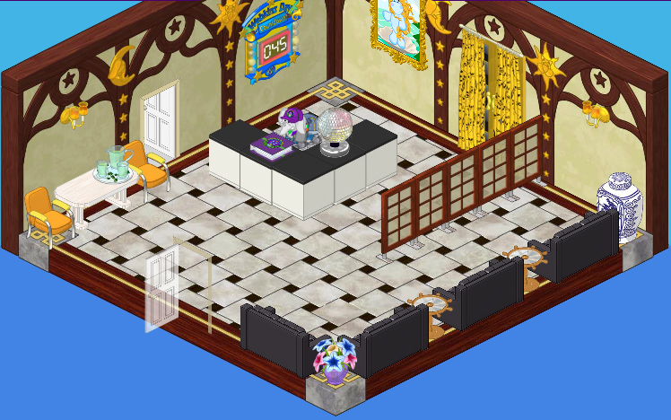
Here is the ‘after’. Elwin and I felt that the golden glow of the Galactic Wallpaper really captured the feeling of opulence we were going for. A fountain is always a nice touch in a public space and the King of Karats Golden Fountain fit the playbill perfectly. We thought that a Glistening Gold Kitchen Counter Top would make a better box office desk than those black and white counters, and we paired it with a Golden Trend Kitchen Stool so that the employee working the box office isn’t always on their feet. We rearranged the four black leather couches, placing them back to back so that some patrons can rest while they mill around, waiting for the doors to open. Oh, and we widened the entrance into the auditorium so that the lineups to get in will be more manageable. Posters of upcoming acts seemed like a good choice for artwork for the walls.

Overall we’re really happy with the results. I think it’s a much more elegant look and will really work well with the high profile production of Kinzville Sings.


Hey it’s Sugar :) I do like the layout and placing of the furniture (it gave me some ideas too :) but I think there is too much yellow. I don’t like the posters (they’re overlapping each other!) or the red wall lamp. Other than the red carpet, the lamp is the only other red! (and it’s not even the same shade :I ) I seriously think they should have kept the old wallpaper…it’s was darker and that was good for a movie theater-they’re supposed to be dark!! I do like that they took out those flowers (it wouldn’t match anyway). My opinion? Overall, most of the room looks nice, I just wish it wasn’t so bright. The lobby is the first thing u’ll see, (other than the outside) and it would make me think that the theater itself is bright. I wouldn’t want to watch a movie in a eye-hurting bright atmosphere. ~S
This is asome. Guys love it.
I don’t care for the new room at all. The black couches and the red carpet are out of place and make the room look dated.. The desk just is out of place. Sorry!!!!!!
I think it is just the wallpaper that detracts. The first reminds me of a rundown theater. The second would be better with a more neutral wallpaper color. That way the posters “pop”.
Wonderful job, guys!
i really like the ‘after’ room! I think it makes sense that the employee should have a chair, rather than stand up. And nice touch with the water fountain!
Love this room,great job guys.
I think your room redesign turned out very elegant!! My 2 favorite designers are back doing a great job. The last few designs attempts I questioned but you are back on track with this redesign which I feel will make a wonderful lobby entrance for the production of Kinzville Sings.
The first room looked good, I don’t think it needed a makeover. The makeover was good except for the wallpaper. Hailey and Elwin choose awful wallpaper a lot these days…
I like this re-do quite a lot. But I do agree with some of the others about the wallpaper. I think that Hailey and Elwin were going for something regal, in gold. However, I think that since we all know the paper as galactic wallpaper, it distorts how we see it. I think maybe it would have been better with plain yellow wall paint, or better still with the rock and roll wallpaper, with its rich warm tones, and spotlights. I think that would have been a better complement to the black couches and red carpet, but would still look great with the glistening gold stuff and the fountain.