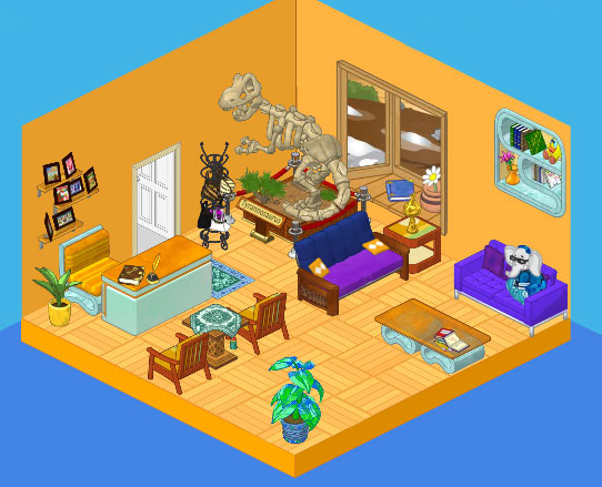
Hailey here. So here is our new reception area and I know what you’re thinking. I thought exactly the same thing when Elwin showed up with the dinosaur. What the heck is THAT doing there?
Elwin says that our reception is going to be where clients get their first impression of our work and that we needed to knock them out with an unforgettable ‘statement piece’. At first I thought he was crazy but before long Tyrone really started to grow on me. With the monotone feel of the orange walls and parquet flooring, it really is cool to have one item that just jumps out at you. Or rather looks as if it might jump out at you – literally.
We used some awesome pieces from the Avante Condo Theme for our reception area to tie in with the orange color scheme, but we created a contrasting conversation area with a couple of purple sofas mixed with orange accent tables.
Elwin’s right about creating an impression. I really think this room has a lot of impact.
Oh, and just between us – please don’t tell Elwin that I’ve christened the dinosaur ‘Tyrone’. If he realizes how attached I’ve become he will never let me live it down.
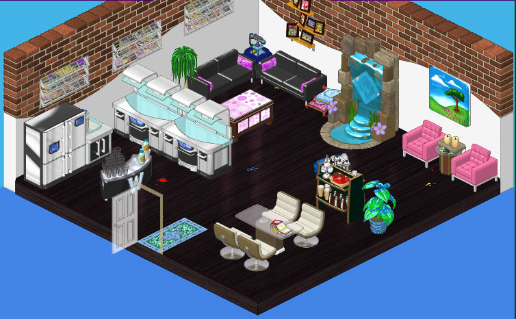
As for our consulting room, we needed a space where we could meet with clients to go over our blueprints and plans.
We just love the flooring from the new Creative Studio Theme. It’s got a few stains here and there, but the way we see it that’s just evidence of the creative process in action. We combined it with an Elegant Exposed Brick Wall.
We wanted at least two seating areas so we could run more than one meeting at a time, so we set up a conversation area in the corner with two Neo Gothic Couches and a Cushioned Blanket Chest as a coffee table, and in the other corner we surrounded a Glass-Topped Dining Table with Cream Crescent Dining Chairs.
To highlight the impact that fabulous kitchen design can have on a space we used pieces from the High End Kitchen Collection. An After Party Serving Station made the perfect kitchen island.
We always like to have a focal point in every room we design and water features can add such ambience so we created a feature wall with a Wellness Waterfall. And finally, we included a casual seating area where we could sit and enjoy a coffee with each other or a client by flanking a Gathered Under Glass Side Table with a couple of Fabulous Fuchsia Armchairs.







at first i saw the reception room and thought, WHOAH! And when I saw the consulting room……breathless
I just LOVE the bay window in the reception room!
i totes like them both really kool! Peace out kool cats! ;-)
I LOVE BOTH ROOMS!!! But I like the consulting room just a teeny bit better. The dinosaur is cute 2. Tyrone. Nice name. I have the perfect nickname for him. Tybones. Okay, its actually longer then Tyrone but its still an adorable name. *Your friend Orange Starburst,*
I love Hailey’s room! The black floor and the things in the room are so cool! The dinosaur in the other room. What is it doing there? That is pretty funny though! >> cat lover cathouse2
Cool. Love the Dino! ~ RainingSt@rz___
Orange walls? Hmmm. Not my favorite I guess. I like everything else about that room, though (including Tyrone!) And I love the consulting room. Great job!! All the best! MDIChickadee
MDIChickadee, I agree. I like both of them! (Psst… Elwin. Hailey named the dino Tyrone! LOL =) )
OMG I love both rooms! I like the consulting room just a LITTLE better though. (*(*dragonfish*)*)
i love it! so cool!
These are two of the best rooms Hailey and Elwin have ever done. And I especially like the dinosaur!
In my opinion, these two rooms actually hurt my eyes to look at lol. They’re not the best, sorry guys. ~QueenVet~
i love both the rooms and the dinosaur
The rooms are absolutely fabulous! I think the dinosaur is a neat touch to the reception room. * The Stargazer *
i so agree with hailey. my first reaction was like this, “That dinosaur is so out of place!!!!!!!!!” I like the new one so much better and the flooring is a nice touch
I really don’t like the reception room, but the consulting room is awesome! Let me guess – elwin did the reception, and hailey did consulting. It really is obvious. Elwin really has a thing for gold! much too neon for me.
Same Star. Its too orange in my opinion. You got to work it with the colors. Anyway, the second one has to be one of my favorites! ;) ~KK ♥
I agree that the consulting room looks better then the reception room, but I think the dinosaur is a unique touch to the reception room! * The Stargazer *
Gold, orange, and bright yellow on a computer screen really hurts my eyes…
I like the 2end one best! Your friend sarahandlacey! :lol: :mrgreen: ;-) :-) :roll: