Hey, gang! It’s Hailey. A big part of camp life is helping out with chores, and campers at Camp St. Bernard are expected to take part in cooking meals and cleaning up afterward. That’s why it’s so important that the kitchen be functional and accessible. You don’t want a load of little campers all tripping over one another. So we were asked to take a look at the existing kitchen and see what we could do to make it flow better and give the kids plenty of room to work.
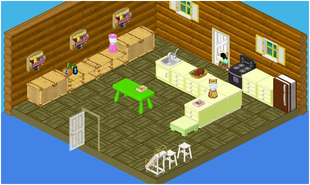
Wow – this kitchen is kind of funky actually. I like the sherbet colored cabinets and countertops. But I’m not digging them so much with the parquet flooring or the green table – the different shades are clashing. All the greens in this kitchen are saying STOP! Elwin and I agree that the layout could be more effective, and that the kids need more workspace. The bamboo shelves might offer up a taste of the wild, but I don’t think they’re necessarily the best use of space in a working kitchen. And one sink to wash all the dishes and prepare the meals for a whole camp? I have a thirst for a better solution! Also, the placement of the fridge and stove is kind of awkward – you have to walk all the way around the L-shaped island to access them. That is not so hot – or even cool.
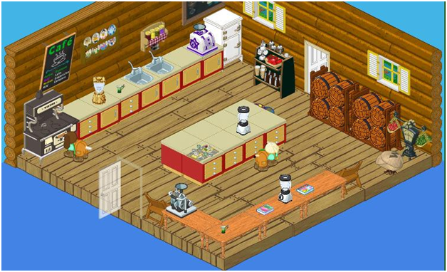
Okay, so here’s what we came up with and I think it’s pretty yummy (if I do say so myself!). First of all we pulled up that parquet floor to expose the rustic Weathered Barn Flooring. We decided to go with autumnal shades for our cabinetry to create a warm, homey feeling (did you know the color red stimulates the appetite?) We added a large island with lots of storage underneath in the centre of the space where the kids can gather to cook up something fabulous for their bunkmates. Putting the stove, fridge and (double) sinks on the same wall made a much more effective work area. Too many cooks can spoil the broth – which is why we created yet another work station out of the way of the main space by lining up some country wood tables against the wall in the corner. Now we can have one group of campers washing and drying dishes at the back wall while another group prepares the main course at the centre island and yet another group can be chopping vegetables or assembling pies in the corner. Finally, we incorporated even more storage with a couple of Hidden Bounty Barrel Dressers in the corner.
So what do you think, ‘Kinz fans? Are we cooking, or what?





I love how they decorated the kitchen it looks amazing!!!!!!!!
Ithink its amazing too.
The 2nd one!! ◘•♦♣
Yeah I saw the comercial yesterday! I thought it wouldn’t be on T.V. but it was. Anyway, I like the new kitchen.
I do watch tv but what commercial? didi t come out today? anyways webkinz is #1
OMG!!!!
I saw the commercal 2 times, and i want the pet, except the bear
SO AWESOME!
:-) legoboy6056
i think they r great rooms!!
hey guys i have been gone because i have been at a swim meet. i won first place in breast stroke. i also found a bird by the road so i took the bird in to my house and nursed the bird back to health. It was fun taking care of the bird.
~ pony girl~
PS i love the room =) ;) :)
Cool! I did that too! It was baby Blue Jay. I had so much fun!
I actually like the first room design a bit better (just a bit) than the new version. The second one just blends together too much-but the first one, things stand out.
♥♥Augu§tGlitter♥♥
I think that is an awesome change for the better. I love the colors of the cabinets and the barrel chest are just great.
The second kitchen gets my vote.