Guess which Elephant twins just got a phone call from one Chef Gazpacho? If you guessed Elwin and me, you’re totally correct (also, I don’t know of any other Elephant twins in Webkinz World, so…the answer was pretty obvious, I suppose).
Anyway, yeah! Chef Gazpacho called us and asked if we could do him a HUGE favor: surprise his good friend Chef Sophia with a brand new dessert café! If there’s anything I love more than decorating, it’s dessert! Elwin and I each have our own designs (of course), so we decided to make this a bit of a competition between us. We’d love to know which design you like best. Let us know in the comments and we’ll create that café for the lovely Chef Sophia!
Here’s Elwin’s Design:
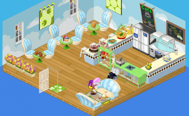
Elwin chose a palette of blue, green and cream. The dark brown diamond pattern on the counter really stands out and looks sharp! This café is light, airy and really pretty. It pains me to admit it, but my brother has some talent.
And here’s my design:
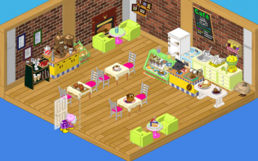
I went for a more traditional café feel. I used pinks, creams and greens (with a bit of yellow) to make my café funky and fun. I used pictures on the wall and a fireplace to create cozy chatting area.
Which one do you think Chef Sophia will like best?






I like Hailey’s design!
Yeah, Hailey by FAR. So Fun and cozy!! Were Elwins is bright and NOT cozy.
Elwin seems to left no path to the fridge! I love his design.
I like Elwin’s design!
same with me :smile:
elwins is the best
I totally like Elwin’s design better. In terms of them themselves, of course I like Hailey best because she’s the one who gives us all the cute clothing prizes on Peek-a-Newz, but I really don’t like the place where the chairs are straight back to back in her design. Elwin has a BEAUTIFUL design with, what – nicely placed paintings and windows, wonderfully put together chairs and tables, a HUGE “island” for the chefs and all, and plus flowers to the side to admire. Just make a little way for the workers to get INSIDE the area with the fridge and all. :mrgreen:
~8clawpaw
I defiantly like the second one better. The kitchen doesn’t seem as closed off and the wall design and the colors match well.
I really like Hailey’s design best. Like she said it is a more traditional cafe feel to it. Great job both of you but I would have to say Hailey’s design! : smile :
I like Hailey’s design better
This was first comment when i posted it, so yay. I personally like Halie’s, but Elwin’s rocks too.
Definately the second room. I absolutely LOVE the way Hailey designed everything!
i agree, i like Elwin’s better. Sorry Hailey!
oops, i meant to put this on 8-Paw. Sorry!
i love, love, love, looooove haily’s design it’s so classy!!!!
I actually prefer thee 1st room, but the other is super awesome too.
i think haily is a better designer in general… but i do like elwins… though haily’s is more original!
I think the second one looks like a resturant more. But the look is allredy so used in webkinz world so I have to take number 2 actualy, It look’s so uniq’e!
I THINK I LIKE ELWIN’S DESIGN BETTER…HAILEY’S IDEA FOR THE FIREPLACE IS VERY COOL BUT ELWIN’S COLOR CHOICE IS WHAT I LIKE THE MOST AND HOW THE ROOM LOOKS IS FABULOUS…KEEP ON DESIGNING YOU TWO!!!!
YA I AGREE ELWIN’S IS WAY BETTER I USAULLY LIKE HAILY BUT NOT THIS TIME
PS LUMAS ARE SO AWESOME
PSS THEY ARE FROM SUPER MARIO GALAXY AND SUPER MARIO GALAXY 2(YES I AM A GIRL)
PSSS ADD ME I AM SMJrocks2001
Elwin, yours is best. No hard feelings Hailey, but yours is to original. Fireplace idea is awesome though. The thing I liked most about Elwin’s is his choice of color. Blue and green are my favorite colors! ;)
it is so hard to decide but i think i like haileys more
Elwin’s is MUCH more inviting!
Don’t forget to vote for the Communal Contest prize during the week.
so haily!!!!!!!!!!!!!!!!!!!
Hailey has the best desingn in the world !
I like Elwin’s the best. Hailey’s looks too traditional, too… bland. Elwin’s looks new, cool, and modern. I think you can buy almost all these items in the W-Shop, too. ;)
Hailey’s,definetly.
I think Elwin’s room is the bomb! It looks so awesome and – and- and . . . something! That’s how cool it is, I can’t even describe it! LOL!!!
Elwin did better to me, Haily you made it WAY to bright, but i like both idea’s of the layout, if i made it out of these i’d do Elwin’s then instead of those chairs from the Soft theme i’d use the Dinner chairs and don’t put those flowers on the floor there i suggest a table by the door with flowers, perhaps two. I hope this is possible and you like my ideas
Oh Haily how DID you get that birthday cake in the room? ;) :cool: :mrgreen: :!:
Yeah! I see all this other stuff that can’t be placed in rooms!
I THINK ELWIN IS BEST CAUSE HE HAS A BETTER BIGGER KITCHEN TO WORK AT IT WOULD BE BETTER FOR ANY CHEF WHO ACTUALLY WANTS TO COOK UNLIKE HAILYS WHICH YOU DO NOT HAVE ROOM TO WORK OR MOVE ABOUT
LOVE EDWIN’S!!!!
I like Elwin’s. :)
IF YOU LIKE YOSHI, LUMAS, SWAMPERT, OR SONIC ADD ME I’M SMJrocks2001
Ya know, you probably should not be giving out ur user name to random people. U never know when a bad person will come along and add u. they may find a way to hack in and get on ur site.
Yoshi rocks! I’ll add you LumaLover!
who noticed that htere is at least one webkinz in each room?
I soooooo agree Moonstream! Haily, Haily Haily! Elwins, bla bla and blah! The plush couch? Is this a living room/bedroom or a cafe/kitchen? Haily’s looks traditional but cool and half modern/half inviting and comfy! I also like that Haily’s has the oven, sink and blender ect. hidden bedind the check out, Elwins is just out in the open where you can see it. NONE of Elwins colors match, the plush with blue and green? The pallet he used was awful but Haily’s design is classy as Moonstream said. -Silverstar**
I was sold as soon as I saw Hailey’s design it’s so high fashon and style! Chef Sophia would LOVE this room! Hailey you rock I am TOTALLY team Hailey! She is epic!
<3 Miki
I personally LOVE what Elwin designed. It has more of the colors I would have in my house. I also like Haily’s too it gives a cozy feel.
I LIKE ELWINS!! (WHO’S WITH ME?)
il like the first one better but for a cafe Hailes is nice and original :)