Guess which Elephant twins just got a phone call from one Chef Gazpacho? If you guessed Elwin and me, you’re totally correct (also, I don’t know of any other Elephant twins in Webkinz World, so…the answer was pretty obvious, I suppose).
Anyway, yeah! Chef Gazpacho called us and asked if we could do him a HUGE favor: surprise his good friend Chef Sophia with a brand new dessert café! If there’s anything I love more than decorating, it’s dessert! Elwin and I each have our own designs (of course), so we decided to make this a bit of a competition between us. We’d love to know which design you like best. Let us know in the comments and we’ll create that café for the lovely Chef Sophia!
Here’s Elwin’s Design:
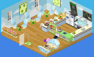
Elwin chose a palette of blue, green and cream. The dark brown diamond pattern on the counter really stands out and looks sharp! This café is light, airy and really pretty. It pains me to admit it, but my brother has some talent.
And here’s my design:
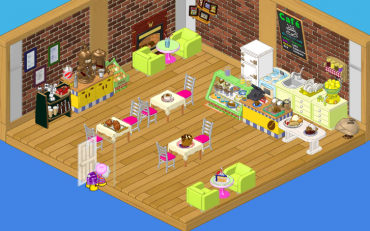
I went for a more traditional café feel. I used pinks, creams and greens (with a bit of yellow) to make my café funky and fun. I used pictures on the wall and a fireplace to create cozy chatting area.
Which one do you think Chef Sophia will like best?






I like Elwins. Hailys was a little bright, cramped and mixed up in the back but i give her credit. Designing awesome rooms is toough. I dont like the mix of Elwins wall art and both rooms were alittle cramped and mixmatched.
I am a girl who plays video games but im not a fanatic about them. I am crazy for Harry Potter and Tacos though.My username is bcf12345. If you think im cool add me 2 your friends list. ttyl :)
Gotta be Elwin’s. I like the open feel and natural color scheme. So pretty . . .
Elwin’s is better! =)
I actually prefer Elwin’s design, it looks pretty good!
cool the 100th comment! anyway i like elwins one better it looks more like a desert cafe to me
I think Chef Sophia will like the first one the best, the comfy chairs, it’s also a little more girly than others and there’s more counter space to cook.
i like haileys better cause you can not even get in to elwins kitchen spot!
Hi
I think Elwin’s design is better.
I THINK THEY ARE BOTH NICE BUT HAILEY’S DESIGN IS 2 DARK AND IT MAKES IT HAVE A DIRTY FEEL (NO OFFENCE) OTHER THAN THAT I LIKE IT BUT I LOVE ELWIN’S DESIGN THE MOST!
FRIEND ME! USERNAME: bugspet
I like Elwin’s better because the kitchen space is much more spacey, comparing to Hailey’s witch has a very crowded kitchen area and with two chefs? I don’t think that’s going to work out. Even though don’t think plush chairs should go in Elwin’s room, it still all fits together. What I love about Hailey’s design, is the green chairs. The chairs just go so good with the room and the wallpaper she used just puts it all together. Good job both of you!