Hailey Interviews Designers
Well, I’ve received a pile of resumes from potential design partners so, as part of the interview process, I decided to put forth a design challenge and ask each candidate to design a kitchen. Based on their work experience, the candidates that I asked to provide designs are PJ Collie, Wiggles Pig, and Tabby Von Meow. PJ has a lot of retail experience from working at the KinzStyle Outlet. Tabby seems to be a Jack-of-all-trades after running the Employment Office for so long, and Wiggles Pig is a great designer in his own right. We just need to see if we could forge a partnership.
The weirdest thing is that when I received all their design proposals, there was another set of drawings that were submitted. I just found them on my desk and I have no idea where they came from. And the thing about the drawings is that they’re really – well, I’ll let you judge for yourself.
So here are the designs submitted by Tabby, PJ, Wiggles and… ?
Tabby
Tabby decided to go with a country theme for her kitchen. She used the Wind Farm Wallpaper to really capture the country feel. She created a huge eating area with several Country Home Dining Tables, Chairs and Benches. She really went for it with the Tangerine counters though – I’m not sure. I think maybe this room is a little bit too country, and not enough rock ‘n’ roll, you know?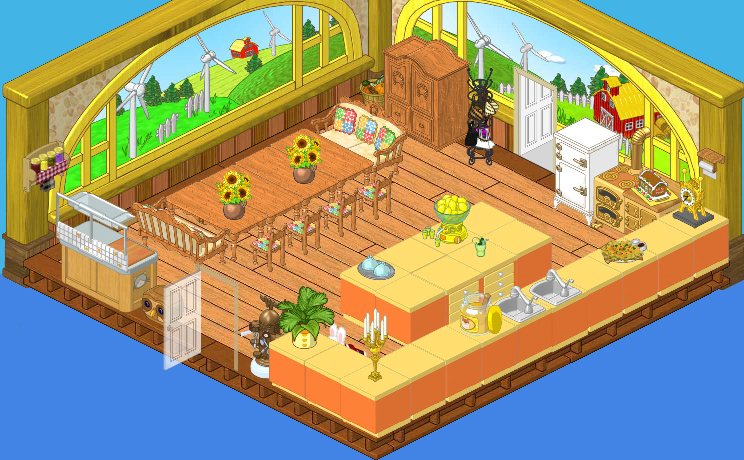
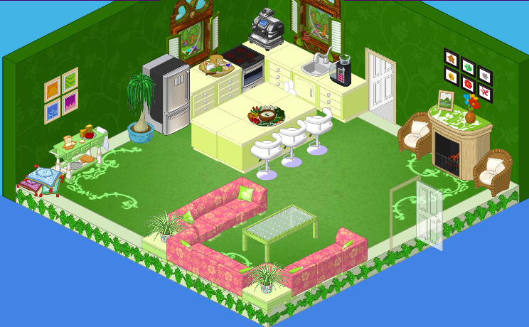
PJ
Wow! What a colorful space PJ has created with this vibrant green room! The Guildwood Hall Wallpaper and the Fruitland Flooring create a stunning backdrop for the Flower Power Modular sectional sofa and tables. I think it’s really interesting the way she created a dining area using the sofas and a Fresh Glass Dining Table. The Green Apple Counters are nice with the Flower Power set, but do you think they might clash a bit with the darker greens? But I do love the cozy nook she created with the Clean and Green Fireplace flanked by two Wicker Chairs.
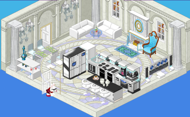
Wiggles
Oh wow! Wiggles always makes a statement and this room is totally in keeping! It’s absolutely divine! He used my favorite appliances from the High End Collection and he mixed them up with some pieces from the new Mega Modern theme. But placing everything against the stunning Ancient Civilization Flooring and Wallpaper just raises it all to another level, you know? And with the Elegant Manor Fireplace this certainly is a grand kitchen. I’m just not sure it’s got mass appeal.
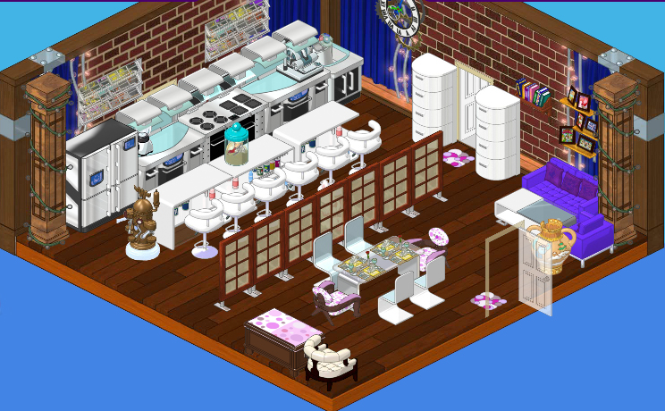
Anonymous
And here is the mystery candidate’s design. I don’t know who this is, but this is a designer after my own heart. I just love the Studio Loft Wallpaper. It’s got such an edgy feel. And I adore the way they created a long island using several Dehyrdrotope Drink Bars and Bar Chairs from the Mega Modern theme. Isn’t it cool how they created the entryway by putting an Oval Contour Cabinet on either side of the door? Again, how can you beat the High End Collection and the divider between the work space and the sitting areas creates a real sense of intimacy. The Polka Dot Chairs set off the Frosted Top Dining Table and Omni Glass Dining Chairs perfectly and I really like the reading nook with the Cushioned Blanket Chest and Downtown White Armchair. The Downtown Chic Sofa and Chairs look great in this funky space. I just wish I knew who designed this!







I bet the mystery canidate is elwin. just a guess.
I’m voting for PJ or the Mystery Designer! I think the Mystery Designer is Nibbles. :P
i think nibbles designed the mystery one. it is either nibbles or elwin i think, but how could elwin get his designs on her desk if he is miles away, and how would he even know about this whole thing? so, most likely nibbles, possibly maybe elwin somehow. -4pb-
I think I like PJ’s best. I wonder if the mystery designer is Elwin? ~~O~~SapphireSea~*~*~
Tabby’s kitchen is great for working space and seating except the stove she put in it is so small and right beside the fridge, not by the counters where you work on. I also would have liked the colour orange toned down a bit. PJ’s doesn’t have practical dinner table to sit at if you are a family and white cushions in a kitchen, that is like white in a child’s playroom – don’t plan on it staying white or unstained. I like the general colour scheme just needed table and chairs rather than a couch and table. Wiggles is too white so is very harsh colour. I love the flooring but the rest is just so white it makes the blue chair not fit in. The mystery designer is good. But having looked closely at all of them I think Wiggles is the best, just change the white couches for coloured ones so the blue chair doesn’t stand out so awkwardly and add some plants.
I would say the Last two, Anonymous and Wiggles! :) ~HrsGrl
TOTALLY agree with KK. PJ did it casual and comfortable, and thats what i like. i agree with most of you guys… Elwin probably sent it in! even though hes far away. i could tell because of Hailey liked everything “anonymous” did! :) i cant wait to see the answers.
I love the country kitchen and PJ’s is awfully cute. Not a fan of Wiggles’ design. I bet that last design came for Elwin.
I bet it was Elwin and he is going to become Hailey’s partner again!!!
I think they’re all good, each in its own way. The last one SCREAMS Elwin, especially the screaming purple couch/chair in the corner. Hailey, your worries are over.