Hailey: Today’s room redesign was probably my favorite of all of them. I LOVE the library.
Elwin: I do too. It’s such a great place to go!
Hailey: This particular library was in the Kinzville Academy. That explains why it’s so…what’s the word, Elwin?
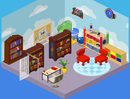
Elwin: Juvenile. It was perfect for a kindergarten-aged kid…but what about the older students? They needed a much more grown up library. Those chairs were so tiny!
Hailey: Agreed! Here’s what we came up with.
Hailey’s Design:
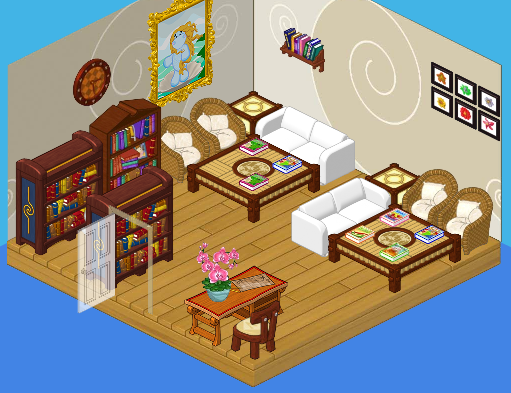
Hailey: Ah, serenity. I LOVE the quiet feel of this library. The white couches, the wicker chairs, the wood floors – so comfy, yet so mature. Both young and old students will enjoy this space. It’s perfect!
Elwin’s Design:

Elwin: And here’s my design! OK, so I decided to go more imaginative with mine. Check out the suits of armor! The golden fireplace! The floating lamps! It’s such a cozy, friendly, cool place. Can’t you imagine wizards and dragons just hanging out there reading their favorite books?
What do YOU think, readers? Do you love Hailey’s simple elegance, or Elwin’s imagination?






I like Elwin’s better, but I think it needs more chairs
i like haileys design because there’s more places to sit and i like elwins because everyone knows there’s magic in books
I have to go with Elwin on this one. I am a huge fan of fantasy books, so his theme suits my personal tastes more. I love the wallpaper, the armor, and the medieval sconces. The library has a very magical feel now! However, Hailey did an awesome job, too.
Like Haily’s a lot but white couch’s with kids is not good.Elwins is nice to but not enough seating.
I LUV BOTH!!!!!!!!! Hailey’s is gentle and elegant, but Elwin’s is warm and fun! So I like both of them.
I like Hailey’s design again.
I think Elwin’s room is cooler.
I agree Webkinz user .I will vote for Elwin no matter what comments others say about his creative, fun rooms.
Haliey’s design looks too grown-up. Like not for kids. But Elwin’s design look more what a kid would like :3 ~*Gringersnap*~
I like Hailey’s best there is more room for people to sit. But both are lots of fun!
I like Hailey’s design better too, partially because there is more room to sit. However, I do like both designs, and I like the history/sci-fi of Elwin’s design; it doesn’t have enough room to sit though. Besides, Hailey’s chairs look more comfy. :)
I don’t know. I guess equal? I really like them both!
I like both designs, the are very pretty and elegant. My favorite would be Hailey’s design, I love the Silk Sofas and Wicker chairs! ~SilverFluffy
Sorry Elwin, but Hailey really did well on this
Both are a bit random
I HAVE TO AGREE IT IS HAILEY AGAIN….ELWIN I LOVE YOUR FIREPLACE BUT HAILEYS ROOM WINS IN MY EYES!!!!!!!!
To be honest I think there should be more bookshelves on both!
uh elwin are you sure little kids are going to like the suits of armor if and litte kids would be afraid if you told that there were drogons and wizards in there it also is not a wizards or drogons libary its a libary for everyone I give it to haily your twilight fan mcyrus2010
I have to pick hailey’s! She did a good job! It looks like a room that I would want to be in! Your friend sarahandlacey! :lol: :mrgreen: ;-) :-) :roll:
Hailey’s! I kinda like Elwin’s, but some of the stuff doesn’t fit! ♠♠♠TheGameStar♠♠♠
I vote Hailey yet again because of the wall paper and wall designs they were really my style. It had a mature mix of furniture for bothe boys and girls. Elwin’s not so much because it just had a boyish tinge to it. And those creepy statues of armor. Ughhh. *~Artistic~*
Your right sarahandlacey! I like Hailey’s a lot better than Elwin’s. It is the BEST place to sit and read a book! Did I tell you that I LOVE to read? That is a very,very nice room to read in and I know it is! Your true friend, **$**furryhairylion**$**
Thanks! Your friend sarahandlacey! :lol: :mrgreen: ;-) :-) :roll:
I’m not trying to be negative, but I really don’t like Elwin’s design. Thankfully, Hailey’s is impressive. For this design, I think it’s obvious I vote Hailey :!: :D Have Serenity :!: -Serene :mrgreen:
Ditto. I vote Hailey’s.
Hailey
Elwin’s. Hailey’s? Just, no. – * S h a d o w c l a w *
Elwins is my favourite! it looks really nice with the medical feel to it, kinda is way more imaginative, not much seating though. Haleys is nice too, but very large tables, which I’m not fond of. ~*Sigs*~
Really, I don’t LIKE either. The original 1 is NOT juvenile, and it looks awesome. I’m not sure if I’m “really” voting, but I vote the original 1. ~:: cfc~~crazyforcats~~ :: $
I agree, crazyforcats. The original is awesome! Hailey and Elwins are just OK.