Hailey: Today’s room redesign was probably my favorite of all of them. I LOVE the library.
Elwin: I do too. It’s such a great place to go!
Hailey: This particular library was in the Kinzville Academy. That explains why it’s so…what’s the word, Elwin?
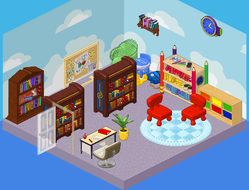
Elwin: Juvenile. It was perfect for a kindergarten-aged kid…but what about the older students? They needed a much more grown up library. Those chairs were so tiny!
Hailey: Agreed! Here’s what we came up with.
Hailey’s Design:
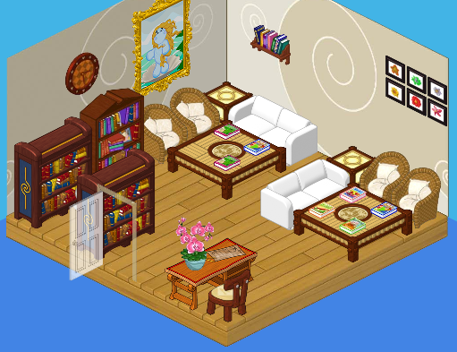
Hailey: Ah, serenity. I LOVE the quiet feel of this library. The white couches, the wicker chairs, the wood floors – so comfy, yet so mature. Both young and old students will enjoy this space. It’s perfect!
Elwin’s Design:

Elwin: And here’s my design! OK, so I decided to go more imaginative with mine. Check out the suits of armor! The golden fireplace! The floating lamps! It’s such a cozy, friendly, cool place. Can’t you imagine wizards and dragons just hanging out there reading their favorite books?
What do YOU think, readers? Do you love Hailey’s simple elegance, or Elwin’s imagination?






i like haiileys better dis time elwins needs more chairs b.t.c.l.
I like Hailey’s more, it’s more relaxing and modern, but I could do without the giant hippo picture.
Hailey’s is wwwwwwwwwwaaaaaaaaaaaaaayyyyyyyyyyyyyyyyyyyyy better.
This is a tough one… Although Hailey’s looks quite comfortable, its way to crowded. Elwin’s isn’t much better though. I’d have to go with ELWIN’S design this time. Overall good job you two! (*(*dragonfish*)*)
Well, I actually like Elwins but, seriously, that’s not much Bookshelf for a Library. . .
I am going to have to say Elwin’s! Hailey’s needs to have a little kid’s corner or something in it to make it all-ages friendly. Elwin’s helps the kids’ imaginations soar! Even though I am not a big fan of the wizard theme. Great job designers!
Hailey’s
I love Hailey`s design. it is modern, spunky, and not too grown-up, like Elwin`s design. I love the cozy-looking wicker chairs and the small reading space. One thing i dont like is the bookcases crammed together. I wish that they were not in front of eah other.
I say both. Hailey’s room has that peace and quietness while Elwin’s room has that imagination and creativeness.
Hailey’s is better, more place’s to sit.