Hailey: Today’s room redesign was probably my favorite of all of them. I LOVE the library.
Elwin: I do too. It’s such a great place to go!
Hailey: This particular library was in the Kinzville Academy. That explains why it’s so…what’s the word, Elwin?
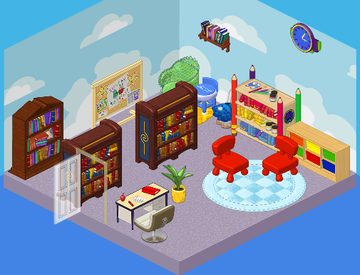
Elwin: Juvenile. It was perfect for a kindergarten-aged kid…but what about the older students? They needed a much more grown up library. Those chairs were so tiny!
Hailey: Agreed! Here’s what we came up with.
Hailey’s Design:
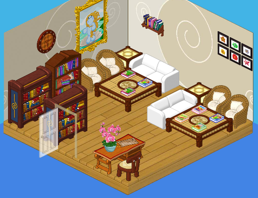
Hailey: Ah, serenity. I LOVE the quiet feel of this library. The white couches, the wicker chairs, the wood floors – so comfy, yet so mature. Both young and old students will enjoy this space. It’s perfect!
Elwin’s Design:
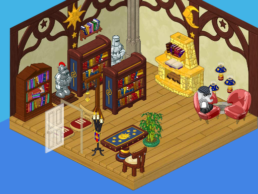
Elwin: And here’s my design! OK, so I decided to go more imaginative with mine. Check out the suits of armor! The golden fireplace! The floating lamps! It’s such a cozy, friendly, cool place. Can’t you imagine wizards and dragons just hanging out there reading their favorite books?
What do YOU think, readers? Do you love Hailey’s simple elegance, or Elwin’s imagination?






Hailey has it again, I like it , it has more chairs and more books.
Hmm, this is VERY close, but I’m going to have to say Elwin. Hailey’s just wouldn’t seem appealing if I was a little kid and the couches are very crowded, which I don’t like. Elwin’s is magical, but also nice for the older students. I think Elwin should add more bookshelves, though, and those random chairs by the bookshelves are kind of weird…
I think Hailey’s is better. Elwin’s is just… :(
Um, can we combine the two?? I like most of Hailey’s except the wicker chairs from the nursery theme. I like most of Elwin’s except for the floating lamps and wizard’s table.
I am sorry to say but I like the original one much better than either of the new ones. First Hailey’s has too much furniture leave out one of the tables but keep the chairs. Elwin’s is too dark in taste for me.
Hard decision but I go with Hailey’s design :)
This time I have to go with Elwin’s imagination, although I think they both did an excellent job.
I like Hailey’s simple elegance a lot, but Elwin’s kid library looked good too. I will have to go with Hailey!
i like haileys so much better. elwins needs more chairs and the knights in armor look out of place
I liked neither. I would have made the library WAY diferent, if I could be the designer.