Hailey: Today’s room redesign was probably my favorite of all of them. I LOVE the library.
Elwin: I do too. It’s such a great place to go!
Hailey: This particular library was in the Kinzville Academy. That explains why it’s so…what’s the word, Elwin?
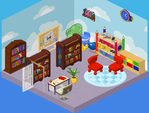
Elwin: Juvenile. It was perfect for a kindergarten-aged kid…but what about the older students? They needed a much more grown up library. Those chairs were so tiny!
Hailey: Agreed! Here’s what we came up with.
Hailey’s Design:
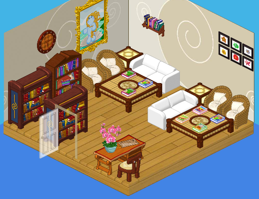
Hailey: Ah, serenity. I LOVE the quiet feel of this library. The white couches, the wicker chairs, the wood floors – so comfy, yet so mature. Both young and old students will enjoy this space. It’s perfect!
Elwin’s Design:

Elwin: And here’s my design! OK, so I decided to go more imaginative with mine. Check out the suits of armor! The golden fireplace! The floating lamps! It’s such a cozy, friendly, cool place. Can’t you imagine wizards and dragons just hanging out there reading their favorite books?
What do YOU think, readers? Do you love Hailey’s simple elegance, or Elwin’s imagination?





this has been the hardest choice yet!!!!!!!! :( :) Both of these designs i really like. but haileys i think is better for a kids school and i like the whole design a bit better as well. but great job both of you but hailey u win my vote again
I’m torn. Hailey’s design is much more appealing look at but, being a teenager, I should like it more. Elwin’s design is so imaginative, yet he pulls everything together nicely. I think boys, girls, teens, and kindergarteners would love Elwin’s design. Then I look at Hailey’s… it’s just so pretty!
I would have to say hailey again, i mean i would have picked elwins if it had more places to sit though.
I vote for Hailey’s! Btw, am I the only one who thinks Elwin’s design looks a bit like something from harry potter?
Hmmmm. Close. Hailey’s design has appeal, but it seems cramped. Just a little bit. Elwins is good, very imaginative. It does remind me of reading, but, really, each of them could of gone more whimsical. Hailey’s seems better for adults, and elwins seems better for, well, Hogwarts. Plus, Haileys room would of had my sincire, entire vote if it wer’nt for her choice in wall decor. Each has flaws. {to tell you the truth, When I think of Kinzville academy, I prefer the before picture.} I have to choose Haileys. I seriously dont like either, but when you think of KA, I don’t prefer Elwins. {as I said. hogwarts.}
Hailey’s room is prettier
I like Hailey`s best!!!!!!!
Hailey’s rocks!
I have to go with Hailey on that one!
I really dont like either of the redesigned rooms. They are both too dark! Also, there is no area for the little kinz in either one. My vote is to stay with the original design. Hailey’s room is too crowded, and Elwin’s room would be nice for teens but too dark and scary for little kinz. Greenie goes green!