Hailey: Today’s room redesign was probably my favorite of all of them. I LOVE the library.
Elwin: I do too. It’s such a great place to go!
Hailey: This particular library was in the Kinzville Academy. That explains why it’s so…what’s the word, Elwin?
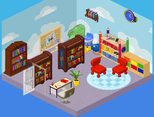
Elwin: Juvenile. It was perfect for a kindergarten-aged kid…but what about the older students? They needed a much more grown up library. Those chairs were so tiny!
Hailey: Agreed! Here’s what we came up with.
Hailey’s Design:
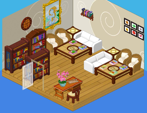
Hailey: Ah, serenity. I LOVE the quiet feel of this library. The white couches, the wicker chairs, the wood floors – so comfy, yet so mature. Both young and old students will enjoy this space. It’s perfect!
Elwin’s Design:
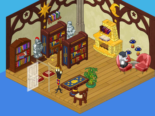
Elwin: And here’s my design! OK, so I decided to go more imaginative with mine. Check out the suits of armor! The golden fireplace! The floating lamps! It’s such a cozy, friendly, cool place. Can’t you imagine wizards and dragons just hanging out there reading their favorite books?
What do YOU think, readers? Do you love Hailey’s simple elegance, or Elwin’s imagination?





Both are really good designs, but this time around I really got to go with Hailey’s design. Maybe it because I love to read, but I prefer a much quiter and peaceful looking place to read.
I have to vote for Hailey on this one, her room is so elegant,sorry Elwin.
“And this time the vote goes to…Elwin!” And the crowd goes wild! I couldn’t resist. :) :) :) :) Usually Hailey’s design is head and shoulders above Elwin’s design, but this time he put a fireplace in the room. I love fireplaces! If he put a few more tables in it would look better, but his is still the best. ~Arabian99~
This is the room they should have BOTH worked on together. Don’t care for either.
I have to say once again-Haliey. It does look like you jammed a bit to much furniture in the corners, though, and more plants would surely be appretiated. I am glad you decied to redecorate the library, because I love libraries, but I wish we could actually GO TO these places! I mean, what good does it do if NO ONE can actually enjoy them!
Hailey’s design is perfect for a library. Sorry, Elwin, but yours looks more like a museum.
I, personally, think that Elwin’s design looks like my dream library. I can totally see what he’s saying with the wizards and dragons and such, and I think that I’d love reading in a library like that.
I’m voting for Hailey’s room (again). I like Elwin’s room, but it looks more like a museum than a library. I wouldn’t be afraid to touch things in Hailey’s room.
I think Hailey won this one too just because hers is more usable with more seating but both of them forgot about the little kids. The original design at least thought of the little one.
hi maricis23 here. i really like hailey’s design better it’s really relaxing and cool i would go to the library every day if it looked like that it cater’s to the young and old, girl and boy and i really like that and theres more sitting room so for those reasons i vote hailey’s design. BUT elwin’s design is a whole diffrent story i think that it cater’s ONLY boy’s i mean it’s cool but what about us girls were do we hang out and read i would NOT go to that library my brother’s would but i would only stay for a little bit . and there’s not allot of sitting room. sorry elwin but you’ve done better. SO I VOTE HAILEY”S DESIGN. Bye LOVE, Maricis23.