Okay, guy – it’s me, Hailey. Elwin and I have been given an assignment we can really sink our teeth into. Chef Gazpacho may be an artist when it comes to whipping up delectable feasts, but when it comes to his restaurant’s design, it looks like he just threw everything into the pot.
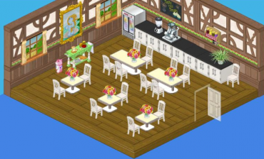
Why is he using diner tables in his restaurant? And who put those industrial looking counters on the menu? Bland white chairs with bland white tables – where’s the spice? This restaurant is a recipe for disaster.
So Elwin and I went away and came up with two new designs that we’re sure Chef Gazpacho will find much more tempting to his palate.
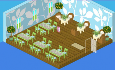
I decided to go with a lighter fare. It wasn’t in the budget to change the flooring, but once I got rid of that heavy wood paneling, suddenly the Green Leaf Flooring looked a lot more appetizing. To complement it, I selected the gorgeous Green Leaf Wallpaper. The bright shades of the Fresh Glass Dining Tables and the Willow Green Dining Chairs gave me the breezy touch I was looking for. And in keeping with my outdoorsy feel, the natural fibers of Wicker Chairs paired with Vanilla Cream Side Tables offered comfortable seating for two.
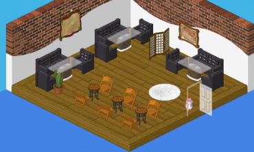
Elwin’s approach was on the meatier side. The Boomin’ Black Couch and Lounge Chairs could have been overpowering, but lightness of the Glass Top Dining Tables made their heavy looks more digestible. The Exposed Brick wall treatment created a lofty effect and Dance Recital Chairs paired with Beautiful Brown Mosaic Tables completed the bistro feel. A few touches of white, in the Shaggy White Rug and the Studio Room Divider helped to temper the strong flavor of this room.
So I guess it all depends on whether Chef Gazpacho is in the mood for salad or a main course. Which one would you choose, Webkinz fans?





I guess it’s okay
I don’t know
I think it looks great! Anyways maybe you should start doing more contests in Webkinz World where you can submit pictures of your room in need for a makeover. That way we won’t be seeing fake rooms. I hope you go with what i just said! :D :) :? :(
I agree with you
I love these posts!!!! Can u plz do more on fashin design 2??? I want 2 b a fashion or interior designer when i grow up!!!
Cool. I liked Hailey’s design. :happy:
I like the original design most of all.
The glass tables w/ black chairs are next, but NOT the room & smaller tables there.
The green tables look like porch tables, but the smaller tables, wicker chairs & trees in that one are cute.
I was just going to say that! xD
I personally think the original design is the best, the “plain” white eating area complements the busy wallpaper very nicely ^ ^
Exactly! I don’t know WHATS wrong with the room… the designs just get worse and worse! I HATE Elwin’s design – It’s too dark, and all those leather chairs? If I had them, I would sell them! And Elwin and Haileys resturants – they don’t even have a KITCHEN! Its basically just some place to sit! And whats wrong with diner tables? THEY use side tables!
The original one is definitely better! Thank you silverstar for your great description of Elwin’s – a man-cave. And Hailey’s is OK-ish… I just think they need to design the before’s worse so the after’s look nice ;) !!!
Cool! But why isn’t this article showing up on the home page???
none of those designs really look good to me because Haily’s just has a bit to much green and Elwin’s doesn’t really look like a restaurant at all. Chef Gazpacho’s design was much better minus all the stuff on the wall.
cool! those rooms are amzing!
I like both. I think that elwin is to dark and hailey yours has a little bit to much green for me. It is still cool though. I kind of like the first one too. I’m not sure…….
I would chose Elwins! I just like the layout and the leather couches! Its modern and I like modern styles! Nice job!!
I think maybe I will use your ideas for a restaurant of my own! :)
I like the designs they are cool. I might redo my kitchen so I might use some of their ideas. Nice Job!
i hate haileys design! elwin u rock! keep on getting more fabo elwin! :D
It is Faboo or Fabulous! And I HATE Elwins design, it looks more like a man-cave-not a resturant or dining room. The ”Spider Plant” ( what was it called?) looks atrocious! Esspecially with the couches, don’t you usually sit at a booth or chairs? NOT COUCHES!!!!!!!!!!!!! -Silverstar7
Wow webkinz- I mean just wow. ALL of these designs are the best you’ve ever made.
i agree. what’s with the couches!!!!!!!!!!!! change it, please!!!! mine looks better, and im not an interior designer!!!!!sheesh!!!
Hailey’s design is more relaxed, like a homey feeling.
lol! A man cave! I know right!
I totally agree!
HAY THAT’S MEAN! Elwin’s room has more of a cozy and relaxful feeling and Hailey’s more a happy, fun feeling that’s why i like Hailey’s and plus it’s my favorite color GREEN!
i like the first one!!!!!!!!!!
l like Hailey’s cause lt has a light, delicate feeling.Elwin’s has brown, uncomfort looking pull-out chairs. luv yhe couches though. ;)
I LIKE HALEYS!!
Elwin rules haileys look for the room makes me throw up in my mouth cause it to bright and colorful.a restruant is a more settle colored calm looking room.I would just hate to see what hailey think of for a kitchen
i like Hailey’s best i love green!
come on guys.. please stop putting down the designs. personally, i think they should combine the two… that would be the perfect look!
I don’t really like both of them, but I like Elwin’s better! (Again)
i think they should just stick with the regular ‘restaurant’ theme, it gives much more of a classic restaurant look
I like the 1st one!