Okay, guy – it’s me, Hailey. Elwin and I have been given an assignment we can really sink our teeth into. Chef Gazpacho may be an artist when it comes to whipping up delectable feasts, but when it comes to his restaurant’s design, it looks like he just threw everything into the pot.
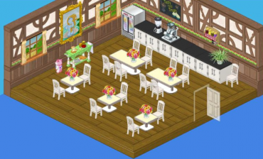
Why is he using diner tables in his restaurant? And who put those industrial looking counters on the menu? Bland white chairs with bland white tables – where’s the spice? This restaurant is a recipe for disaster.
So Elwin and I went away and came up with two new designs that we’re sure Chef Gazpacho will find much more tempting to his palate.
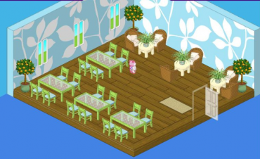
I decided to go with a lighter fare. It wasn’t in the budget to change the flooring, but once I got rid of that heavy wood paneling, suddenly the Green Leaf Flooring looked a lot more appetizing. To complement it, I selected the gorgeous Green Leaf Wallpaper. The bright shades of the Fresh Glass Dining Tables and the Willow Green Dining Chairs gave me the breezy touch I was looking for. And in keeping with my outdoorsy feel, the natural fibers of Wicker Chairs paired with Vanilla Cream Side Tables offered comfortable seating for two.
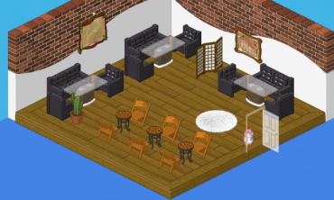
Elwin’s approach was on the meatier side. The Boomin’ Black Couch and Lounge Chairs could have been overpowering, but lightness of the Glass Top Dining Tables made their heavy looks more digestible. The Exposed Brick wall treatment created a lofty effect and Dance Recital Chairs paired with Beautiful Brown Mosaic Tables completed the bistro feel. A few touches of white, in the Shaggy White Rug and the Studio Room Divider helped to temper the strong flavor of this room.
So I guess it all depends on whether Chef Gazpacho is in the mood for salad or a main course. Which one would you choose, Webkinz fans?






I liked how it was at first and the last one.
i like yours hailey its relly cool
i like hailey’s design
add me to you friends account: juliacs9
<3
I like Hailey’s better. It buts people in a more happier mood :)
Elwin’s reminds me of Rock & Roll . . .
I’m sorry but Elwin’s design is too dark and boyish and Hailey’s is too… well, too bright and green and girlish for a gourmet restaurant. If I HAD to choose I guess I’d say Elwin’s- it looks more gourmet-ish.
DON’T SAY THAT THOSE CHAIRS ARE BLAND!!!! See, I re-did MY kitchen and used those dining chairs… They look cute in my kitchen. They look really cute in my dining room… Well, it’s a dining room slash kitchen. Kind of a mix between both! I seperated the two by putting up some counters. There is a small gap so you can go through though… I also put this little lemanade glass on my table. I’m going to put my new on the go coffee somewhere too… I got that at the Wacky Logout Carnival. Except it logged me out on purpose even though I didn’t press the logout button… Please fix this…
I like Hailey’s better on this one. And Recipe for Disaster is the hardest quest on RuneScape. Wow. Now I want to go play. I’ll be on that after the Log Out Carnival :3
Definately love Hailey’s design! The green and blue are so calming. Elwin’s is too dark for me.
Totally Haileys. But mixed together would be better! Like with the map and the wicker chairs and the leaf walls and so on.
The second one is okay,but it could have been much better!