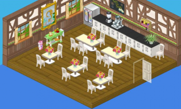
Okay, guy – it’s me, Hailey. Elwin and I have been given an assignment we can really sink our teeth into. Chef Gazpacho may be an artist when it comes to whipping up delectable feasts, but when it comes to his restaurant’s design, it looks like he just threw everything into the pot.

Why is he using diner tables in his restaurant? And who put those industrial looking counters on the menu? Bland white chairs with bland white tables – where’s the spice? This restaurant is a recipe for disaster.
So Elwin and I went away and came up with two new designs that we’re sure Chef Gazpacho will find much more tempting to his palate.

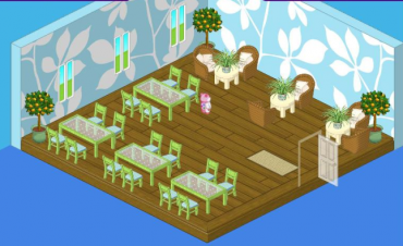
I decided to go with a lighter fare. It wasn’t in the budget to change the flooring, but once I got rid of that heavy wood paneling, suddenly the Green Leaf Flooring looked a lot more appetizing. To complement it, I selected the gorgeous Green Leaf Wallpaper. The bright shades of the Fresh Glass Dining Tables and the Willow Green Dining Chairs gave me the breezy touch I was looking for. And in keeping with my outdoorsy feel, the natural fibers of Wicker Chairs paired with Vanilla Cream Side Tables offered comfortable seating for two.

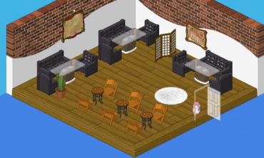
Elwin’s approach was on the meatier side. The Boomin’ Black Couch and Lounge Chairs could have been overpowering, but lightness of the Glass Top Dining Tables made their heavy looks more digestible. The Exposed Brick wall treatment created a lofty effect and Dance Recital Chairs paired with Beautiful Brown Mosaic Tables completed the bistro feel. A few touches of white, in the Shaggy White Rug and the Studio Room Divider helped to temper the strong flavor of this room.
So I guess it all depends on whether Chef Gazpacho is in the mood for salad or a main course. Which one would you choose, Webkinz fans?


I like Hailey’s the best but Elwin’s is really cool! I kind of liked Gazpacho’s old kitchen the best though. Lol! :lol:
I like Haleys MUCH Better!
I would choose Hailey’s design. I looked at it and immediately went “Wow, I love that room.” It’s so fresh and bright, and the green furniture looks great. The wicker chairs are a nice touch, and there’s so many plants. Nice job, Hailey!
I have to admit to having to make a tough decision here, but I’m going to have to say that Elwin’s design wins this one. Good job man!
I’m not a fan of either of those two bottom restaurant pictures. I think they should leave the room the way it is.
I like the first picture the best! I think it looks good, at first I thought that was the room you makeovered!
I love the light touches in Halley’s design and think her design promotes more customers (which is where some of the dollars are in the restaurant business!) Might have been nice,had the budget allowed, to have some artwork on the wall. Elwin’s design is nice, too, though a bit dark (that floor is a challenge!) Neither seems to have allowed for a service area – the place where the wait staff go to get what they need to service the customers, but perhaps that is out-of-the-dining-area in these designs. On the whole, both are nice, but Halley I think may have topped Elwin this time.
I like Elwin’s best. The original one has to much stuff on the wall, and Hailey’s is to bright.
I like Elwin’s WAY better!!! I love the couches and everything!!! I like Hailey’s wallpaper but other than that I don’t like Hailey’s!!! YAY ELWIN!!!!!!!
Totally Hailey’s!