Elwin: Hey everyone! It’s your favorite decorating team here – Elwin and Hailey! We’re super-excited to tell you about the business our company has been getting ever since we redecorated Fluffington’s house for the holidays! Ms. Birdy was the first to call us, and she invited us over to check out the problem. The problem, by the way, wasn’t at her house. It was at Dr. Quack’s. When Hailey and I got there, we thought maybe the foyer needed redoing. Ms. Birdy, however, said that Dr. Quack just had it re-painted. She took us into his living room and we immediately noticed it was…what’s a polite way to say it, Hailey?
Hailey: Uh. Dated. Let’s say dated. As in, out-of-date. As in, from the last century. Or possibly the one before that. Well, let’s just let the picture do the talking, shall we?
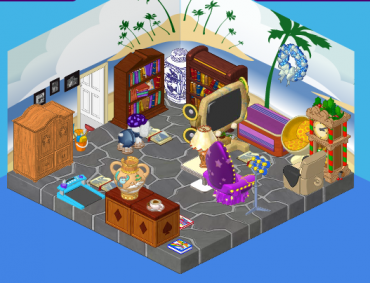
Elwin: There are so many things going wrong here, I don’t know where to start.
Hailey: The wallpaper. It’s the worst.
Elwin: No, I think it’s the arrangement of furniture. The mismatched, random arrangement. Have you ever seen anything like that before, Hailey? I mean, wow. It’s just…it’s awful.
Hailey: Ms. Birdy said that Dr. Quack doesn’t really have time for decorating. He’s so focused on his work. Basically, his living room is where everything goes – stuff that Dr. Quack might get around to moving.
Elwin: After discussing the situation with Dr. Quack (who was surprised and happy to see us at his house), he agreed to let us do whatever we wanted to make this room over. Ms. Birdy was so thrilled, I thought she was going to faint.
Hailey: After several days of work, lots of visits to our favorite stores, and a little bit of luck – this is what we came up with:
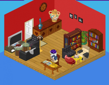
Elwin: It’s…it’s…beautiful! Let’s talk about what we did here. First, we removed all of the furniture. Then we started over.
Hailey: From the ground up. We replaced the floor and repainted the walls – the room is bold, yet warm and welcoming.
Elwin: We put in two big bookshelves to accommodate Dr. Quack’s extensive book collection.
Hailey: I love the TV corner – it’s a terrific little place to relax.
Elwin: I’m a fan of the desk. Dr. Quack was thrilled to have a place to do some work. I also think the counter by the door works wonderfully as a display area for some of Dr. Quack’s treasures.
Hailey: I think the most enthusiastic reaction we had was from Dr. Quack himself. What did he say? “I love it! And you didn’t throw out my old chair!”
What do you think of Dr. Quack’s new room?







I liked the first one better. The second one is just so dark.
~fanofthefrog~
i think that the couch in the corner needs to be moved back .and it really is not a desk it just too much. add me!my user name is gelbe -(*swissi lover*)
i like the second room alot better it is less crowded
It looks great! It’s still a little cramped but in all it is nice. You shouldn’t have used the pug’s PSI, because Dr. Quack doesn’t have a pug! Anyway you should have used the duck PSI bed. It would’ve been great.
-lovebugs131-
Hmm…I’m not a big decorater myself, but I like the second room!
Luv,
GreatFriend
i think its fine certainly better than the before picture but a little cramped i don’t like how in the reading corner there are mismatched chairs but better
tigerstripes PEACE
Good job on bringing this room up to date…love that you saved his favorite recliner.
i would do it if there weren’t rare or estore items in it. But Still Awesomness! Maybe they should do more makeovers with wshop only items. That way the some of us who like to copy the rooms still can
:)I think It is sort of boring.I don’t like how there is no patterns or more deco on the walls and for me It’s still to rustic. the tv corner way to small and my legs would be cramped because the tables are way too close. It IS better than the first room though,And I think EVERYONE agrees on that. – Scobarificus***
Ditto. I agree, it does look cramped but its way cleaner and simpler that the first one.
~KK♥
The new one looks nice, but still a little cramped.
The second room does look a bit cramped and crowded. But other than that it looks a LOT better than the first one! ;)
The *~Webkinz Wizard~* :)
I actually think the first one looks crowded. The second one is nice and simple. ;)
~KK♥
I agree krystalkat. It looks way better than the first picture! It is not modern, but not olden day looking. In my opinion, it looks very charming.
Add me on webkinz!
oldwooffie :mr.green:
The second one is great!
~*(*)*sparklegirlLT*(*)*
I really like the second room, but if it was in my house I would probably add a window to make it feel a little less crowded. :)
Same here, Stardrop* the window would probably add a really nice touch. Great job Hailey and Elwin! :mrgreen:
*~♥SwedishLatte♥~*
I think the first one is WAAAYY too crowded but it still looked okay. ;)
The second one is still a bit crowded, but the wall color looks a lot better. ;)
*Luv from LillyLuvie*
I have never liked Haily and Elwin’s designs and apparently won’t be starting now. My living room looks a lot better, sorry! -Moonstar◙◙◙
Oh, my living room looks a lot better too. I still like the second living room though. :) A window would be good.
~*(*)*sparklegirlLT*(*)*
I’m trying to do the New Years treasure hunt, and the second clue says: Winterfest is all around! Look for a clue where apps can be found!
So I clicked the mobile apps spot on Webkinz Newz, but no little bubble popped up leading to the next clue. Am i looking at the wrong spot? Or is this a glitch?
*~♥SwedishLatte♥~*
That’s happening to me too. ?
~*(*)*sparklegirlLT*(*)*
I’m stuck on the first clue in the Bulldog treatsure hunt. Got the clue, went to the room, and no bubble saying I found it and stating the next clue. Hope they fix this soon.
Me too. Sorry I haven’t posted in a while.
I really like the second room.
~~~*~~~♥PinkPeace♥~~~*~~~
The second one is much more organized and calming. I had no idea what was going on in the first one, there was too many mismatched things! The second one was great. :)
*Awesomeness, Epicness, Warriors*
-☼Mudstar☼
oh, BTW Add me on webkinz!
oldwooffie
yeah. i agree. i like the second 1 MUCH better. the first 1 just….. well….. like Hailey and Elwin said. all wrong. i think the floor and wallpaper are totally wrong 2gether. and not a lot matched……. i just think that first room wouldn’t be like the rooms in my webkinz home. i like room 2 better.
Crazy gal :mrgreen:
I agree….the first is just plain awful….and the second way less clutered and nice color scheme but…….it does seem a little crowded but alot better than the first…ik they cant make rooms bigger and stuff (i wish!) but still…….
no offense to Dr. Quack but he doesn’t have very good taste in furniture. and hailey and elwin did a good job fixing that but that’s DEFINITELY not the kind of room i would like to be in my house! it just doesn’t have enough “brightness” to it.
Wow! The first room reminded me of an attic or a basement! The second is still a bit crowded, but a MILLION times better!!! ;)
I think both rooms are OK! Cheers sarahandlacey! :lol: :mrgreen: ;-) :-) :roll:
Hey does anyone know when Webkinz is going to release the January POTM video?
I was thinking that too WebkinzMember. I think they’re busy with all of the holiday things going on that they didn’t have a lot of time to work on it. I’m sure they’re going to release it soon though! :D :) ;) :mrgreen: :lol: :P 8)
Happy Be-lated new year! :mrgreen:
~NeptuneFeline925 ^.,.^
♪♫Nƒ♪♫
Yes, the second one is cramped, but it’s better than the first one. In the second one, the two chairs sitting across from each other should be Matching, but one is red and the other is the pug PSI. Other than that, it’s quite nice. :) ~*Dawn*~
^^ My sis has a lil’ kinz pug… :lol: Anyhow, the second room looks refined, simple and divine.