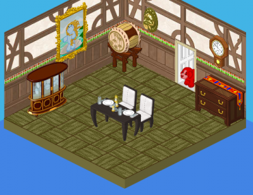
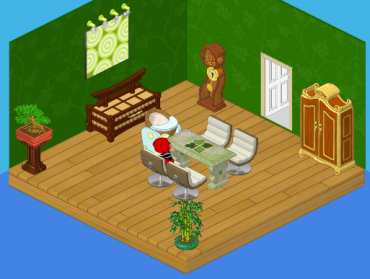
Do you see that picture? That’s what Roberta’s family’s dining room looked like, before Hailey and I redesigned it. Now, of all the rooms in the house, I have to say this one was the least problematic. The floors were actually kind of cool. The issue I had was that, again, everything was so mismatched. In differently designed dining room, the table would’ve looked great. And the sideboard. And hey, even the drum! But together, in one room? Not so much. So Hailey and I drew up some new sketches, and this is what we ended up with:
OK, let me just say that I LOVE this room. Green is such a terrific color to use for dining rooms. It’s very relaxing, and the leafy pattern on the wall made the whole room feel so natural. That’s why we stuck with a stone dining room table, and added a few plants for ambiance. Roberta’s parents were thrilled with how this room turned out, and very happy that we remembered a high chair for the future baby!


Green is a great color for ANY room lol :-) Sincerely Fr3d420
Don’t like it at all…Sorry
Yeah green!!!!!! I`m wearing green today lol.
This was an improvement??? Well, everybody has their own style, I guess.