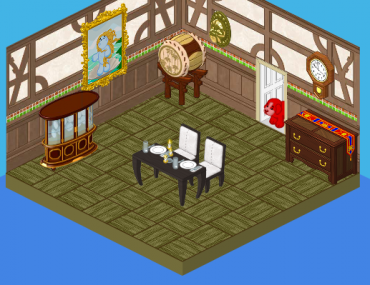
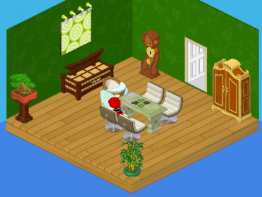
Do you see that picture? That’s what Roberta’s family’s dining room looked like, before Hailey and I redesigned it. Now, of all the rooms in the house, I have to say this one was the least problematic. The floors were actually kind of cool. The issue I had was that, again, everything was so mismatched. In differently designed dining room, the table would’ve looked great. And the sideboard. And hey, even the drum! But together, in one room? Not so much. So Hailey and I drew up some new sketches, and this is what we ended up with:
OK, let me just say that I LOVE this room. Green is such a terrific color to use for dining rooms. It’s very relaxing, and the leafy pattern on the wall made the whole room feel so natural. That’s why we stuck with a stone dining room table, and added a few plants for ambiance. Roberta’s parents were thrilled with how this room turned out, and very happy that we remembered a high chair for the future baby!





i thought you said it didn’t match….and this does???
I completely agree, Shannon. I wish they had done something that would go with the first table, I liked the table. Though it may have made the room too dark and heavy… ~~O~~SapphireSea~*~*~
I like it after it was done. The one before did not match a single thing.
Wow! That is a LOT of GREEN. Maybe it is because I cannot see the wall with the windows that softens everything and blends it together … and, please, Hailey and Elwin, please show us Roberta’s room soon!! Thank you! All the best! MDIChickadee
My kitchen is also so mismatched! But that’s just what gives it character! Mismatched rooms (for my house anyway) give it a really good character. In a way. ♥
I think the High Chair is cute! But it looks like it was last minute; it’s all squished up in the corner… But other than that (and the ugly wall — green kitchen? so not me), I think it’s OK. ~CC~
i reallylike this room other then the fact that it is a bit empty to me. i think they could of put more into the room. Did you see how it was a blue hig chair that might be giving us some hints that it is a baby boy. maybe not though. if it is a girl they will have to buy another high chair a pink one.
I really want the baby to be a girl!
I don’t like either room, although the second is a little bit better. it IS practicall.
I don’t really like this room and I agree the high chair is pretty out-there…
The blue high chair looks kinda odd in that room. Got any spray paint? You could spray paint the high chair green 2 make it look more natural. Other than that I luv the room!!!!!!!!!!!!!!! *Your friend, Orange Starburst*
i agree with the high chair,and i don’t really like the table :cry:
I don’t really like the dining room -^.~ Skypelt
I think that, again, Hailey and Elwin did a good job re-designing. The dining room before it was re-done is so mismatched! ~PepperPots
It’s a little early to be buying a high chair, after all, what if they end up needing a pink one?
Not bad. I really like the green leafy wallpaper. I want it. :) ~(*)sparklegirlLT(*)
so what if it’s a girl and it’s blue????? girls can almost go with ANY color!!!!!!
@Time Bandit, agreed! What IF they did get a girl? ~ SugarComet***
Even if they do have a girl, that doesn’t mean that everything HAS to be pink. I’m a girl and when I was really little I didn’t really like pink, and my favorite color was blue.I hope they have a healthy baby, whether it’s a boy or a girl!
I dont like it. It was better before they did anything to it. It was so calming but now its too, nah.
The second room is not nice than the first. The second is mismatched a lot more than the first.
It’s ok. Not one of their best rooms, but it looks alright. (*(*dragonfish*)*)
Nice choice Hailey and Elwin! I agree that leafy patterns do look nice for dining rooms… maybe ‘cuz MY dining room is green too! And, LOL, good thing you remembered the future baby bunny’s high chair! ~Phoenix Wind~
the dining room just doesn’t look … colorful and happy. it’s too plain, in my view… -zodiac princess-
I guess it’s a change! Your friend sarahandlacey! :lol: :mrgreen: ;-) :-) :roll:
yeah, the before, was SO not made for a FAMILY i like the after, but whoever desighned it, couldhave dne better! you friend, amber~j.