Elwin here with our very first Rabbit family home makeover. We decided to start with Roberta’s parents’ room. Since Mrs. Rabbit is pregnant, we know she needs lots of rest and that she wants a peaceful, pretty room. Mr. Rabbit’s only request was for a comfy chair so he could read. With that in mind, we got busy and created a new design.
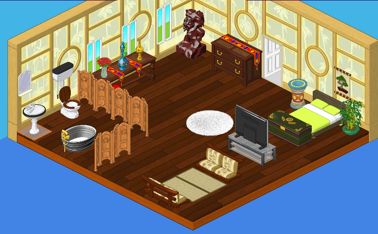
First, here’s what the room USED to look like:
There’s a lot going on in this room. The furniture is very heavy, and quite mismatched. Also, neither of the Rabbits was very fond of the country western feel that the bathroom had. Hailey and I couldn’t agree more!
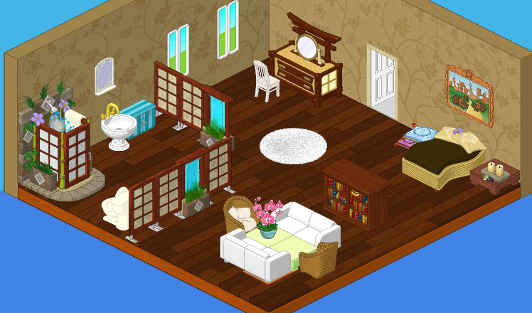
Now, here’s what we came up with:
Ahh! Beautiful! Hailey and I decided to keep the floor and change the wall color. We went with a very light brown to keep the room tranquil. My favorite change was the bathroom – it feels just like a spa. Roberta’s mom said she might never leave her room again! I guess she likes it!


That looks really good! How do you take pics of ur rooms on ur computer? I will check back this time…LOL
its kinda cool but no not-deluxe person could ever do that to a room. -sie sie
beautiful, just beautiful!
I like it!!! Not only does it have a place for Mr. Rabbit to read, but it looks so comfy!!!!!
Very pretty rooms. They both look about the same though. I hope the Rabbits like it! >> cathouse2
I agree #Solo cup#. Can I ask u guys something? Is it just me, or is anyone else liking the original room better? *Your friend, Orange Starburst*
I think the first room is better. The second room just seems darker- both the color scheme for the floor and wall as well as the amount of windows. And I think it’s more cluttered.
Yo elwin and hailey dudes i Luve them both but i think it needs like a bigger or 2 beds and a crib but just a thought but real cooooool! lol! peace out kool cats! ;-)
thats great! not only is evrything comfy and netural but you made everything come together with a little splash of color! hey who wants to see my garden? come check it out! my UN is fudgeyvanilla
It’s really pretty, I’m glad you left the t.v. out. jennifer
What an absolutely beautiful room! And functional, too. There might even be room for a cradle when that is needed … All the best! MDIChickadee
I love it! It’s a wonderful improvement. I would change a couple things though. 1- really don’t like that dresser. I would use maybe the tri-mirror one. 2- I was really expecting two beds, but that’s not major. 3- the bookshelf seems out of place. 4- the painting seems out of place. 5- i would have made a space in the seating area. But none of those are major changes, just little tweaks. Overall, a great job Hailey and Elwin. Oh, how I wish I was Estore and could make that!
Same! It just doesnt say “Roberta”. Where are all the crafts, magazines, decorations, stuffed plushiez that every gitl has in her room? I like it ALOT but its just noe “Roberta” ~KK♥
KK- LOL, that’s her PARENT’s room! ;)
Oooh… :oops: ~KK♥
I think it looks wonderful!! Not perfect, but nothing really ever is. It’s one of my favorites from all the rooms they’ve designed. ~(*)sparklegirlLT(*)
wow. it’s perfect!!!!!!!!!
Hahaha. :) ~(*)sparklegirlLT(*)
LOL! And sparklegirlLT, you are right- nothing is EVER perfect! ~ SugarComet***
Oh I Agree With You On Everything But Maybe Not 2 Beds But On Big One But 2 Beds Would Use Space Which Is What This Room NEEDS!! I Mean To Bathroom Is TOO Big!! **~**Sonici**~**
I totally agree 1,2,4, and 5, starburst. I really like where the bookshelf is, though.
Wow, that is one BEAUTIFUL room. I especially love the bathroom. Also, there is plenty of room for a cradle in there. That room is huge! Love it! (*(*dragonfish*)*)
You are right about the bathroom! I don’t have enough estore points to buy it though. **~ J.cat ~**
I luv the shower
I love the re-design! Hailey and Elwin always do such a good job. The one before looks as though it was just thrown together. ~PepperPots
I think they did an awesome job! Your friend sarahandlacey! :lol: :mrgreen: ;-) :-) :roll:
But VERY EXPENSIVE. I personally do not have over twenty bucks to spend on pixals. I wish they would keep the decorating ideas for all. I mean we can only use wshop items when we do a room design for contests. Same rules should apply, RIGHT?