By Wiggles Pig
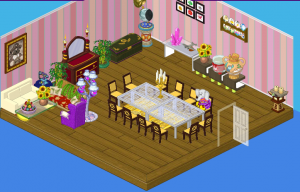
Hello everyone! Do you know my favorite part about being a designer? It’s getting to know my clients and figuring out what kind of room will suit them best. Some people are colorful and bold, others are quiet and peaceful –and others are, well, eccentric. Enter Meriwether St. Bernard. Meriwether is Fluffington’s great-aunt. She’s got a HUGE mansion (bigger than Fluffington’s, if you can believe it), and she had a dining room that was…well…cluttered. Check out the picture below and see for yourself:

Wow. That’s…something else. Anyway, I decided to really change things up. Meriwether told me to do whatever I thought was best (hopefully she didn’t regret that decision when she saw the final product!). Want to see what I came up with?
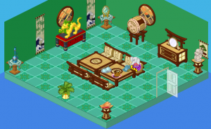
I present to you, Great-Aunt Meriwether St.Bernard’s NEW (and improved) dining room!

I love this room because it’s so peaceful – so green! Hailey and I worked hard to make sure we still had many of Meriwether’s special items on display, but the room looks much more spacious (note the Fluffington St. Bernard stone bust – which I nearly dropped, by the way). It’s quite regal with the use of different shades of green, brown and a splash of red. I absolutely adore this dining room and would probably eat here every night. You know, if Great-Aunt Meriwether invited me over (hint, hint).


Cool, it looks a lot better and green is my fave color! (light green, actually… ;) ) Don’t say the first one looks better because it is the style of room Meriwether St. Bernard wanted and likes. I think this is the first comment, not that it matters, because it doesn’t really matter and isn’t a race, I know! xD
Super Cool!!!!Wish I had that dining room.Even though the items in the first room was better this one is more spaced and green along with some peaceful touches like the windows from the w-shop.
Beautiful I especially love the patio futuirnre!Question do you find that you have a lot of chalk dust to clean up off the floor? I am wanting to paint a wall with chalkboard paint but shudder over the amount of chalk dust.Thanks for the tour!
I love it!
PRETTY! GREAT SCOTT! CAN ANYONE TELL ME WHAT CRUMPETS TASTE LIKE?? THANKS!
I <3 LONDON!
I love your cross collection and your inlvig rooms is a beautiful place! I love the built in book shelves, perfect!, it so nice for books and pretty things like you have it. The rugs are grate, I love oriental rugs, I have one with similar colors in the dining room. Thanks for the tour of your beautiful home.
i love the dining room
Not a huge fan of the low table for a dining room. Personally, I would have gone with a more classic and formal design, with dark wood and silver accent tones.
I actually like most of the original room better than the new one. I think just a few minor changes could have made the original room really great. I don’t think the green really compliments the Ichiban pieces (which is a shame because I generally love when the Ichiban pieces are used) in the ‘new’ version. I also wish that these make-over rooms would use more of the original items. It seems to me that make-overs should use a lot of what is already there not just throw everything out and start from scratch.
We agree with you. A makeover is not a startover.
Okay I’m convinced. Let’s put it to aicton.
Wow, I like it. A little bare, but I like it. I’m a room designer myself. Anyone want to friend me, my username is mattbomerrocks thanx
I love what Hailey and Elwin did to that kitchen! Especially the Asian aspect to it. Again a splendid job done by the elephant twins.
<3 Miki
Most help articles on the web are inaccurate or incoherent. Not this!
I dont really like the new one the old one looked better and more colorful.No affence to those who like the new one.
125glitter
p.s. add me user name is 125glitter
I like is too but i agree, it’s somewhat bare. i lov designing rooms!!!! :mrgreen:
I kind of liked the first one but the second one is good too!
or shall I say AWESOME!
Once again I like the before picture better. ;)
i like the before picture better ;)
You copied the person in front of you!!!!
me too
I love the first Dining Room a lot better. The second one has too much green. It doesn’t have any “Pazzazz” to it. lol
I like the first, don’t find it cluttered.
The second isn’t bad, but is a bit busy. And blocking windows is a big no-no.
I so agree with you
Your house is so pretty!! I totllay get you in regards to having the kitchen be a breezeway for the kids to get to another end of the house. We have a very small eat-in kitchen and a very big table. I literally have at most 24 inches between my L-shaped kitchen area and my table. I know that my table has been scooted down too far when I can’t get my refrigerator open and it’s a side by side Same with the dishwasher, I have to close it to let folks get by!! On the other hand it sure does make life handy when you just have to lean back in your chair to get most anything you might need during mealtime []
Cool dining room!
that is kool. (ellenlovesme, i like ur name)
Yep, its NOT the first time I LOVE (Well, KINDA love) The BEFORE picture! The second one? NOT enough!!! :(
:cool: HarryPotterNarwhals :cool: