By Wiggles Pig
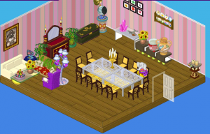
Hello everyone! Do you know my favorite part about being a designer? It’s getting to know my clients and figuring out what kind of room will suit them best. Some people are colorful and bold, others are quiet and peaceful –and others are, well, eccentric. Enter Meriwether St. Bernard. Meriwether is Fluffington’s great-aunt. She’s got a HUGE mansion (bigger than Fluffington’s, if you can believe it), and she had a dining room that was…well…cluttered. Check out the picture below and see for yourself:

Wow. That’s…something else. Anyway, I decided to really change things up. Meriwether told me to do whatever I thought was best (hopefully she didn’t regret that decision when she saw the final product!). Want to see what I came up with?
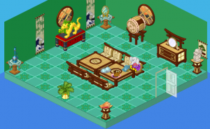
I present to you, Great-Aunt Meriwether St.Bernard’s NEW (and improved) dining room!

I love this room because it’s so peaceful – so green! Hailey and I worked hard to make sure we still had many of Meriwether’s special items on display, but the room looks much more spacious (note the Fluffington St. Bernard stone bust – which I nearly dropped, by the way). It’s quite regal with the use of different shades of green, brown and a splash of red. I absolutely adore this dining room and would probably eat here every night. You know, if Great-Aunt Meriwether invited me over (hint, hint).


I LOVE THE FIRST ONE
We think the first one looks more grandmotherly and should have kept the flooring and wallpaper and simply removed some things. The second one is good but it doesn’t look like it was made for the same person and we don’t see anything carried over…
Personally, I liked the first one better than the second one, so if I was Meriwether I would have regretted telling Wiggles to do what he thought was best.
The second one looks kinda really expensive, also.
Love your rooms design 1 for me plz
I don’t really like any of the dining rooms they all look pretty ugly .
EWWWW……….. that’s a ugly dining room……!!!!!!!!!!! bleh i don’t like either of them!!
i liked before better! way better! so better i can’t even see ANYONE doing a makeover on it!
it’s ok, i don’t know what but there is something about it i just don’t like, but i can’t put my finger on it
soooo cool! i wish i had a Webkinz dining room like that. only that has some eStore, which i wish i could go to , but i can’t.
Cool! Nice job!