Hailey: Hey all! Hailey and Elwin here with the first of our redecorating challenge articles.
Elwin: That’s right, Hailey. All week we’ll be putting up our latest projects to see whose room designs Webkinz Newz readers like better.
Hailey: The first room we tackled was the Employment Office Break Room.

Elwin: Can you say seventies shabby? That’s what I thought when I first saw it. Ugh. The room was just such a jumble of mismatched furniture.
Hailey: Tabby told us that most of the furniture had come from secondhand stores, or from friends. She got it when she first opened the Employment Office, and she just hadn’t updated the room in years.
Elwin: Enter the Designer Elephants! Hailey and each took a stab at creating the new and improved break room. Here’s what we came up with:
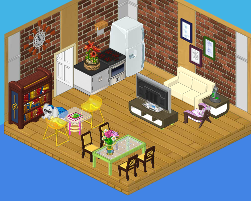
Hailey’s Design:

I decided to create a serene, restful space for the employees. We’ve got a plush couch with a big screen TV, a dining area where they can eat lunch, a reading area for relaxing, and a top-of-the line kitchen. It’s functional and stylish. I’d like to see Elwin outdo this room!
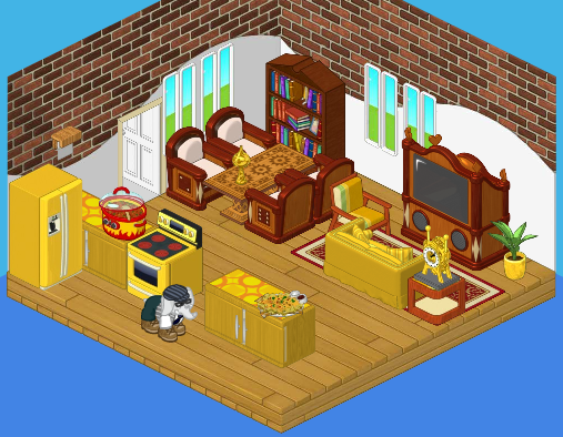
Elwin’s Design:

Interesting that we both used bricks in our wall treatment! I guess that comes from being twins (or just having good taste). Although I like my sister’s design, I have to say – mine is far more interesting! The gold really makes the room pop, and the heavy wood balances the brightness perfectly. Adding windows opened the room up. The little accessories really make the room feel like home.
So what do you think readers? Which of the Designer Elephants created a better break room?


I like Hailey’s room the best out of the two!
I love both of the room designs! I would use them differently, though. Hailey’s is a little more “homey”, which is why I would use it as a room or maybe have a little get-together there. Elwin’s has more windows and “openness” to it which makes it more of a break room.
ELWIN’S IS AWESOME
They are both very unique, but I think I like Elwin’s the best. Even though people say his is crowded with stuff, I like it bc it is very open, it actually has windows unlike Hailey’s. With windows, you can get some fresh air in there! Who dosnt agree that fresh air is nice to have?
I have to say that I like Elwins room best,I can see myself relaxing in that breakroom,nice job Elwin:)
I like Hailey’s room better for sure!
i like elwins better. it looks more peaceful
Haiely did a WAY better job than Eldwin.
i like hailey’s better elwin your design didn’t have enough color it just had gold and brown and i got bored from just looking at it . hailey your design is AWESOME i would love to hang out there but i think it needs some windows i like how there’s diffrent areas so i VOTE HAILEY SORRY ELWIN BUT YOUR DESIGN IS JUST REALLY DULL.