Hailey: Hey all! Hailey and Elwin here with the first of our redecorating challenge articles.
Elwin: That’s right, Hailey. All week we’ll be putting up our latest projects to see whose room designs Webkinz Newz readers like better.
Hailey: The first room we tackled was the Employment Office Break Room.

Elwin: Can you say seventies shabby? That’s what I thought when I first saw it. Ugh. The room was just such a jumble of mismatched furniture.
Hailey: Tabby told us that most of the furniture had come from secondhand stores, or from friends. She got it when she first opened the Employment Office, and she just hadn’t updated the room in years.
Elwin: Enter the Designer Elephants! Hailey and each took a stab at creating the new and improved break room. Here’s what we came up with:
Hailey’s Design:

I decided to create a serene, restful space for the employees. We’ve got a plush couch with a big screen TV, a dining area where they can eat lunch, a reading area for relaxing, and a top-of-the line kitchen. It’s functional and stylish. I’d like to see Elwin outdo this room!
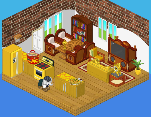
Elwin’s Design:

Interesting that we both used bricks in our wall treatment! I guess that comes from being twins (or just having good taste). Although I like my sister’s design, I have to say – mine is far more interesting! The gold really makes the room pop, and the heavy wood balances the brightness perfectly. Adding windows opened the room up. The little accessories really make the room feel like home.
So what do you think readers? Which of the Designer Elephants created a better break room?


I like Hailey’s design better. Elwins’s is nice, but the table area is cramped and the kitchen seems un-organized. Hailey’s room looks very relaxing compared to Elwin’s. – LilyTheSheep
YOU RULE LILYTHESHEEP!!!!!!
interesting, although Hailey’s design is very peaceful and calm, but it need some light, sun bath is a great way to relax, so i think i like elwin’s design better, just cause of the window, the kichen is a little to gold, but overall is very pretty( both of it)
A++++++++++++++++++++
I think Hailey’s is better.
I actually think that elwins was pretty close to being better than haileys bu they are to close to tell…..
I vote Hailey’s. I think it’s more functional for the employees’ needs. :)
i so totally agree!
I like Elwin’s design better. Sorry Hailey, but Elwin’s design just matches more. Either way, both of you have a great taste for (re) decorating rooms.
Webkinz Girl~
I have to say this room goes to Elwin.
Haileys definately! Its so simple and chic!
Hailey’s design is Number 1.
I like Haliey’s better. No offense Elwin but i think that the break room has to be relaxing not loud with contrast
Ditto, Kimmycat! Haliey’s is the best. Sorry I haven’t been comenting in a while.
*Peace, Love and Hope, Icewolf*
I like Hailey’s design better! ~Hello Kitty ROX! ^.^
Hey guys! I’m new to Webkinz Newz. Everyone seems really nice, I think I’ll stay a while! :)
I like Hailey’s better than Elwin’s. Although I am not in love with it, it is substansially better than Elwin’s.
-The 49th Warrior■■■
I have to say, I actually like Elwin’s!
~catluv… luv the cats!~
hmm… both r cute… i prefer elwin’s no offense hailey. both r cool(blahblah on her mom’s laptop)
~*blahblah*~
I like Hailey’s.
~(*)sparklegirlLT(*)
I love Hailey’s because even though Elwin’s is nice, but I feel like the gold is too bold and too much for the room.
*~♥SwedishLatte♥~*
Same here. :lol:
I agree catluv! I like how the gold contrasts with the brown.
Me too, catluv! Elwin’s wins, :) . I can’t believe no one but a few people agree with me, ’cause… well, it should be obvious. I like the gold he added to the room, and and love the windows. They’re bright and friendly. Elwin rules! ~:: cfc~~crazyforcats~~ :: $
Though Hailey’s is casual and airy, Elwin’s has a LOT more sitting space. That’s nice. Now to say which I like better… I like Elwin’s, but not as a break room. More as a crazy antique party room.
Love from DogLove1
Hailey’s has eight seats and Elwin’s only has four. Ha, lol.
Just thought I’d point that out ;)
~Claire6land
Welcome! I know you’ll fit it perfectly with the other community. Slice of cake, Warrior?
I like Hailey’s design better. It seems much more cozy and functional. Hey, I’ll keep score…
1 Hailey 0 Elwin
~Nicole ♫
Elwins!!!!!
1st of all, WELCOME to 49th Warrior!!! :) And no offense 2 anybody, but I like Elwin’s room better. It just feels fresh and friendly and more open 2 me :) And I love having windows in rooms. :)
i like hailey`s design better! It looks more relaxing. Sorry Elwin! By the way welcome to webkinz newz The 49th Warrior!
Cool, but I like
I’m gonna have to be honest here. I like Hailey’s room best. Elwin’s is to funky to be a break room while Hailey’s kinda says, “Lets chill”.
~LemonCandy
Hailey’s! FlowerSt@r
I’m going to have to pick Hailey, as the excessive gold in Elwin’s design clashes too much with the brick wall, and it’s nice to have a clock on the wall instead of having to walk across the room to see a table clock
haileys
i like hailey’s better. i totally agree with u kimmycat. the room’s gotta be relaxing!
~tigerstripe
I like Hailey’s better because it has more of the serene peaceful sort of atmosphere that is the way a break should seem, while Elwin’s has a busy on the go sort of atmosphere that is not as relaxing. Also he put very bright loud colors and went a little bit overboard with the gold though don’t you think? The arrangement of furniture is also very tight and squeezed together. Hailey’s arrangement of furniture is much more airy and spacey. The color is more muted which is relaxing.
*~Artistic~*
Hailey’s is perfect! It has all the things they need and is very casual and clam, perfect for workers to relax!
*~Snowcares~*
Hailey all the way! Hers is more relaxing………. and there isn’t gold. I just am NOT a fan of THAT much gold. Tjough it matches, Hailey’s matches too. It doesn’t need to be the same color to match.
there’s a lot of truth in that but Elwin yours is nice but Hailey’s is better
I HAVE TO VOTE FOR ELWIN….HIS DESIGN BLOWS AWAY HAILEYS ROOM DESIGN….THE USE OF COLORS REALLY MAKES THE ROOM WARM, INVITING AND RELAXING….WAY TO GO ELWIN…I WOULD LET YOU DESIGN A ROOM FOR ME ANYTIME!!!!!!!!!!!!!!
i to like Hailey’s better. i think it looks well….. i don’t know how to explain, but i like hers better. :
No offense to Hailey but I think Elwin’s is WAY cool and I’d L<3VE to hang out in there.
@ Kimmycat,
Agreed! ~ SugarComet***
Defiantly agree, Kimmycat! Elwin’s is too loud. Its nice and all… But Hailey’s is like, MILLIONS times better!
Sometimes the simpler it is, the better ;)
~Claire6land
Sorry, Elwin but I’m going to have to pick Hailey! I mean were not talking about the tashma hall here! Just a liitle break room! Your friend sarahandlacey! :lol: :mrgreen: ;-) :-) :roll:
Elwin wins me over.
-Coolgirl27965
Exactly! Elwin’s decoration is too… bright. After a long day of work, do you really want to come into a relaxing room with bright colors that hurt your tired eyes? Hailey wins this one.
Haliey’s looks better. No offense Elwin but I think it needs look relaxing and peaceful so it is Haliey I like best.
Your true friend,
**$**furryhairylion**$**
I Liked Hailey’s better , too Kimmycat