Hailey: Hey all! Hailey and Elwin here with the first of our redecorating challenge articles.
Elwin: That’s right, Hailey. All week we’ll be putting up our latest projects to see whose room designs Webkinz Newz readers like better.
Hailey: The first room we tackled was the Employment Office Break Room.

Elwin: Can you say seventies shabby? That’s what I thought when I first saw it. Ugh. The room was just such a jumble of mismatched furniture.
Hailey: Tabby told us that most of the furniture had come from secondhand stores, or from friends. She got it when she first opened the Employment Office, and she just hadn’t updated the room in years.
Elwin: Enter the Designer Elephants! Hailey and each took a stab at creating the new and improved break room. Here’s what we came up with:
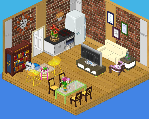
Hailey’s Design:

I decided to create a serene, restful space for the employees. We’ve got a plush couch with a big screen TV, a dining area where they can eat lunch, a reading area for relaxing, and a top-of-the line kitchen. It’s functional and stylish. I’d like to see Elwin outdo this room!
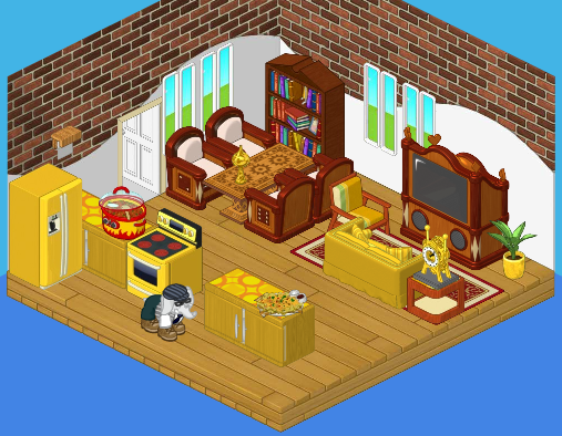
Elwin’s Design:

Interesting that we both used bricks in our wall treatment! I guess that comes from being twins (or just having good taste). Although I like my sister’s design, I have to say – mine is far more interesting! The gold really makes the room pop, and the heavy wood balances the brightness perfectly. Adding windows opened the room up. The little accessories really make the room feel like home.
So what do you think readers? Which of the Designer Elephants created a better break room?


I LOVE Hailey’s design. Elwin’s design is a bit too colorful and you switch between themes. I like Hailey’s design because you feel like you are at home and you feel relaxed just looking at it.
I like Elwin’s room better. No offence Hailey but the Refriderator just looks wrong with the stainless steel.
I didn’t know Elwin and Hailey were twins. But I like Hailey’s design a little bit better, especially the sparkly green table. So… ( Shakes pompoms) Go… team… Hailey! ( does a spilt ) woohoo! :)
~♥ Love, Peace, Happiness, GentleDreamer~♥
I like Hailey’s design better. Although the windows in Elwin’s room are nice, the gold clashes, and Hailey’s room seems much cozier and relaxing.
Ok 2 for elwin and 5 for hailey so far!
Hailey’s all the way!
i like hailey’s more because elwin’s is a little too golden. sorry elwin. i think hailey’s is created better
I have to say Haileys because elwins room is a little crowded and to gold.
it is hard to decide!!!!!i think i like Elwin’s better thouh!
ELWIN
Hailey, what were you thinking with a polka dot chair, wizard bookshelf, and that side table. Yuck!