Hailey: Hey all! Hailey and Elwin here with the first of our redecorating challenge articles.
Elwin: That’s right, Hailey. All week we’ll be putting up our latest projects to see whose room designs Webkinz Newz readers like better.
Hailey: The first room we tackled was the Employment Office Break Room.

Elwin: Can you say seventies shabby? That’s what I thought when I first saw it. Ugh. The room was just such a jumble of mismatched furniture.
Hailey: Tabby told us that most of the furniture had come from secondhand stores, or from friends. She got it when she first opened the Employment Office, and she just hadn’t updated the room in years.
Elwin: Enter the Designer Elephants! Hailey and each took a stab at creating the new and improved break room. Here’s what we came up with:
Hailey’s Design:

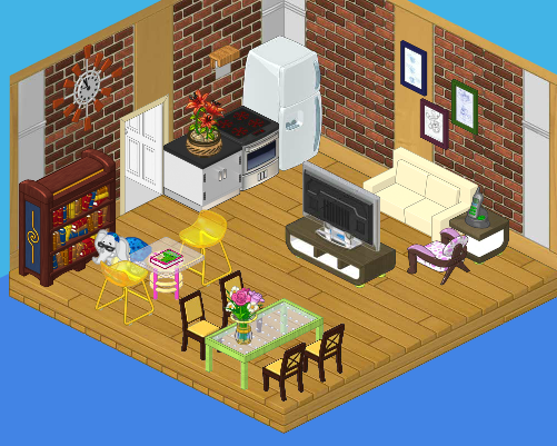
I decided to create a serene, restful space for the employees. We’ve got a plush couch with a big screen TV, a dining area where they can eat lunch, a reading area for relaxing, and a top-of-the line kitchen. It’s functional and stylish. I’d like to see Elwin outdo this room!
Elwin’s Design:

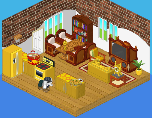
Interesting that we both used bricks in our wall treatment! I guess that comes from being twins (or just having good taste). Although I like my sister’s design, I have to say – mine is far more interesting! The gold really makes the room pop, and the heavy wood balances the brightness perfectly. Adding windows opened the room up. The little accessories really make the room feel like home.
So what do you think readers? Which of the Designer Elephants created a better break room?


I like Hailey’s room better. It looks comfortable and relaxing. It’s calm and a cute mix of classy and colorful, the flowers give the room a chic natural touch. The bright yellow, hot pink, soft purple, and lime green go together nicely with with the vanilla custard, black, and mahogany. It looks functional and stylish as Hailey said, and just a little cozy nook to relax and let loose. Elwin’s is okay but I think he forget people are going to be relaxing in this room. It’s uptight and uncomfortable looking. It looks way to serious and there’s to many antiques, I mean I love classy but after all, to much of a good thing isn’t so good. The bright windows clash and don’t seem to fit in, and it looks completely man made. No nature at all (except for a measly little green plant in a gold pot holder). In my opinion Hailey’s is definitely the better choice.
Hailey totally!!
Haileys! luv it!
3 for elwin and 11 for hailey! Elwin fans better post now!!!!!
I like both!!!!!!!!
I like Hailey’s better!
***Puppylover75***
I agree with Kimmycat and Icewolf – Hailey’s is the best. I like it better because, as has been said, it is calm. It also seems less cluttered. I might like chairs that were a bit more comfortable fro reading, but, after all, this is a break room – so I would not be there long – and I could sit on the couch if I wanted, too. Good job to both of you, but, to me, Hailey’s design is better for this room. All the best! MDIChickadee
I like Hailey’s is better. More relaxing. No offence Elwin, yours is nice too.
Haileys flows a lot better, and it looks more open and spacious. while elwins looks more cramped. on the other hand haileys doesnt match as well as elwins and the kitchen isnt as big as elwins. hmm this is a tough one
i really cant decide. Hailey’s is small and settle but Elwin’s is both small and settle as well as accented with the yellow. i like them both