Hailey: Hey all! Hailey and Elwin here with the first of our redecorating challenge articles.
Elwin: That’s right, Hailey. All week we’ll be putting up our latest projects to see whose room designs Webkinz Newz readers like better.
Hailey: The first room we tackled was the Employment Office Break Room.

Elwin: Can you say seventies shabby? That’s what I thought when I first saw it. Ugh. The room was just such a jumble of mismatched furniture.
Hailey: Tabby told us that most of the furniture had come from secondhand stores, or from friends. She got it when she first opened the Employment Office, and she just hadn’t updated the room in years.
Elwin: Enter the Designer Elephants! Hailey and each took a stab at creating the new and improved break room. Here’s what we came up with:
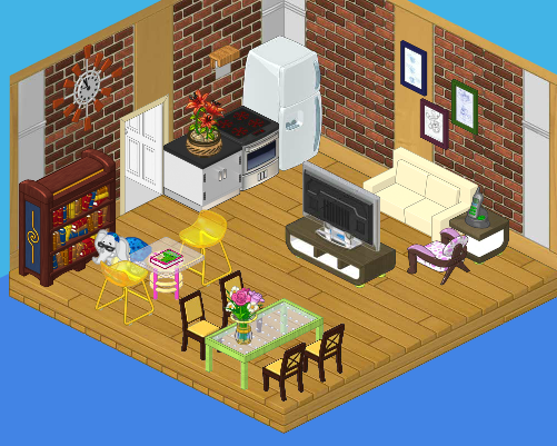
Hailey’s Design:

I decided to create a serene, restful space for the employees. We’ve got a plush couch with a big screen TV, a dining area where they can eat lunch, a reading area for relaxing, and a top-of-the line kitchen. It’s functional and stylish. I’d like to see Elwin outdo this room!
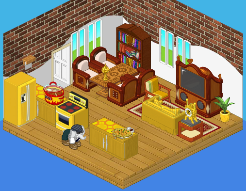
Elwin’s Design:

Interesting that we both used bricks in our wall treatment! I guess that comes from being twins (or just having good taste). Although I like my sister’s design, I have to say – mine is far more interesting! The gold really makes the room pop, and the heavy wood balances the brightness perfectly. Adding windows opened the room up. The little accessories really make the room feel like home.
So what do you think readers? Which of the Designer Elephants created a better break room?


Hi,
I have to admit I like both! I do like Haley’s design more than Elwin’s. When you first walk in on a break isn’t the first thing you want food? Hailey’s room has the kitchen right when you walk in. Elwin’s room you have to walk around a bunch of things. All though they both did great, I like Hailey’s design more. Go Hailey!
Peace, Love, And Happiness from flitterfly1
i like Hailey’s better, but it would have been nice if her room had windows.
**my ryelee**
We have 2 more for hailey! Total current score 17 hailey! 3 elwin wow….I think hailey has already won this but I guess I will wait to see if he will come back before tommorrow afternoon! :) :) :)
Hailey’s Design!
I like the big clock and the poke a dot chare!
Elwin’s Design… it’s to cramp’t in there the TV is ugly and I do not like where the books are.
Elwin’s Design ugly.
Hailey’s Design cute!
(sorry i am not the greatest speller!)
I have to say, I LOVE both of them! But if I had to chose one, I guess I’d chose Hailey’s design. Its looks pretty relaxing compared to Elwins. His is kind of cramped and the color of the furnitre doesn’t go together very well. I mean first there’s all gold ( which I think looks pretty nice ) but then there’s all this wooden furnitre. It would look better if it was just wooden. Hailey’s looks very relaxing and most of the furnitre go together. I like all the light colors but I don’t like the gold chairs that much. And the poka dotted chair looks kind of weird. And the table would look better if it was more of a brown color.
Another vote for hailey! And style girl I really like your designing advice! :)
i like both designs and would be happy for either. but i would have to say that hailey’s design is better :):):) no offense elwin your design is pretty cool to! :)
I’m going with Hailey’s design. Break rooms are supposed to be break rooms, nice and relaxing, not “in-your-face” rooms.
3 more for hailey! That makes 14 for hailey!
LOVE your design Hailey. it’s tranquil and sleek. Elwin if you gave it maybe a more serene color scheme (like blues, greens, aqua, etc.),perhaps added some whites and brownes, replaced the gold with silver, used sleeker furniture, and made seperated areas like Hailey’s, then u would have my vote. btw welcome 2 wkn the 49th warrior!
Style Girl ! ;)
PS: tell me what you guys think of my advice!