When a new character is created in Webkinz World, it often takes a few tries before the design looks just right. Thank goodness for our awesome art and creative directors, our creative team (they come up with the ideas) and the super artists – they make sure a character looks perfect before it arrives in Webkinz World.
Let’s take a look at Amanda Panda – and the many variations that were created before we found just the right look for her:
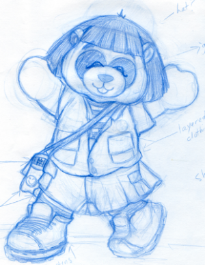

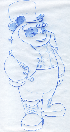
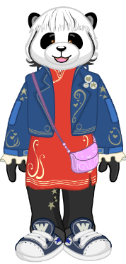
We think Amanda turned out great! What do you think?



love her shoes
kinz rocks
I’m kinda offended cause’ my name is Amanda and she looks really odd.
But I like her! OHH her shoes are ugly I agree
1st one is soooooooooooo cute but looks more like a kid. The last one looks way more Grown up!!!
yes and i think she is best now and the first picture is second
HEY WEBKINZ PEEPS!!!!!!!!!!!!! my username is ronimaloni, FRIEND ME!!!!!!!!!!!!!!!!!!!!!!!!!
I like the first one better
SHE LOOKS GRATE I LOVE HR
The second one looks like a clown, no offense anyone! She looks good now, save for the shoes and her eyes. Her eyes are too tiny and have no pupils, making her eyes look kind of zombie-ish. No offense to anyone who doesn’t think so, but her eyes ARE incorrect.
I like the 1st Amanda Panda!!!