Hailey: Hailey and Elwin here! Well, thanks for all your feedback about our rooms yesterday. Elwin and I are very excited to see who will ultimately win our design-off!
Elwin: Definitely. Now today’s redesign was a bit of fun for both of us. We redid the Kinzville Academy’s office. The secretaries were very happy to see us and they didn’t even make us bring a note from home when we arrived late.
Hailey: Uh, Elwin? We’re not in school anymore.
Elwin: I know. But every time I go into the office, I always get nervous.
Hailey: You did spend a lot of time there when we were kids.
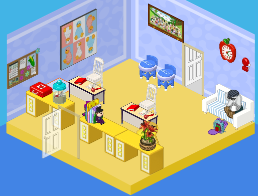
Elwin: Moving on! Here’s what the office used to look like:

Hailey: Honestly? I thought it was cute. Outdated, but cute. Ah, Elwin! I see you took your usual spot outside of Ms. Cowoline’s office.
Elwin: That was the exact same couch I used to sit on when I was a little guy.
Hailey: Which means it’s time to get rid of it! Here are our designs.
Hailey’s Design:

Hailey: Having a brother like Elwin has definitely opened my eyes to the way kids see the office. I wanted it to be WAY more welcoming and friendly. After all, it’s the princiPAL, right? I decided to take a page from Elwin’s book and play with color. I added a window wall treatment, bright and colorful counters and couches, a new floor, and functional and comfy desks and chairs for the secretaries. In fact, the only thing I didn’t change was the bulletin board. Why? Because it won’t come down. The caretaker tried every tool in his tool box, but it’s stuck there forever. So it stayed!
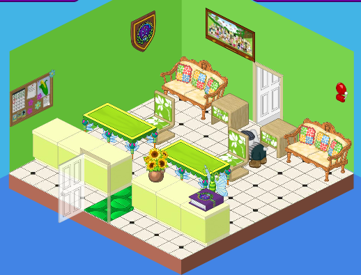
Elwin’s Design:

Elwin: I have to agree with Hailey. The office should be friendly! I decided to go decidedly green with my design. Why green? It’s a comforting, relaxing color. One of the easiest colors to live with, and probably good for a kid who’s waiting to see the principal. I love the light green counters, the different shades of green, and the comfy country-western couches. It’s all about mixing themes, but having the continuity of a color to tie it all together.
So what do you think, dear readers? Which room is best?


I like Elwin’s better this time. It’s very nerve soothing and it should calm webkinz who’re seeing the principal because they are in trouble…So Elwin’s this time, but both are really nice!
Hailey!
HAILEY! I’m rootin’ for you!
*~Ruchirock~*
HamsterHuey, I have to agree with you, the only thing that is wrong with Hailey’s design is the pink couches, but the rest of the room I love. But I have to vote Hailey again. Elwin’s room shows more western it really doesn’t look like a office. Hailey’s room is more school-like. So now it is: Hailey: 2 Elwin:0
~♥ Love, Peace, Happiness, GentleDreamer~♥
sorry Elwin, but Hailey gets my vote again. to the comment about the boys not wanting to sit on Hailey’s couches, i guess that they just should not get sent to the principal’s office.
**my ryelee**
Interesting! :-) For the last designs that they did (the Employment Office Break Room Redesigns), I voted Hailey because Elwin’s had more negatives to it than positives. One, the kitchen area seemed disorganized, and two, the table area was way too cramped with that bookshelf.
For these redesigns however, I can’t really choose. I like them both about equally. They both have positives and negatives to them.
I love Hailey’s! It’s very friendly and exciting and not boring, old and frumpy like the original.
I vote Hailey again.
i like Hailey’s better. everything seems much more modern and the colors work better together.
I personally like Hailey’s better, it looks more open and inviting.
Hailey!
I vote Elwin’s – Hailey’s bright pink couches would not do for the little boys who go to school!
I think I vote Hailey’s room re-do again.
Sorry Edwin but I really think those couches look old.
But remember its just MY opinion. I like how you both used
the Kinzville binder book and put it on the table! Edwin yours
is a little too green. So I vote Hailey!!! :) :) :) :) :)
~Insipire♥ Imagine♥ Create~
I completely agree with you! However, I prefered the art that was on the walls in the original room. I wish those things were in the eStore (the wall items)! I would totally buy those!
♠(~ ̄▽ ̄)~♥R3dRulez♥~( ̄▽ ̄~)♠
I like Hailey’s but Elwin’s is nice too. It was a hard decision. :)
~(*)sparklegirlLT(*)
i like Hailey`s the best. It was hard to decide! Even though Hailey`s room has the pink couches I like her room better.love , peace, and happiness vaquitanine*$*$*
I’m going to have to say Hailey’s (sorry Elwin) because hers seems more inviting, while Elwin’s focused a bit too much on all the green themes.
*~♥SwedishLatte♥~*
i will vote either elwin’s or the old one. haileys is OK not my style
b.t.c.l.
No, not estore, R3dRulez, but W-shop! That would be awesome! But I vote for Hailey’s. It’s bright and happy :) and Webkinzy! ~:: kkf~~kinzklipfan~~ :: $ P. S. I liked the Googles wall picture in the original 1.
I agree, that google poster is totally cool. Was that available in webkinz world before I got an account? Green is awesome! If you guys combined the rooms it would be even better.
I like Hailey’s deign best. I love the furniture she chose. ~SilverFluffy
I LUV Hailey’s more; even though I like BOTH, Hailey’s has more light which is what a nice classroom needs.
Hailey all the way!
I sooooo vote Hailey’s because Elwin’s was not relaxing at ALL! Plus it seems very confirmed and small because of the dark wallpaper and strained seating arangement. But, Hailey’s has lots of windows which lets the light in and helps relieve stress. So my vote is Hailey. *~Artistic~*
I HAVE TO SAY HAILEY’S ROOM THIS TIME…..SO IT IS ONE FOR ELWIN AND ONE FOR HAILEY….TIED AS OF TODAY….GOOD LUCK TO YOU BOTH!!!!!!
What’s up with all the green! I pick Hailey’s! She did the best job! Your friend sarahandlacey! :lol: :mrgreen: ;-) :-) :roll:
I have to say Hailey’s. It nice and more modern and I think the colors work better together.
Elwin’s is TOO green! I am not a fan of green!!!!!!!
Your true friend,
**$**furryhairylion**$**
P.S. sarahandlacey could you be my friend on webkinz?
THANKS!!!!!!
Sure just tell me your UN! Your friend sarahandlacey! :lol: :mrgreen: ;-) :-) :roll:
ok! My UN is furryhairylion. Thanks satahandlacey!!
Your true friend,
**$**furryhairylion**$**
Ok, I will add you! You’re wellcome! Your friend sarahandlacey! :lol: :mrgreen: ;-) :-) :roll:
I think Hailey gets my vote this time! I like the art in the old one though! :mrgreen:
~catluv…. luv the cats!!~
I vote Elwin too………… I don’t know. I just don’t really like Hailey’s. To be Honest, I would change things inboth rooms. Neither of the rooms are my style. And, I just don’t like the use of space in Hailey’s room.
Hailey all the way!!!!!
I would have to say Hailey’s design, but I also agree with HamsterHuey, the pink couches would not do for all the boys that end up there……. I personally like them, but there are WAY more boys that will end up there. I think. So maybe if you swapped them out for a nice shade of blue instead, that would work too.
Byes! ♥~Silverfang~♥
P.S. I am still thinking of a new WKN name, so if you got any ideas, LMK! (Let Me Know!)
Hailey, i like her wallpaper
Elwin’s. Hailey’s is too 70′s. Elwin’s might be too green, but I don’t like Hailey’s style.
I love Haily’s!!! it’s so friendly