Hailey: Hailey and Elwin here! Well, thanks for all your feedback about our rooms yesterday. Elwin and I are very excited to see who will ultimately win our design-off!
Elwin: Definitely. Now today’s redesign was a bit of fun for both of us. We redid the Kinzville Academy’s office. The secretaries were very happy to see us and they didn’t even make us bring a note from home when we arrived late.
Hailey: Uh, Elwin? We’re not in school anymore.
Elwin: I know. But every time I go into the office, I always get nervous.
Hailey: You did spend a lot of time there when we were kids.
Elwin: Moving on! Here’s what the office used to look like:

Hailey: Honestly? I thought it was cute. Outdated, but cute. Ah, Elwin! I see you took your usual spot outside of Ms. Cowoline’s office.
Elwin: That was the exact same couch I used to sit on when I was a little guy.
Hailey: Which means it’s time to get rid of it! Here are our designs.
Hailey’s Design:

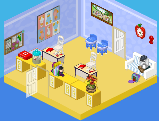
Hailey: Having a brother like Elwin has definitely opened my eyes to the way kids see the office. I wanted it to be WAY more welcoming and friendly. After all, it’s the princiPAL, right? I decided to take a page from Elwin’s book and play with color. I added a window wall treatment, bright and colorful counters and couches, a new floor, and functional and comfy desks and chairs for the secretaries. In fact, the only thing I didn’t change was the bulletin board. Why? Because it won’t come down. The caretaker tried every tool in his tool box, but it’s stuck there forever. So it stayed!
Elwin’s Design:

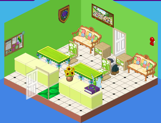
Elwin: I have to agree with Hailey. The office should be friendly! I decided to go decidedly green with my design. Why green? It’s a comforting, relaxing color. One of the easiest colors to live with, and probably good for a kid who’s waiting to see the principal. I love the light green counters, the different shades of green, and the comfy country-western couches. It’s all about mixing themes, but having the continuity of a color to tie it all together.
So what do you think, dear readers? Which room is best?


Personally, i like Haileys design. It’s more open and friendly, the windows really helped ;) I don’t just like Haileys better cause imma girl LOL :))
Your friend,
~Luvvy6~ (=^-^=)
Hailey!
I must vote for Hailey’s room again, all that green makes me feel sick. Nice and open and bright Hailey! Very inviting, even if you are in trouble.
Greenie goes green!
Green is my favorite color but, I like Hailey’s desing with the excption of the pink couches and the wall paper. And I agree with a lot of the others I like the wall art in the first room. So my I guess my vote is for Haileys design
Definitely Hailey on this make over…
LOVE Elwin’s room so COOL.
P.S. I’m the same person as Doglove .But will sometimes us this name for comments
Love the moon, Moon Blue
Well I like Elwin’s best because it’s not to girly like Hailey’s after all not everyone likes pink couches and Orange and Purple furniture.But Elwin’s is a little bit too green though …… But it’s still the best to me (like the other room)
Hailey’s I think is better, its casual and bright.
I like Elwin’s design. First of all I like it because to me it has that warm welcoming feeling. Secondly it’s greenwhich is one of my favorite colors next to blue! Lastly I like it because Elwin put a bunch of different designs. I realize they both have many designs but I prefer the way Elwin did it more. Sorry Hailey! ELWIN!!!!!!!!!!!!!!!!!!!!!!!!!
Wow The current results are 7 elwin and 51 hailey including my vote!