Hailey: Hailey and Elwin here! Well, thanks for all your feedback about our rooms yesterday. Elwin and I are very excited to see who will ultimately win our design-off!
Elwin: Definitely. Now today’s redesign was a bit of fun for both of us. We redid the Kinzville Academy’s office. The secretaries were very happy to see us and they didn’t even make us bring a note from home when we arrived late.
Hailey: Uh, Elwin? We’re not in school anymore.
Elwin: I know. But every time I go into the office, I always get nervous.
Hailey: You did spend a lot of time there when we were kids.
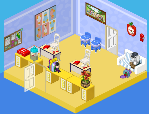
Elwin: Moving on! Here’s what the office used to look like:

Hailey: Honestly? I thought it was cute. Outdated, but cute. Ah, Elwin! I see you took your usual spot outside of Ms. Cowoline’s office.
Elwin: That was the exact same couch I used to sit on when I was a little guy.
Hailey: Which means it’s time to get rid of it! Here are our designs.
Hailey’s Design:

Hailey: Having a brother like Elwin has definitely opened my eyes to the way kids see the office. I wanted it to be WAY more welcoming and friendly. After all, it’s the princiPAL, right? I decided to take a page from Elwin’s book and play with color. I added a window wall treatment, bright and colorful counters and couches, a new floor, and functional and comfy desks and chairs for the secretaries. In fact, the only thing I didn’t change was the bulletin board. Why? Because it won’t come down. The caretaker tried every tool in his tool box, but it’s stuck there forever. So it stayed!
Elwin’s Design:

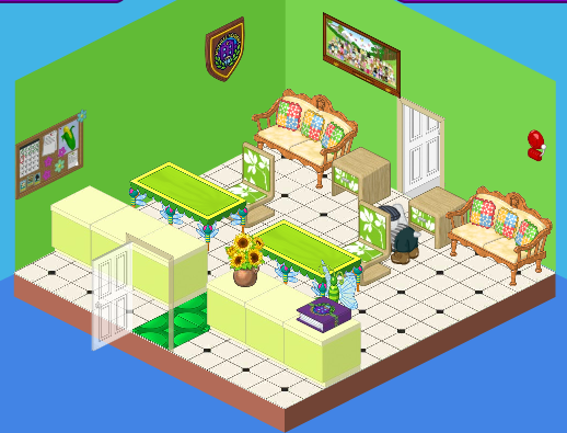
Elwin: I have to agree with Hailey. The office should be friendly! I decided to go decidedly green with my design. Why green? It’s a comforting, relaxing color. One of the easiest colors to live with, and probably good for a kid who’s waiting to see the principal. I love the light green counters, the different shades of green, and the comfy country-western couches. It’s all about mixing themes, but having the continuity of a color to tie it all together.
So what do you think, dear readers? Which room is best?


I vote for Elwin’s design
I personally think Elwin’s is ugly. Sorry, but it just doesn’t look good. I’m going for Hailey.
Hailey all the way! Elwin has to much green in his.
i like haileys walls and floor but don’t like the pink couch i like elwins couches so it’s a tie
Please don’t laugh at me for this, but-I didn’t know that Elwin was a guy until now. OH gosh! I LOVE that googles poster!!!!!! Well, I have to say, I like Hailey’s design better. And I know Elwin said the green ties his together, but I think it looks a bit miss-matched. And umm, Webkinz, if you couldn’t take the bulliten board down, there would be a little patch of old wallpaper around it. OR you couldn’t even change the wall paper at all! Crazy 4 Ever, Ninja M
I vote for Hailey’s.
I like Hailey’s better. Elwin’s colors are not relaxing. Just going to the office is enough to make you feel jittery, and the glaring green in Elwin’s room doesn’t do anything to make it better.
i like hailey’s design way better. elwin’s just seems really odd the couches really look old and don’t match the green theme it needs more light like hailey’s it didn’t even have a first aid kit. SO FOR ALL THOSE REASONS I VOTE HAILEY’S DESIGN SORRY ELWIN .
Haily wins again
OOOOH.NOOOO. I saw a disaster.Elwin’s room design made my head spin. Normally, a color theme would be good.But seriously, and I have no idea why, Elwins room has little appeal to me. I don’t prefer hailey’s choice of wall, but her design Out-looks Elwin’s today. My choice for this is Hailey.