Hey Webkinz fans! Last week was another busy week for the Designer Elephants and I (Wiggles)!
Plumpy came to us a couple of weeks ago with three design dilemmas: her garage, her living room and her guest bedroom were simply not working for her anymore.Plumpy is a Hippo of good taste, and she realized that everything was either too messy (her garage), too sparse (her living room) or simply out-of-date (her guest bedroom).
After lots of sketching and imagining, Hailey, Elwin and I were pretty proud of the results! Check out the magic we performed on each of these rooms – and let us know what you think of the before and after shots!

Wiggles says: Woah! Plumpy had WAY too much stuff in her garage. Christmas trees…an old tub…and a stove that didn’t work! First things first – donating items and finding storage space in other areas of the house!

Whew. That’s way better! A bit more storage and a lot less clutter goes a long way!

Hailey says: Elwin looks so lonely in that giant room! I think it needs a bit more furniture to fill in the blank spots!
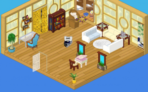
Ahh! Lovely! Now THAT’S a pretty living room!
And finally, let’s see the guest bedroom!

Elwin says: This room was such a mishmash of items! The first thing we need to do? Repaint the walls!

Now THIS is a welcoming room! It’s a vision in purple – a very regal color. We replaced the desk with some storage – something many weary travelers appreciate!
Tell us which of the three makeovers you like best – we love to hear your opinions!







The living room is totally the best. Love it. The guest bedroom is pretty good. There are something I would have added/changed though. And the garage is ok….I guess. Not a fan of [webkinz] garages period. What’s ironic is, I have one. LOL! :D
yay i would change some stuff too but the rooms all look good
They are really pretty!
I like them all, but definately the guest bedroom the best!!! The designs inspired me to do some work of my own!
Same here!:)
I really really like the redesign of the living room!
I love the guest room and why is there a garage? any way why do the rooms always only have one door
If you only have one door off of your room it’s a lot easier to design. You don’t have to worry about furniture blocking the doors, you can put your wall art exactly where you want it, and you don’t run out of room for wall art. Hope this helps! ;D
i like the third the best
awesome!!!!!!!!!!!!!!!!!!!!!!!!!!!!!!!!
I love the Guest Bedroom makeover the best!!!!!
me 2 luv it awesome ps my friend and her little sis lov it 2
Love it!
interesting design choices… just ok.
Good…but why is there a bed in the garage?
LOL! I LIKE YOUR NAME! ITCHY CHICKEN!!!
LOVE THE LIVING ROOM FIRST, GUEST ROOM SECOND AND GARAGE LAST.
Brilliant. I love the transformation! Good job!
I totally disagree agree!!! (sorry, I just like dong the cool stuff! ;-) The transformations are good, but I don’t really care for any of the rooms, before or after…
Sorry, oops, it was supposed to bold the word totally and strikethrough the word disagree and put a parentheses after the word stuff. Sorry!
Are you really AbbyFlower7?
I do not care for the first design. They took away all Plumpy’s cars except three. The second and third design are better. Over all, the designs were not the best.
Than please do not comment because I and other people like it so please do not comment!!!!!
not really my taste…. i really don’t like the living room.
AWESOME!! That’s my opinion on the BEDROOM ONLY. I really dislike the living room, and the garage is an epic fail!!! DX Sorry guys I LOVE my designs
(Wishing Haily will comment to this!!!) I made AWESOME rooms lately!!! I was going CRAZY to the results!! I just need someone to share them with :(
HarryPotterNarwhals. ( TeeHee I like it.)
says Snooter20
Oh my gosh I completely redecorated my living room AND dining room. I chose bright green for my dining room and pink and white for my living room. They both look FANTASTIC!!!
That sounds awesome!
Me too! I made a Popstar room and Ice room. They look good with no changing!
BUT it cost a ton to make them both.
I like most of them, but the AFTER for the 2nd one from the top is UGLY. They said the BEFORE for the 3rd was a mishmash, but it’s nothing compared to that. In my opinion it is ugly.
i like the guest room!
Hmm….Hailey and Elwin, this is not your best design yet, but still pretty good. I’m not really sure about the guest room because well, I’m not sure Plumpy is the type who likes purple rock beds. :D Have any of you noticed how in a lot of the remakes of the rooms, there is a plate of Cookie’s Cookies? (As in the Mazin Hamster Cookie.) Maybe that’s Elwin’s favorite food! ;)
I love the transformations the rooms look great with the beds side by side :)
the purple room is awesome it makes me think of jutin beiber *sigh* <3 <3 <3
i like the before bedroom better, even though it is mismatched, its better for all the different kinds of people who sleep there.
Haha, me too. These haters just don’t understand! ;)
oh!!!! when r the new cloth r comming???????
I like the new bedroom design
I love webkinz world so much! It is so much fun on webkinz . I think we are all deluxe inside!!!!!
I LOVE WEBKINZ WORLD SO MUCH !!!!!!!