Hey Webkinz fans! Last week was another busy week for the Designer Elephants and I (Wiggles)!
Plumpy came to us a couple of weeks ago with three design dilemmas: her garage, her living room and her guest bedroom were simply not working for her anymore.Plumpy is a Hippo of good taste, and she realized that everything was either too messy (her garage), too sparse (her living room) or simply out-of-date (her guest bedroom).
After lots of sketching and imagining, Hailey, Elwin and I were pretty proud of the results! Check out the magic we performed on each of these rooms – and let us know what you think of the before and after shots!

Wiggles says: Woah! Plumpy had WAY too much stuff in her garage. Christmas trees…an old tub…and a stove that didn’t work! First things first – donating items and finding storage space in other areas of the house!

Whew. That’s way better! A bit more storage and a lot less clutter goes a long way!

Hailey says: Elwin looks so lonely in that giant room! I think it needs a bit more furniture to fill in the blank spots!
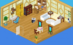
Ahh! Lovely! Now THAT’S a pretty living room!
And finally, let’s see the guest bedroom!

Elwin says: This room was such a mishmash of items! The first thing we need to do? Repaint the walls!

Now THIS is a welcoming room! It’s a vision in purple – a very regal color. We replaced the desk with some storage – something many weary travelers appreciate!
Tell us which of the three makeovers you like best – we love to hear your opinions!







I LOVE THESE ROOMS ARE PRETTY ESPECIALLY THE LAST ONE.
wow
intresting… i don’t really like the bedroom or garage but the living room was nice. the colors reminded me more of the nursery theme, sorry guys, not the best job.
My fav is the Living Room, but I ADORE the guest room! They are SO my style! :smile: :mrgreen:
I LUV THE MOCHA ROOM THEME
IT IS SO AWESOME
CAN U PLEASE DESIGN IT FOR ME !!!!!!!!!!!!!!!!!!!!!
“Three Gorgeous Room Designs”… Um, I say… Not so gorgeous.
um those rooms need a couple more things
Lol , the first one looks like my grandmom’s house! If you could see her house you’d freak!!!!!!!!!
Now those are some sweet rooms! I think they were all super awesome. My favortie color is purple, so that guest room is just for me. It looks cool. Then the living room just super good, because at first it was very undecorated and the walls didn’t go together too well. Now they match better and there is more furniture and it just looks good. Then the garage. It’s less cluttered and it just looks well, like the living room. GOOD JOB!
I really think that the before and after have a really big difference! I really like the afters. They look so great!
Hi guys its me !!!( agin) But one thing,have any of you guys tried my room I made up???PLZ try It and post how you like it !!! one little thing in my commet instead of goldstar I only put gold but that is my room OK !!! PLZ someone be nice and try it and post it so other peaple try it 2!!!!!!