Hailey: Elwin, I think we’ve both been doing a pretty great job with these makeovers. Wouldn’t you agree?
Elwin: Sure. Yes. Definitely.
Hailey: You seem a bit…distracted. Could it be that today’s design has left you rattled?
Elwin: No! No! My design was great. IS great.
Hailey: Have you seen my design?
Elwin: Yes. Let’s not talk about it. Let’s just show what we’ve done and let our fans decide whose is better.
Hailey: I knew it! You DO think mine is better!
Elwin: First, let’s see the original Tournament Arena lobby:

Hailey: Wow. It’s very bright, don’t you think? And there’s so much stuff in there. If I was a competitor, this would NOT make me feel relaxed and ready for my game. And look at all the junk food they’re serving.
Elwin: Er, yes. I didn’t mind it that much, actually. Lots of color, lots to look at. Anyway, here’s my design:
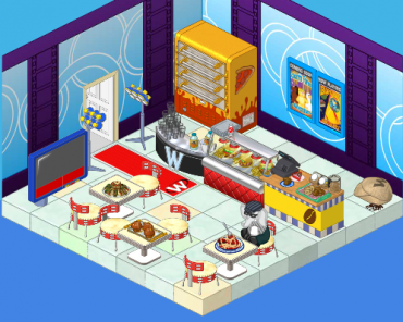
Elwin: I tried to incorporate some blue – very restful color, you know. And I’ve added a pizza oven (the manager of the arena wanted another way to earn KinzCash, so I suggested selling pizza. He thought it was a great idea!). The tables are great for sitting at and watching the tournaments (on TV). And the lights will make everyone feel like a superstar when they arrive.
Hailey: Very nice! Now here’s my design:
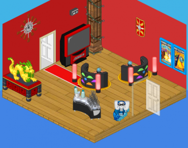
Hailey: I went with a more upscale, modern look. I wanted competitors to feel excited to be there (hence the red) and to have some healthy snacks to eat (goodbye fast food counter). I added the dragon for luck and inspiration, and the booths make great places to sit and discuss strategy with a friend.
What do you think, reader? Which elephant has created the better design? Leave your thoughts in the comments below!






I agree heailey’s looks kind of dull looking I’d go with hers anyway because It has a lot of space.
Hailey has the best room this time, I would of used yellow but blue is good to.
Elwins, paws down. He didn’t do away with the junkfood, but really, Elwins designs always show spunk and fun, Hailey’s designs are always too quiet for me, except during the library one. Please! Start working together again! I miss the elephant twins!
Hailey, I didn’t think you had enough room for seating until I realized it’s only the lobby. Webkinzs aren’t supposed to hang around in here. Just enough seating and snacks to relax before a game or heading home. You out did yourself girl. jennifer
I say Elwin has this won all wrapped up. His is WAY better then Hailey’s, she has like two pieces of furniture (even if they are cute) and she only has a drink stand. What’s that about? You can’t play games on an empty stomach! So yeah, Elwin is definetly got a better design for this one.
I am going with Elwin this time, his design goes better with the theme of the room.. Way to go Elwin!!!!!!!!!!!!!
Elwin for sure! Hailey’s has, like, no furnature in it! It’s kind of empty.
I don’t really like either of them, but if I had to choose. I would’ve chose Hailey. Elwin’s room looks more like a restaurant, not like a lobby. You need to feel relaxed. So Hailey wins this round. ~♥ Love, Peace, Happiness, GentleDreamer~♥
I think Elwin’s won this one there’s no furniture in Hailey’s but I do like her tables!
Hailey, great job! Your room has lots of room, and is so relaxing. Sorry Elwin, but I like Hailey’s better.
Abosolutely agree with you hailey’s is so relaxing!!! elwins makes me feel cramped and not as secure for my games :)
Hailey’s. Elwin’s looks like a restront, NOT a lobby. Were Hailey’s does. (: ~ Chuse! FlowerSt@r P.S. I’m going to chang my name to rainingstar. (: just leting u all know.
I love how Hailey is encouraging healthier snacks too!
me too, but her lobby is just to plain. i prefer elwins
I gotta say, Hailey won my votes 3 times in a row! Keep up the good work! ;) ~KK♥
I am going to share my own opinion. I’ve seen a lot of Hailey fans since the completion , but I am just LOVING Elwin’s. This completion Hailey made it A LOT better. But I say she made it 7 out of 10. Elwin is (in my opinion) 8 out of 10. Elwin’s a little to squished out. ♠♠♠Gameboy♠♠♠ PS. Used to be TheGameStar.
I really like Elwin’s makeover of the Tournament Arena lobby. But Hailey’s is pretty too… :D :roll: *Luv from LillyLuvie*
I agree KK! I vote Hailey! Your friend sarahandlacey! :lol: :mrgreen: ;-) :-) :roll:
Elwin’s for me! I like it for the nice tournament lobby way. I think there are fast food counters at every arcade that I have seen. Your true friend, **$**furryhairylion**$**
i like elwins and my new name is Snowstar warrior
Elwin’s room!!!!!!!!!!!!!!!!!!!!!!!!!!!!!!!
I like Hailey`s better . Elwin`s looks cramped. Hailey`s is more relaxing.
Great job both of you! Elwin’s won most of my votes, but Hailey got me this time! ;) There’s one thing I’m experiencing as a problem though. Some of you are probably just voting for Hailey because she’s a girl, and I don’t think that’s very fair. Thank you for reading my comment. :mrgreen:
go elwin! i love your design!
I’ll go with Hailey’s. I think Hailey’s room is a little spacey, but it’s a whole lot better than Elwin’s mismached colors with the fast food counters. And, I don’t like fast food, so I really like Hailey’s water station:D *Peace, Love and Hope, Icewolf*
I`m going with Haileys design. It is more lobby like, and is more relaxing, lots of estore though. I like Elwins too though because it has mainly w-shop items but is more like a cafeteria. ~*Sigs*~
Honestly, I love Hailey’s design the best…..The first tournament arena lobby is too bright for my liking and Elwin’s looks like a fast food restaurant not a lobby. ~SilverFluffy
I LIKE ELWINS DESIGN OF THE TOURNAMENT ARENA THE BEST….HAILEY DOES NOT HAVE ENOUGH IN HER DESIGN AND MAKES THE ROOM WAY TO BARE!!!!!!!!!!!
Ditto ( I agree! ) iamawebkinzmom2.
I think Hailey’s is better. I’m one for Retro / Modern, so… Don’t worry Elwin, yours is nice too! -Tiffers-
I like Elwin’s better. Hailey’s looks like she was on a tight budget. Way to open. I like Elwin’s cause it looks like what it should be, because the tournament arena lobby is real a cafeteria. Hailey’s feels so much smaller, and what do you do if you get hungry? All she has is water… I love pizza and hotdogs and chips and soda. Hailey’s is really bad no offence but it is true…
sorry to the people who like hailys but I agree to Dragonfire and Jed1923457 and LOL its so funny cause I like her tables too Jed1923457! love is for the world
Elwin, definately. I liked the little red lights by the couches , though, and the wallpaper and flooring. The dragon was cool, too. Those are the things I like in Hailey’s. But the general design in Elwin’s was great. So Elwin gets my vote! ~catluv… luv the cats!~
Hailey’s feels more relaxing, an that’s why we’re going for. Hailey 4 Elwin 2
um totally elwins! His looks like a place where you could go and get your mind of the games for a little while so that you dont get too nervous! coolio
Definitely Hailey. I love how she included the healthier snacks,(the runners would enjoy it, junk food has too many carbs)and made it feel relaxing. I also like the dragon in the corner. It gives(as Hailey said; good luck) and an oriental feel to this relaxing room. I think Hailey will win! ~ SugarComet***
I am going with Hailey’s design. Much cooler!
Elwin. I mean, personally I like the original one the best… I don’t know why… I’m not crazy about either of the new one’s, ESPECIALLY Hailey’s cause it’s very boring and dull and not enough space and the colors don’t work! Elwin’s isn’t perfect either, but Elwin wins ~Claire6land
Elwins for sure. Hailey’s is WAY too open. Not much going on, and Elwin’s looks more like an arcade. Good job Elwin! :)
I don’t know which design to choose :!: I feel like Hailey’s is way too spacey, Elwin’s is too crowded, and both of them have mismatching items. Sorry, but never of you have my vote this time. I hope you improve for the next makeover. Good luck :!: Have Serenity :!: -Serene :mrgreen: