Hailey: Elwin, I think we’ve both been doing a pretty great job with these makeovers. Wouldn’t you agree?
Elwin: Sure. Yes. Definitely.
Hailey: You seem a bit…distracted. Could it be that today’s design has left you rattled?
Elwin: No! No! My design was great. IS great.
Hailey: Have you seen my design?
Elwin: Yes. Let’s not talk about it. Let’s just show what we’ve done and let our fans decide whose is better.
Hailey: I knew it! You DO think mine is better!
Elwin: First, let’s see the original Tournament Arena lobby:

Hailey: Wow. It’s very bright, don’t you think? And there’s so much stuff in there. If I was a competitor, this would NOT make me feel relaxed and ready for my game. And look at all the junk food they’re serving.
Elwin: Er, yes. I didn’t mind it that much, actually. Lots of color, lots to look at. Anyway, here’s my design:
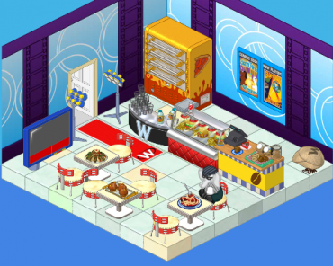
Elwin: I tried to incorporate some blue – very restful color, you know. And I’ve added a pizza oven (the manager of the arena wanted another way to earn KinzCash, so I suggested selling pizza. He thought it was a great idea!). The tables are great for sitting at and watching the tournaments (on TV). And the lights will make everyone feel like a superstar when they arrive.
Hailey: Very nice! Now here’s my design:
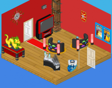
Hailey: I went with a more upscale, modern look. I wanted competitors to feel excited to be there (hence the red) and to have some healthy snacks to eat (goodbye fast food counter). I added the dragon for luck and inspiration, and the booths make great places to sit and discuss strategy with a friend.
What do you think, reader? Which elephant has created the better design? Leave your thoughts in the comments below!









I think Elwin’s is the best. Blue IS a very relaxing look, and Hailey’s room looks kinda empty. There’s no food or anything. But Hailey’s furniture (mostly the seats) look way cool. But for a Tournament Arena Lobby, I’d say go with Elwin’s room and Hailey’s seats. :-) ~CoconutCloud~ (on a laptop)
At first, I thought Elwin’s was definitley better, but after reading some of those comments, I sort of agreed with Hailey, a little. Because Elwin’s wallpaper, and his mix of colors and designs was not too good. And also, after I stared at it a little, I thought that it did not look so much like a lobby. But then I looked at Hailey’s, so maybe Hailey’s.
My decision is based on how the room is to be used. Is this a lobby where people enter to hang out before they go into a tournament? If so, then I think I like Elwin’s design. Or is this a lobby where people get ready before they go to compete in a tournament? If the latter, then I like Hailey’s design. My vote is dependent upon what is suppose to happen in the room. Again, two great designs. Hailey and Elwin – you two are simply the best! All the best! MDIChickadee
i think Elwins´ design is better because hailies ( i don´t think i spelled the nake correctly) is to boring. i mean look at it! it looks like a chinese place or something
I like Hailey’s tought, but it is kind of bare and Elwin’s is too cramped. Overall, I like Elwin’s design. Wether it looks like a restraunt or not.
Hailey’s is 100% gross and ugly, in my opinion. The walls are horrible, it’s too empty and that room would make me more stressed than the old one. Elwin’s may be a little crowded looking, but it’s a lot better. And there’s real food in there, not just some drinks. Elwin all the way.
i like hailey’s better!
This time i go with Elwin’s!
I really like Hailey’s, sorry Elwin and I also agree jennifer. It is just the lobby. Not everyone wants to hang out in the lobby. I think Elwin’s looks like a restaurant. You really don’t need alot of food, but I do think you need some kind of drink and some kind of food. $Chocolate Chip Cookies Rock!$
Hailey gets my vote (again.) I like the openness, it is calming. Elwin’s design is good, but looks more like a restaurant. Please note that BOTH left out the lockers (again). Competitors need somewhere to stash backpacks, purses, extra clothes, etc. while competing. Greenie goes green!