Hailey: Elwin, I think we’ve both been doing a pretty great job with these makeovers. Wouldn’t you agree?
Elwin: Sure. Yes. Definitely.
Hailey: You seem a bit…distracted. Could it be that today’s design has left you rattled?
Elwin: No! No! My design was great. IS great.
Hailey: Have you seen my design?
Elwin: Yes. Let’s not talk about it. Let’s just show what we’ve done and let our fans decide whose is better.
Hailey: I knew it! You DO think mine is better!
Elwin: First, let’s see the original Tournament Arena lobby:

Hailey: Wow. It’s very bright, don’t you think? And there’s so much stuff in there. If I was a competitor, this would NOT make me feel relaxed and ready for my game. And look at all the junk food they’re serving.
Elwin: Er, yes. I didn’t mind it that much, actually. Lots of color, lots to look at. Anyway, here’s my design:
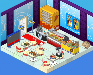
Elwin: I tried to incorporate some blue – very restful color, you know. And I’ve added a pizza oven (the manager of the arena wanted another way to earn KinzCash, so I suggested selling pizza. He thought it was a great idea!). The tables are great for sitting at and watching the tournaments (on TV). And the lights will make everyone feel like a superstar when they arrive.
Hailey: Very nice! Now here’s my design:
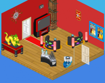
Hailey: I went with a more upscale, modern look. I wanted competitors to feel excited to be there (hence the red) and to have some healthy snacks to eat (goodbye fast food counter). I added the dragon for luck and inspiration, and the booths make great places to sit and discuss strategy with a friend.
What do you think, reader? Which elephant has created the better design? Leave your thoughts in the comments below!









hi maricis23 here i like them both but elwin’s is a little better i like the concession stands and all the seating. Hailey’s is good but i thought it needed more concesion stands like elwin’s but i LOVE the booths. but elwin’s design was just a little bit better. i think both of the designs need windows. and some lockers like the original design had. both of your designs were great can’t wait to see your next designs. Love , Maricis23 (maricis23 is also my username so anyone can ask to be my friend on webkinz i hope you will )
Elwin
Hailey’s would be better for a small family’s living room, but Elwin’s is too cramped. Also, both are very RANDOM. Mix match of too many themes and designs. If I had to pick, (which I do), I would pick Elwin’s. Sorry Hailey, yours would just be better for a family who has a lot of movie/dinner nights.
I like Elwin’s better.
Hi Hailey & Elwin (: Your designs are lots of fun! I like Elwin’s room better today. The blue walls and cool color flooring helps create the relaxing feeling that you were talking about, and I think the red carpet entrance is such a fun idea! The only thing I would have done differently is leave out the pizza machine (too big and bulky, and not a very healthy choice). I think a fruit stand would have been a neat choice.
Hi! I’m sorry i haven’t posted in a while-been really busy. I’m kind of disappointed. In my opinion, neither Haily nor Elwin made the room better, I liked it before. Haily has WAY WAY WAY WAY too much open space. It makes the room kind of boring. Elwin didn’t do a bad job, it’s okay, but i liked hte room better before. See ya! :mrgreen: bookworm
I like Elwin’s the best! I think it is really cool!
I like Elwin’s better! Sorry Hailey.
I think the original area is the prettiest!!!
I think Hailey’s is better. Just add some food counters and VOILA! Wonderful!
I don’t i like the original the best