Hailey: Elwin, I think we’ve both been doing a pretty great job with these makeovers. Wouldn’t you agree?
Elwin: Sure. Yes. Definitely.
Hailey: You seem a bit…distracted. Could it be that today’s design has left you rattled?
Elwin: No! No! My design was great. IS great.
Hailey: Have you seen my design?
Elwin: Yes. Let’s not talk about it. Let’s just show what we’ve done and let our fans decide whose is better.
Hailey: I knew it! You DO think mine is better!
Elwin: First, let’s see the original Tournament Arena lobby:

Hailey: Wow. It’s very bright, don’t you think? And there’s so much stuff in there. If I was a competitor, this would NOT make me feel relaxed and ready for my game. And look at all the junk food they’re serving.
Elwin: Er, yes. I didn’t mind it that much, actually. Lots of color, lots to look at. Anyway, here’s my design:
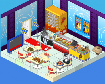
Elwin: I tried to incorporate some blue – very restful color, you know. And I’ve added a pizza oven (the manager of the arena wanted another way to earn KinzCash, so I suggested selling pizza. He thought it was a great idea!). The tables are great for sitting at and watching the tournaments (on TV). And the lights will make everyone feel like a superstar when they arrive.
Hailey: Very nice! Now here’s my design:
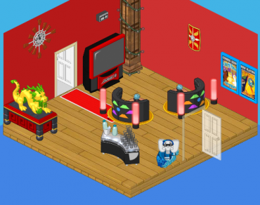
Hailey: I went with a more upscale, modern look. I wanted competitors to feel excited to be there (hence the red) and to have some healthy snacks to eat (goodbye fast food counter). I added the dragon for luck and inspiration, and the booths make great places to sit and discuss strategy with a friend.
What do you think, reader? Which elephant has created the better design? Leave your thoughts in the comments below!






Wow. I can’t decide. Hailey’s design is more modern and spacious, but there’s little seating and *gasp* healthy food!! It’s not east for the manager to make more money that way and, yes, healthy food should be an option but not the ONLY option. I like Elwin’s design because he has more options (I don’t know about you, but I like to eat whatever when I eat out) and I really like his little catwalk. I’m not going to pick my favorite, but I would pick a design that takes Hailey’s style and adds Elwin’s creativity and practicality. Bottom line: Hailey and Elwin are best TOGETHER!
i think hailey’s is best
i think elwin’s is better, hailey’s design has too, too, um little stuff, so it doesn’t really, what is the word, fit in (ok, two words) and if i’m the competitor, i DONT want to be too exited, or i will be nervous again. so yeah elwin the great!!! A++++
HAILEY totally won this round. I honestly, think its more calming to those who are nervous, and exciting to those who are not. Keep up the good work!! (*(*dragonfish*)*)
P.S. If u think i might be being mean, Im sorry about that. I care about all these places Hailey and Elwin remodel, and i want my pets and your pets to LOVE their rooms with no regrets.
Oooh. Well, I {being the room designer extrordinare that I am} Have thought through this well. Elwin’s seems a bit crowded, and looks a bit more like a cafeteria. { Why didn’t he use this idea for the arcade cafeteria design?!} As for Hailey’s design, She stuck with one color, { why not add green and gold? } and as many people said, the room is kinda bare. {but actually, despite the reviews, not THAT bare.} Cafeteria/restraunt wise, Elwin wins hands down. But for the TA lobby, I enjoyed Hailey’s concept of luck { from the dragon} and her “eat right ” idea. Bare or not, My vote goes to Hailey.
Go Hailey!
tie!!!!!!!!!!!!!! both degins r good not haileys best work though!!!!!!!!! :)
hi tarabella9 whats your username for webkinz i want to be your friend
hailey’s,
hi tarabella9 whats your username for webkinz? i want to be your friend