Hailey: Elwin, I think we’ve both been doing a pretty great job with these makeovers. Wouldn’t you agree?
Elwin: Sure. Yes. Definitely.
Hailey: You seem a bit…distracted. Could it be that today’s design has left you rattled?
Elwin: No! No! My design was great. IS great.
Hailey: Have you seen my design?
Elwin: Yes. Let’s not talk about it. Let’s just show what we’ve done and let our fans decide whose is better.
Hailey: I knew it! You DO think mine is better!
Elwin: First, let’s see the original Tournament Arena lobby:

Hailey: Wow. It’s very bright, don’t you think? And there’s so much stuff in there. If I was a competitor, this would NOT make me feel relaxed and ready for my game. And look at all the junk food they’re serving.
Elwin: Er, yes. I didn’t mind it that much, actually. Lots of color, lots to look at. Anyway, here’s my design:
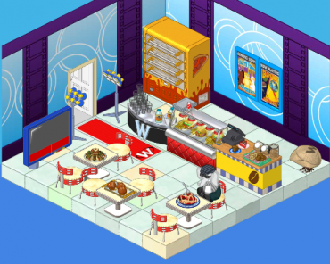
Elwin: I tried to incorporate some blue – very restful color, you know. And I’ve added a pizza oven (the manager of the arena wanted another way to earn KinzCash, so I suggested selling pizza. He thought it was a great idea!). The tables are great for sitting at and watching the tournaments (on TV). And the lights will make everyone feel like a superstar when they arrive.
Hailey: Very nice! Now here’s my design:
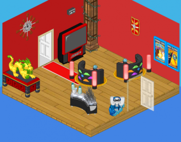
Hailey: I went with a more upscale, modern look. I wanted competitors to feel excited to be there (hence the red) and to have some healthy snacks to eat (goodbye fast food counter). I added the dragon for luck and inspiration, and the booths make great places to sit and discuss strategy with a friend.
What do you think, reader? Which elephant has created the better design? Leave your thoughts in the comments below!







I like Hailey’s WAY BETTER srry Elwin and his fans! add me august829000
Hailey!
Hailey. Love the sleek design. Sorry, Elwin way too busy.
I totally agree with the comment that Hailey and Elwin should work as a team!. For this makeover, Hailey gets my vote as the room is much more relaxing. (But I have a couple of those booths, and they seat only one pet.)
Elwin’s room
I like Elwin’s room. It looks like more fun to hang out in.
I have to go with Elwin this time. He listened to what the customer wanted and delivered a very nice design.
Obviously, I would choose Elwin’s. Hailey’s is… plain and empty.
i’m going with Haliey’s (sorry my name is that but not spelled that way get rid of the i) because its full of healty snacks and water that just like is perfect but Elwin’s is pretty nice but too cramped i would have picked his but this time its just too cramped so its like Haliey’s : 100% Elwin’s: 99% and a half so very close
I like Hailey’s because it’s nice and relaxing looking.