By Elwin
Onto to the dining room! Fluffington seemed pretty happy with our bathroom makeover so we’re getting down to the final couple of rooms.
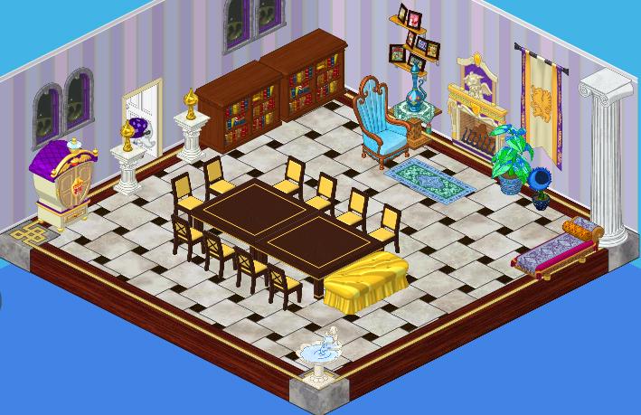
Fluffington’s dining room is fairly understated. He’s got a lovely marble floor set off by a cool-hued striped wallpaper. He’s also got a nice seating area by the fireplace. We should try to play that up. And of course, being Fluffington’s place, there is a lot of gold and purple.
We wanted to tie in our decorations to the color scheme that Fluffington already had and we thought that the High Class Christmas Tree would be perfect with its violet shades. We set it off with the Violet Persian Rug that we had removed from the living room.
We used the Jolly Holiday Dining Table to introduce some Christmas colors into the room, but we tied in the cool tones by surrounding the table with the True Blue Dining Chairs.
The Elegant Ice Fountain creates a lovely focal point in the corner, and the King’s Feast Dining Table offers an extra serving area, as does the Treats for Santakinz table. Guests can help themselves to drinks at the All Stocked Up Display, positioned next to our miniature Glittering Gem Tree. They’re right under the windows which have been blinged up with the Tis the Season Windows.
The Fabled Fireplace is flanked by a pair of Over Stuffed Stockings and we also threw in another pile of gifts in the SantaKinz Gift Bag. There’s even a plate of cookies next to the fire for you know who.
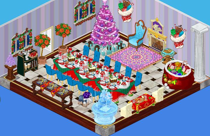
I think this is a pretty festive spot for Fluffington to feed his guests, don’t you? Of course, once Chef Gazpacho starts serving up his yummy dishes, I doubt anyone will even notice their surroundings!





This room has unique style that only Elwin and Hailey could create. They really nailed this room as well as all the others. I can’t wait to see more festive designs!
I like the rug and the tree but the thing that bothers me is why they do NOT have a picture of SANTA! I agree with madichip .
I agree that there’s so much going on in the room it looks crowded and out of control. Parts of it I really like, and I do think the original was a little too somber for a party. Guess I would like to see something in between the two.
Something in between the two is also what I hoped for. Sigh, Hailey and Elwin never seem to make a subtle change to a room. They just make it way too over-the-top. That’s why I design all my rooms myself. (for those who don’t know, a subtle change is a not-as-noticable change that sometimes works better than an over-the-top change) Sorry for the long post.
~PrincessLunaIsDaBomb
I agree. (Your post isn’t long at all, don’t worry!) I am not a fan of Hailey and Elwin’s designs, because: 1. They, in my eyes, don’t always compliment the person talents, charm and likes. 2. The items usually clash. Items are not matching, things that don’t look good and other things are always in their rooms. 3. They work on a budget. (I think) Working on a budget makes it harder to design a GOOD room. It makes you feel under pressure and you know, you can’t really let all your designing knowledge out. 4. The rooms are always to full. You can’t see walkways, although I think there are, the rooms are always too busy. These are just my thoughts. -OceanBay§§§
P.S. Now THAT is a kinda long post! ;) :) :mrgreen: :roll: :D
OceanBay, I think there is only 1 walkway,
this is cool.
IDK about that room it is WAAYY to crowded but i like the decor!
shadowismykitty
Hi shadowismykitty…welcome! I don’t comment very often, but I do read the comments all the time!